At its core, a high-converting landing page is a specialized web page built for one thing and one thing only: getting a visitor to take a specific action. That action could be buying a product, signing up for a webinar, or downloading a guide. We measure its success by its conversion rate—the percentage of visitors who actually do the thing you're asking them to do.
The Anatomy of a High-Converting Landing Page
Forget about one-size-fits-all templates. A landing page that actually works isn't just a pretty design; it’s a strategic, focused experience where every single element has a job. Think of it as a well-oiled machine, with every gear turning in unison toward a single goal.
This whole process starts before a visitor even lands on your page. It begins with the ad or link they clicked. The connection between that ad and your page needs to be seamless—a concept we call message match. If your ad promises a "50% Discount on Your First Order," your landing page headline better shout that same offer loud and clear. Any friction or confusion here is the fastest way to lose a potential customer.
Core Components That Drive Conversions
I've seen thousands of landing pages, and the ones that consistently convert are built on a handful of non-negotiable components.
- A Magnetic Headline: This is your first impression. It needs to instantly grab attention, state the main benefit, and reassure the visitor they've come to the right place. No fluff.
- A Compelling Hero Shot: People are visual. Use a high-quality image or a short, punchy video that shows your product or service in action. Help them see the value.
- Benefit-Oriented Copy: Ditch the jargon and feature lists. Your copy needs to answer one question for the reader: "What's in it for me?" Focus on solving their problem and making their life better.
- Social Proof: Nothing builds trust faster than seeing that other people have already had a great experience. Use real testimonials, case studies, or logos of well-known clients to show you’re the real deal.
The Path to Action
Once you've convinced them, you have to make it incredibly easy to take the next step. This is where so many pages fall flat.
Your form needs to be simple and unintimidating. I can't stress this enough: only ask for what you absolutely need. Every extra field you add is another reason for someone to give up.
The ultimate goal of a landing page is to remove all distractions. Every link, image, and word that doesn't contribute to the primary call-to-action is a potential leak in your conversion funnel.
And that brings us to the main event: the call-to-action (CTA). This should be a big, bold, can't-miss button with clear, action-focused text. "Get My Free Template" crushes a generic "Submit" every single time. There should only be one primary CTA, giving the visitor a clear, unambiguous path forward.
To really dig into the nitty-gritty, explore these strategies to create a high converting landing page that sells. Mastering these fundamentals is how you build a page that doesn’t just get clicks—it gets results.
Write Words That Actually Get People to Act
If design is the skeleton of your landing page, your copy is its heart and soul. It's the persuasive engine that turns a casual browser into someone who needs what you're offering. Think of it as building a bridge with words, connecting your visitor's biggest headache directly to your solution.
This all starts the second they land on your page. Your headline is everything. It’s not just a title; it’s a promise that you get what they’re struggling with and have an answer right now. A weak headline is an instant "back button" trigger, but a great one makes them stop and lean in.
Pinpoint Their Problem, Then Present Your Solution
Great copy doesn't just list what your product does; it describes your visitor's problem so well they feel like you've been reading their mind. When someone feels that understood, trust follows almost immediately. So, stop leading with features and start with the pain point.
For instance, a project management tool could say: "Our platform features Gantt charts and Kanban boards."
Or, it could say: "Tired of missed deadlines and chaotic projects? Get your team aligned and deliver on time, every time."
See the difference? The second one hits an emotional nerve. It calls out the frustration and instantly frames the tool as the only logical fix. This simple pivot from features to benefits is the secret sauce of landing pages that convert like crazy.
Turn Dry Features into Desirable Benefits
Here's a hard truth: people don't buy your product. They buy a better version of themselves. Your job is to translate every feature into a tangible, desirable outcome. The easiest way to do this is to apply the "So what?" test to every feature you list.
Let’s try a few common examples:
- Feature: 10GB of cloud storage.
- So what? Benefit: Never lose an important file again. Access your work from anywhere, securely.
- Feature: 24/7 customer support.
- So what? Benefit: Get expert help the moment you need it, so you never get stuck.
- Feature: One-click integration.
- So what? Benefit: Save hours of setup time and connect your favorite tools instantly—no coding required.
A feature is what your product has. A benefit is what your customer gets. Always, always lead with what they get. This shift in perspective makes your offer feel essential, not just optional.
Nail Your Value Proposition
Your value proposition is your core promise. It's the crystal-clear reason a customer should choose you over anyone else. This isn't a fluffy slogan; it's a strategic statement that spells out the primary benefit of your offer. For a deeper dive, check out our guide on how to create a value proposition that resonates with your audience.
A killer value proposition is usually delivered through a powerful combination of your headline, sub-headline, and a few key bullet points. It needs to be the first thing a visitor sees and understands without any effort. A strong headline alone can triple conversion rates. And it's no surprise that websites with 10 to 15 landing pages see a 55% increase in leads compared to those with fewer than 10. Tailoring your copy for each audience just works. You can find more stats on landing page performance on Hostinger's blog.
Don't Sweat the Big Stuff and Forget the Small Stuff
Headlines and body paragraphs get all the glory, but the tiny bits of text—the microcopy—can have a massive impact. I'm talking about the words on your buttons, the labels on your forms, and even the error messages.
Just think about the difference between a button that says "Submit" versus one that says "Get My Free Guide." The first one is a chore. The second one is a reward. It reinforces the value and makes clicking a no-brainer.
Here are a few tips for getting your microcopy right:
- Be Action-Oriented: Start your button text with a verb that describes the payoff. Think "Start My Trial," "Download the Ebook," or "Reserve My Spot."
- Ease Their Fears: A tiny bit of text near a form field can work wonders. Under an email field, a simple "We hate spam as much as you do" can lower their guard.
- Make Errors Helpful: Instead of a blunt "Invalid Entry," try something specific and human, like "Oops! Please enter a valid email address."
Every single word on your landing page is a chance to persuade, reassure, and guide your visitor. When you obsess over their needs, translate every feature into a real-world benefit, and sweat the small details, you’ll craft copy that doesn't just get read—it gets results.
Designing for a Seamless User Experience
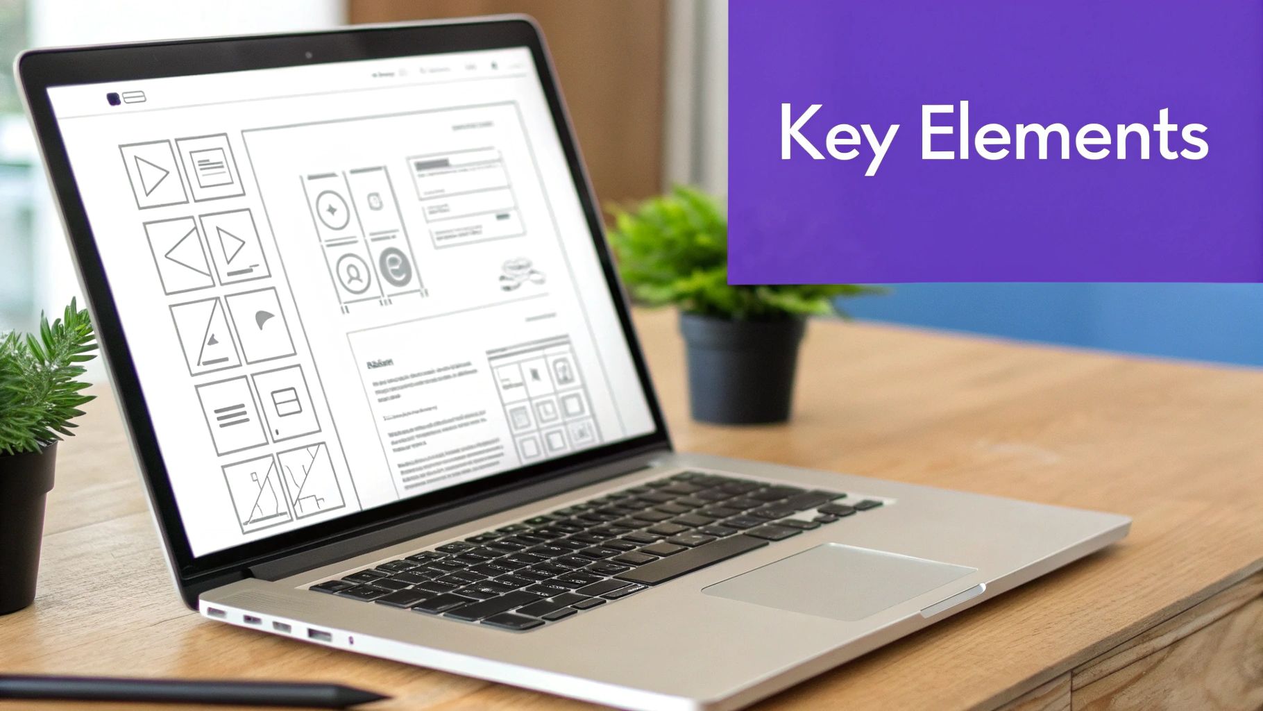
Great landing page design isn't about winning art awards. It’s about creating a silent, intuitive guide that leads a visitor from "I'm curious" to "I'm in." The goal is to make the path to conversion feel completely natural, almost effortless. This is where a strong visual hierarchy comes into play.
Think of it as telling a visitor’s eyes where to go. You use size, color, and placement to create a clear path. Your headline should be the biggest, boldest thing on the page. Your sub-headline comes next. And that all-important call-to-action (CTA) button? It needs to pop with a contrasting color that demands to be seen. It's not about being flashy; it's about being undeniably clear.
Guiding the Eye with Strategic Visuals
Don't underestimate the power of empty space. Whitespace—or negative space—is the breathing room around your elements. It's what keeps your page from feeling like a cluttered mess, making your content easier to read and helping crucial elements like your form and CTA stand out.
Visuals aren't just there to break up text; they build an emotional bridge and establish instant credibility. A crisp, high-quality image or a quick, compelling video showing your product in the real world can convey value much faster than a paragraph of text ever could.
- Choose Authentic Imagery: Steer clear of generic stock photos. They feel impersonal and can actually hurt trust. Instead, use custom photography or high-quality images that truly reflect your brand and connect with your audience.
- Show, Don't Just Tell: Selling software? A quick GIF or video showing off a key feature is golden. For a physical product, show a happy customer using it.
- Optimize for Speed: Huge image and video files are notorious for slowing down your page, and slow load times kill conversions. Always compress your media files to ensure your page loads in under three seconds.
To help you put these principles into action, I've broken down the core design elements and how to get them right.
Key Design Elements and Their Impact on Conversions
Visual Hierarchy: Its purpose is to guide the user's eye to the most important elements in a specific order (headline, form, CTA). A best practice is to use size, color, and contrast to make your headline the largest text, and ensure your CTA button stands out.
Whitespace: This is used to reduce clutter, improve readability, and draw attention to key conversion elements. You should be generous with the empty space around your text blocks, images, and forms. Don't crowd the page.
High-Quality Media: This helps to build emotional connection, demonstrate value, and establish credibility quickly. Use authentic, high-resolution images or short videos of your product in action and remember to compress all media to ensure fast load times.
Color Psychology: The goal is to evoke specific emotions and create contrast that draws attention to the CTA. Choose a brand-aligned color palette and use a bold, contrasting color for your CTA button so it's impossible to miss.
Clean Typography: This ensures the page is easy to read and digest, reducing friction for the visitor. Stick to 1-2 easy-to-read fonts and ensure text is large enough to be legible on all devices, especially mobile.
Getting these elements right creates a cohesive and persuasive experience that feels professional and trustworthy, nudging visitors toward your goal.
Prioritizing the Mobile Experience
Let's be clear: designing for mobile isn't an afterthought anymore. It's the whole game. With over 82% of landing page visitors now showing up on mobile devices, a clunky mobile page is like slamming the door on most of your potential customers.
A "mobile-first" approach is the only way to go. This means you design for the smallest screen first and then adapt the layout for bigger ones, not the other way around. It forces you to focus on what truly matters—the core message and the CTA.
Despite this, a shockingly low 17% of marketers consistently use A/B testing to improve their landing pages. This is a massive opportunity to pull ahead of the competition. For more stats like this, check out the latest landing page optimization trends from Mailmodo.
Making Forms Effortless to Complete
Your form is the final hurdle. It’s the last thing standing between you and a new lead, so it needs to feel as frictionless as possible. Every extra field you add is another reason for someone to give up and leave.
Your form should feel like an easy final step, not a chore. The rule of thumb is simple: only ask for the information you absolutely need to take the next step in the customer journey.
If you’re offering a newsletter, an email is all you need. For a sales demo, you might need a name, email, and company. Keep it lean. Here’s how you can make your forms less of a pain to fill out:
- Use a Single-Column Layout: It's so much easier to follow, especially on mobile. It creates a simple, straight line to the finish.
- Employ Clear Field Labels: Don't put labels inside the input fields as placeholder text that vanishes. Keep them visible above the field at all times.
- Provide Reassuring Microcopy: A quick note like "We'll never share your email" or a reminder of the awesome thing they're about to get can do wonders for reducing anxiety and getting that form submitted.
Win Over Skeptics with Trust Signals and Social Proof
On the internet, trust is everything. Before anyone even thinks about clicking your call-to-action, you have to break down their natural skepticism. This is where trust signals and social proof come into play—they’re how you show, not just tell, that what you're offering is the real deal.
Put yourself in your visitor's shoes for a second. They just clicked an ad and landed on your page. Their first thought is almost always, "Is this legit? Can I trust this company?" Your page needs to answer that question with a confident "Yes!" before they have a chance to second-guess. Without these trust-building elements, even a brilliantly designed page will fall flat.
Different Kinds of Social Proof
Social proof isn't just a single testimonial hidden at the bottom of the page. It’s a whole toolbox of credibility-builders you can use, and each one helps chip away at a different type of visitor doubt.
A huge part of earning that trust is effectively implementing social proof on your website.
Here are a few of the most powerful types I've seen work time and again:
- Customer Testimonials: Direct quotes from happy customers are a classic for a reason. Always use real names and photos to make them feel genuine. A specific quote like, "This software saved our team 10 hours a week," packs a much bigger punch than a generic, "It's great!"
- Detailed Case Studies: If you’re selling something complex or high-ticket, a full-blown case study can be a total game-changer. It walks a potential customer through the entire journey—the problem, your solution, and the measurable results. This is absolute gold for analytical buyers.
- Client Logos: Do you work with any well-known brands? Their logos are an instant stamp of approval. A simple "Trusted By" section featuring recognizable logos immediately gives your own brand a massive credibility boost.
These all tap into a basic human instinct: we trust what other people trust. When a visitor sees that others have already had a good experience, the perceived risk of taking action plummets.
Build Confidence with Trust Signals
Beyond what other people are saying, there are other signals you can send to make visitors feel secure. These are the more technical, behind-the-scenes elements that quiet those nagging subconscious fears about security and privacy.
Trust signals are the silent reassurances on your landing page. They tell visitors that their information is safe, the transaction is secure, and your business is professional and legitimate.
Don't ever skip these crucial pieces:
- Security Badges: Icons from providers like McAfee or Norton, or even a simple "SSL Secured" badge near your sign-up form, can dramatically reduce anxiety about sharing personal data.
- Guarantees and Policies: A bold "30-Day Money-Back Guarantee" shows you stand behind your product. Similarly, having a clear link to your privacy policy demonstrates that you respect your customers.
- Real-Time Activity Notifications: You’ve probably seen those little pop-ups that say, "Jane from New York just signed up!" This creates a sense of urgency and belonging, showing that other people are taking action right now.
By layering these different forms of social proof and trust signals throughout your page, you build a powerful case for your credibility. You stop asking for trust and start earning it.
A Practical Framework for Testing and Optimization
Getting your landing page live isn't the finish line; it’s just the starting gun. I’ve seen it time and time again: the most successful campaigns aren't built on a "set it and forget it" mentality. They're the result of a continuous process of testing, listening to the data, and making small, smart tweaks that add up to big wins.
This is how you turn a static webpage into a dynamic conversion machine. It’s about moving away from guesswork and hunches and embracing a reliable, data-driven process. By methodically testing one element at a time, you can systematically lift your conversion rates and get a much better return on every dollar you spend.
The Foundation of Testing: A/B Split Testing
The simplest and most powerful tool in our optimization toolkit is the classic A/B test, also known as a split test. The concept is refreshingly straightforward: you create two versions of your page. Version A is your control (the original), and Version B is your challenger (the variation). You then show each version to a different segment of your audience and see which one performs better.
The absolute golden rule here is to change only one element at a time. Seriously. If you change the headline and the button color in Version B, you'll have no clue which change actually moved the needle. Was it the compelling new headline or the eye-catching button? You'll never know.
This infographic really nails the core principles of designing for conversions.
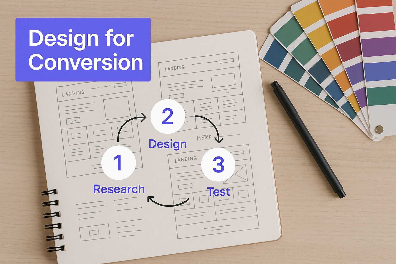
It’s a great reminder that every single choice—from the layout down to the color palette—plays a direct role in persuading a visitor to take action.
Prioritizing Your Tests for Maximum Impact
So, what should you test first? While you can test just about anything, some elements pack a much bigger punch than others. If you want to see significant results quickly, start with these high-impact components:
- The Headline: This is your first impression. It’s your best shot at grabbing someone's attention in a few seconds. Try testing different value propositions, emotional hooks, or even just rephrasing your core message.
- The Call-to-Action (CTA): This is the moment of truth. Experiment with the button text ("Get Started" vs. "Claim Your Free Trial"), the color, and its placement on the page. You'd be amazed at what a difference a simple color change can make.
- The Hero Image or Video: Your main visual sets the entire mood. Test a shot of your product in action against a lifestyle photo of a happy customer. See which one connects better with your audience.
- The Offer Itself: Sometimes, the problem isn't the page; it's the offer. You could test a free trial against a money-back guarantee, or a discount against a valuable bonus feature.
By focusing on these big levers first, you can find substantial improvements right out of the gate. Once you’ve optimized the major elements, you can move on to more granular tests like form length or the placement of social proof. For a deeper dive into this, check out our complete guide on conversion rate optimization best practices.
Going Beyond the Click with User Behavior Analysis
A/B testing is fantastic for telling you what is happening, but it doesn't always tell you why. To really understand your visitors, you need to see the page through their eyes. That’s where user behavior analytics comes in.
Data tells you what happened, but user behavior analysis helps you understand the story behind the numbers. It uncovers the friction points and moments of hesitation that raw metrics can't show you.
Two of my go-to tools for this are:
- Heatmaps: These tools create a visual overlay on your page showing you exactly where people are clicking, moving their mouse, and how far they scroll. A heatmap can instantly reveal that visitors are trying to click on something that isn't a link or that they're completely missing your main CTA.
- Session Recordings: Think of these as anonymized screen recordings of real user visits. Watching a few of these is often a humbling and incredibly insightful experience. You’ll see exactly where people get stuck, confused, or frustrated.
This kind of qualitative data gives you the context you need to form much smarter hypotheses for your next A/B test. The effort is well worth it. Dedicated landing pages have a 160% higher conversion rate than other signup forms, and a good one averages around a 23% conversion rate. And don't forget speed—every extra second of load time can slash conversions by a staggering 4.42%. This is why optimization isn’t just a nice-to-have; it's an absolute necessity for success.
Answering Your Top Landing Page Questions
As you get into the nitty-gritty of building landing pages that actually convert, you're bound to run into some common questions. It can be tough to figure out where best practices end and real-world application begins. Let's clear up some of the most frequent sticking points with straightforward answers to help you build better pages.
Think of this less as a set of rigid rules and more as a guide to understanding the why behind the what. Once you grasp the principles, you can adapt them to whatever you're trying to achieve.
How Many Landing Pages Do I Really Need?
The short answer? You should have a unique landing page for every single ad campaign or distinct traffic source you're using.
The secret to a killer landing page is message match—making sure the ad someone clicks on lines up perfectly with the page they land on. If you're running different ads for separate features of your software, each of those ads needs its own dedicated page. It sounds like a lot of work, but the results speak for themselves. Businesses with 10-15 landing pages see a staggering 55% more leads than companies with fewer than 10.
Start with a dedicated page for each of your main campaigns. As you grow your marketing, you can build out more from there.
What’s a “Good” Conversion Rate for a Landing Page?
This is easily the most-asked question, and my answer is always a bit frustrating: it depends. A "good" conversion rate is completely relative. It changes based on your industry, the price of your offer, and where your traffic is coming from. A free e-book download will, of course, convert way higher than a high-ticket consulting service.
Instead of chasing some universal number (which usually floats around 2-5%), focus on establishing your own baseline and working to improve it month over month.
A good conversion rate isn't a static number you hit and forget. It's a metric that's always trending upward because you're constantly testing and tweaking things. Your only real competition is last month's conversion rate.
Should I Make My Landing Page Long or Short?
The right length for your page is dictated by one thing: the complexity of what you're asking someone to do. There’s no magic word count, just what’s right for your specific offer.
- Short pages are perfect for low-risk offers. Think newsletter sign-ups, free templates, or webinar registrations. The goal here is to state the value and get the conversion with as little friction as possible.
- Long pages are a must for complex or expensive offers. If you’re selling a premium course or asking for a big commitment, you need more real estate. You need space to answer every potential question, counter objections with testimonials, and build an undeniable case for why your offer is the right choice.
The trick is to give people just enough information to feel confident without overwhelming them. The only way to know for sure is to A/B test a long version against a short one and see what your audience responds to.
How Much Does Page Load Speed Actually Matter?
It matters. A lot. Page load speed isn't just a technical footnote; it's one of the biggest levers for your conversion rate. We live in a world of instant everything, and every millisecond counts. A slow page is a conversion killer and a one-way ticket to a high bounce rate.
Many people will click the back button before your brilliant headline even has a chance to load. Study after study confirms that for every extra second it takes for your page to appear, conversions drop off a cliff. You should be aiming for a load time of three seconds or less, especially on mobile.
You can use free tools like Google's PageSpeed Insights to see where you stand. It doesn't just clock your speed; it gives you a specific, actionable punch list of things to fix, like compressing your images or cleaning up your code. Making your page faster isn't optional—it's foundational.
At SpeakerStacks, we know that the moment your presentation ends is a huge conversion opportunity. Our platform lets you create a branded, QR-code-powered landing page in under 90 seconds, so you can turn that audience engagement into real leads and meetings, without any friction. See how it works at https://speakerstacks.com.
Want More Insights?
Subscribe to get proven lead generation strategies delivered to your inbox.
Subscribe to Newsletter