A lead generation landing page is a specialized, standalone webpage built for one reason and one reason only: to capture a visitor's contact information in exchange for something valuable. Think of it this way: your homepage is a general store, serving many needs. A landing page is a boutique, an expert in a single product, designed purely to convert curious visitors into qualified leads.
Why a Dedicated Landing Page Is a Game-Changer

Let's be real—your homepage is a jack-of-all-trades. It's your digital front door, your company story, your blog portal, and your main navigation hub all at once. While that's great for general browsing, it's terrible for converting targeted traffic. This is precisely where a dedicated landing page completely changes the game for your marketing campaigns.
Its real power is its laser focus. Someone clicking on your ad or email link isn't there for a grand tour of your business; they're there for the one specific thing you promised them. A great landing page delivers on that promise immediately, without any distracting clutter.
The Power of a Singular Focus
The secret sauce separating a good landing page from a great one is its unwavering commitment to a single goal. Every single element, from the headline down to the final call-to-action (CTA) button, must work together to guide the visitor toward completing that one specific action.
This means you have to be ruthless about cutting anything that might pull their attention away. I'm talking about common culprits like:
- Main website navigation: Don't give them an easy off-ramp to your blog or careers page.
- Competing offers: One page, one offer. Don't ask them to download an ebook and sign up for a webinar.
- Extra links: Every link that doesn't serve your conversion goal is a potential leak in your funnel.
This focused approach isn't just theory; it delivers real, measurable results. We've seen in countless campaigns that these dedicated pages are incredibly effective, boasting an average conversion rate of 26%. In fact, well-designed landing pages often convert at a rate 160% higher than other sign-up forms you might place elsewhere on your site.
Presenting an Irresistible Value Proposition
At its core, this is a transaction. A visitor gives you their precious contact information because they believe what they're getting in return is far more valuable. Your landing page has to scream that value from the moment it loads. This isn't about just listing features; it's about articulating the real-world benefit to the user.
A great landing page answers the visitor's unspoken question, "What's in it for me?" within the first five seconds. It must clearly present the problem it solves and position your offer as the ideal solution.
Here’s a quick-reference summary of the essential elements every lead generation landing page needs to succeed.
Core Components of a High-Converting Landing Page
- Headline: Its purpose is to grab attention and state the core value proposition. The key objective is to make the visitor want to read more.
- Hero Shot: This is a compelling image or video of the offer. Its purpose is to help the visitor visualize the value.
- Social Proof: This includes testimonials, reviews, or client logos. Its purpose is to build trust and credibility.
- Benefit-Oriented Copy: This copy explains what the user gets, not just what the offer is. The key objective is to clearly answer "What's in it for me?"
- Lead Capture Form: This is the mechanism to collect contact information. It should be as short and simple as possible.
- Call-to-Action (CTA): This is a clear, action-oriented button. Its purpose is to compel the visitor to submit the form.
Getting these components right is the key to turning clicks into conversions.
This clarity builds immediate trust and vaporizes hesitation. When a visitor instantly gets the value, they're much more likely to take that next step. Of course, a high-converting page is useless if no one sees it. To ensure your target audience finds it through organic search, you need to understand search engine indexing. Getting this foundational knowledge right ensures your page doesn't just convert visitors, but also attracts them in the first place.
Writing Copy That Persuades and Converts
If your design is the skeleton of your landing page, your copy is its soul. It's your 24/7 salesperson, working in silence to convince visitors that what you're offering is the answer they've been looking for. Truly great copy isn't about using big words or clever jargon; it’s about understanding your visitor's mindset and gently guiding them to a confident "yes."
Think of your words as a bridge connecting a visitor's problem to your solution. Every single word should work to make that bridge shorter, stronger, and incredibly easy to cross. This all starts with the very first thing they read.
Crafting a Headline That Commands Attention
Your headline has one, and only one, job: to stop the scroll and keep the visitor from bouncing. You have just a few seconds to signal massive value and relevance. If your headline falls flat, the most brilliant offer in the world will go completely unseen. It has to be a showstopper.
The best headlines are almost always specific, benefit-focused, and crystal clear. Vague promises are the enemy. Instead of something generic like "Improve Your Marketing," you need a headline that hits hard, like "Generate 50% More Leads From Your Next Speaking Gig." See the difference? The second one paints a vivid picture of a real, tangible outcome.
This is where you need to be bold. Don't shy away from making a strong promise, as long as you can deliver on it. A killer headline speaks directly to your visitor's biggest pain point or deepest desire, making them immediately think, "Okay, this is for me."
Using Sub-Headlines to Deepen the Intrigue
So, the headline grabbed their attention. Great. Now, the sub-headline has to reel them in. This is your chance to expand on the headline's promise by adding a critical piece of context or a juicy secondary benefit.
Look at how they work together:
- Headline: Turn Your Next Presentation Into a Lead Machine.
- Sub-headline: Use our QR code system to capture attendee contact info directly from your slides in under 90 seconds.
The sub-headline reveals the "how," lending instant credibility and clarity to the headline's "what." It's what takes a visitor from being mildly curious to genuinely wanting to know more about your specific solution.
Articulating Value with Benefit-Driven Language
Here's one of the most common missteps I see on a lead generation landing page: people list features, not benefits. It’s a classic mistake. Your visitors don't care about a quarter-inch drill bit; they care about the quarter-inch hole it creates. The hole is the benefit.
Features tell, but benefits sell. A feature is what your product is or does. A benefit is what the user gets or feels because of it.
To flip your features into compelling benefits, just ask "so what?" after every feature you list. Let’s try it.
Feature: Our platform generates a unique QR code. (So what?)
Benefit: So you can effortlessly capture leads from a live audience without forcing them to type a long, clumsy URL.
Feature: We have a built-in ROI calculator. (So what?)
Benefit: So you can instantly see the exact revenue generated from your speaking gig and prove its value to your boss.
This simple shift in perspective instantly makes your copy all about the customer, not all about you.
Building Unbreakable Trust with Social Proof
No matter how persuasive your words are, people will always trust their peers more than they trust your marketing. That’s just human nature. This is exactly why social proof isn't just a "nice-to-have" element—it's an absolute requirement for building credibility and crushing skepticism.
You have a few powerful types of social proof at your disposal:
- Direct Testimonials: Grab quotes from happy customers that highlight a specific result or feeling they had. Always include their name, title, and company for authenticity. If you can get video testimonials, they're pure gold.
- Quantified Results: Don't just say a client was "happy." Show what that happiness looks like in numbers. For example, "SpeakerStacks helped SaaS Inc. capture 250+ qualified leads from a single webinar."
- Trust Badges & Logos: Displaying logos of companies you’ve worked with or security badges (like for GDPR compliance) is a powerful visual shortcut to building trust.
Placing this proof strategically near your call-to-action can be the final nudge a hesitant visitor needs to take the leap.
Writing a Call-to-Action That Inspires Action
And finally, we arrive at the call-to-action (CTA). This is the moment of truth where everything comes together. Your CTA copy has to be clear, concise, and compelling. Get rid of passive, boring phrases like "Submit" or "Click Here." They have no energy.
A great CTA button should complete the sentence, "I want to..."
- I want to... Get My Free Ebook
- I want to... Book My Demo Now
- I want to... Start My Free Trial
This subtle psychological shift makes the action feel like it’s being driven by the user's own choice, not by your command. Every word on your lead generation landing page has a single, unified purpose: to make clicking that CTA feel like the most logical, beneficial, and satisfying next step the visitor could possibly take.
Designing for Conversion, Not Just Aesthetics
It’s easy to get caught up in making a lead generation landing page look beautiful. But here's a hard truth I've learned from years of building these: great design isn't about pretty fonts and colors. It's a science. The real goal is to psychologically guide a visitor’s eye and make the path to conversion completely frictionless.
While aesthetics definitely matter for brand perception, your primary design goal must be to steer every single visitor toward one specific action—filling out that form. Every element, from layout to imagery, must serve this singular purpose. A stunning page that confuses people is a failure; a simple, clear page that guides them will always win.
Create a Strong Visual Hierarchy
Think of your landing page as a roadmap. A strong visual hierarchy is how you draw that map, showing people exactly where to look first, second, and third. You want the most important stuff—your headline, your call-to-action (CTA) button, and your form—to be impossible to miss. This is done with strategic use of size, color, and placement.
Make your headline the biggest, boldest text on the page. For your CTA button, use a contrasting color that pops right off the screen. If your page has a cool blue and white theme, a bright orange or green button will naturally draw the eye.
A great landing page is like a well-lit path in a dark forest. Visual hierarchy provides the lights that guide your visitor from the headline (the start) to the CTA button (the destination) without getting lost.
This deliberate guidance prevents that feeling of being overwhelmed. It helps visitors process information in the exact order you want them to, making the final conversion feel like the most natural next step.
Embrace the "Less is More" Philosophy
One of the most impactful things you can do for your landing page is to strip away anything that doesn't directly contribute to the conversion. This concept is sometimes called "attention ratio"—the ratio of things a visitor can do on the page versus the one thing you want them to do. Your goal is a ratio of 1:1.
The biggest offender? Your website's main navigation menu. Removing it is a simple change that yields incredible results. I’ve seen studies—and my own experience confirms—that removing navigation can boost conversions, sometimes by as much as 100%. Why? Because it eliminates the most common exit route.
Here are a few other distractions to ruthlessly cut:
- Footer Links: Don't give them a tempting link to your "About Us" or "Careers" page.
- Social Media Icons: The last thing you want is to send them off to scroll through their social feeds.
- Competing Offers: A single landing page should have a single, focused offer. Don't confuse visitors with multiple CTAs.
By creating a focused, distraction-free environment, you keep their attention exactly where it needs to be. If you want to go deeper on this, we've got a whole guide on how to build landing pages that convert like crazy.
Use Imagery That Tells a Story
The images on your page are not just decorations; they're a vital part of your message. A generic stock photo of smiling people in a boardroom tells your visitor absolutely nothing. A high-quality, relevant image, however, can communicate value in an instant and forge an emotional connection.
Your "hero shot"—the main image at the top—should help visitors picture themselves winning with your offer. If you’re offering an ebook, show a crisp mockup of the cover. For a software demo, a clean screenshot or a short, looping GIF of the product in action works wonders.
For a service like SpeakerStacks, showing an image of a speaker on stage with a QR code on the screen behind them instantly tells the whole story. This kind of visual context backs up your copy and makes the value crystal clear. Ultimately, a good design is one that drives conversions. Your conversion rate is the only metric that truly matters. A design that looks great but doesn't convert is just art; a design that converts is a powerful business asset.
Building a Lead Capture Form That People Actually Fill Out
Your form is the moment of truth. It's the final gatekeeper between a curious visitor and a new lead for your business. After you've poured all that effort into compelling copy and a beautiful design, this is where the conversion actually happens. Getting this part right is a delicate dance—you need their information, but they’re naturally hesitant to give it up.
The first question I always get is, "How many fields should I have?" There’s no magic number. It all comes down to the value of your offer. If you're offering a simple newsletter subscription, asking for anything more than an email is adding friction for no good reason. But for something more substantial, like a B2B webinar or a one-on-one demo, it's perfectly fair to ask for a name, company, and job title.
The golden rule here is value alignment. The user's perceived value of your offer must outweigh the effort it takes to fill out the form.
Optimizing Form Fields for Maximum Completions
Every single field you add is another little hurdle for your visitor. Think about that for a second. Research has proven time and again that cutting fields boosts conversions. I’ve seen a case study where a company saw a 120% jump in conversions simply by slashing their form from 11 fields down to 4. Your job is to be ruthless. Ask only for what you absolutely need right now.
You have to distinguish between what's essential for the initial contact and what you can find out later.
- Stick to the Essentials: Start with the bare minimum. Often, that’s just an email address.
- Try Progressive Profiling: For more complex funnels, use smart forms. When a known lead comes back, the form can ask for a new piece of information, gradually building a complete profile over time.
- Use Clear Labels: Don't try to be clever with your labels. They should be simple, direct, and placed above the field. Placeholder text that disappears when someone starts typing is a common point of confusion.
This image really drives home how crucial trust is in getting someone to finally hit "submit." It's all about using testimonials, ratings, and trust badges to build confidence.
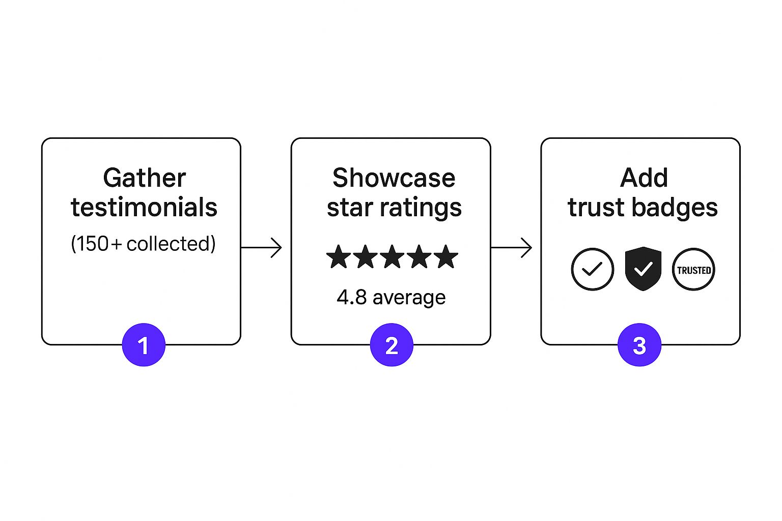
The takeaway here is that social proof isn't just a nice-to-have; it's what reassures visitors that filling out your form is a safe and worthwhile decision.
Advanced Form Techniques to Reduce Friction
Shortening your form is a great start, but you can get even smarter to make the process feel totally seamless. These tactics are especially powerful if you're a B2B marketer who needs more detailed info.
One of my favorite methods is the multi-step form. Instead of hitting someone with a wall of seven questions, break it up. Show them two fields to start. Once they've begun, the principle of commitment kicks in, making them far more likely to complete the next steps. It just feels less intimidating.
Another game-changer, particularly for B2B, is leveraging pre-filled fields. This is where platforms like LinkedIn have become absolute powerhouses. Their native Lead Gen Forms boast an average 13% conversion rate—that's more than five times the typical landing page average of 2.35%. Why? Because they pre-populate the form with the user's profile data, turning a chore into a single click. You can learn more about how effective this is by checking out some of the latest data on LinkedIn for high-quality B2B leads.
Your goal is to make the visitor feel smart and efficient. A form that respects their time by pre-filling information or breaking down questions shows you actually care about their experience.
Finally, take a hard look at your error messages. A generic "Error" is just lazy and frustrating. Use inline validation that tells the user exactly what’s wrong. Something like, "Please enter a valid business email," guides them to a quick fix. On your lead generation landing page, every single detail of the form matters. It can transform a necessary chore into a smooth experience that gets you the leads you’re looking for.
How to Scale Your Efforts with Multiple Landing Pages
Having one solid lead generation landing page is a great first step. But if you’re serious about growth, you need to think bigger. The real magic happens when you move from a single page to a whole portfolio of targeted pages. This is where you graduate from just grabbing leads to building a full-blown lead generation machine.
The thinking here is pretty straightforward: relevance is what drives conversions. A single, generic page that tries to be everything to everyone ends up resonating with no one. A scaled strategy, on the other hand, means creating multiple, personalized landing pages, each one laser-focused on a specific audience, traffic source, or marketing campaign.
Why Personalization Is Your Biggest Growth Lever
Let's walk through a real-world scenario. Imagine you're running two ad campaigns. The first one targets SaaS founders, talking about how to nail their seed funding pitch. The second one is aimed at field marketing managers, focusing on boosting their event ROI.
Sending both of those very different people to the same generic landing page creates an instant disconnect. It’s lazy marketing, and it doesn't work.
But what if the SaaS founder clicks your ad and lands on a page with the headline, "Turn Your Next Pitch Deck into an Investor Interest List"? And the marketing manager lands on a page that says, "Capture Double the Leads at Your Next Conference"? Now you’ve created perfect alignment.
This tailored experience does a few things at once:
- It Builds Instant Rapport: The visitor immediately feels like you "get them," which builds trust and lowers their defenses.
- It Increases Perceived Value: The offer feels more valuable because it speaks directly to their problem.
- It Slashes Your Bounce Rate: When the page delivers exactly what the ad promised, people stick around.
A visitor should never have to do the mental gymnastics of connecting your general offer to their specific problem. Your landing page needs to do that heavy lifting for them instantly.
The data on this is staggering. We’re not talking about a few extra leads here; this is a massive multiplier. Research from salesgenie.com shows that businesses using over 40 unique landing pages generate a mind-boggling 500% more leads than those with fewer than 10. It’s not about the number of pages, but the number of targeted conversion opportunities you create.
How to Manage Multiple Pages Without Losing Your Mind
I know what you're thinking: "Dozens of pages? That sounds like a nightmare to manage." It doesn't have to be. The trick is to work smarter, not harder, by creating a system instead of reinventing the wheel every time. Modern landing page builders are practically built for this.
Start with a Master Template
First, build out a "master" landing page. This is your foundation. It should have your branding, layout, and core structure completely dialed in. Use your best-performing design, your most effective copy framework, and your most streamlined form setup. This becomes your high-converting blueprint.
Clone and Customize
Now, instead of starting from scratch for every new campaign, just clone your master template. From there, all you need to do is swap out a few key elements to personalize it:
- The Headline & Sub-headline: Match these to the ad copy or email that brought the visitor there.
- The Hero Image: Use a visual that resonates with the target audience. A picture of a boardroom for VCs, a crowded trade show floor for event marketers.
- The Core Copy: Tweak the bullet points and benefits to speak directly to the new segment's pain points.
- The Social Proof: If you can, feature testimonials from customers in that specific industry or role.
This system lets you spin up a new, highly targeted lead generation landing page in minutes. For B2B companies, building systems like this is absolutely fundamental to scaling. If you're looking for more in-depth strategies on this, you should check out our guide on lead generation for SaaS to see how these systems create predictable growth.
By scaling your landing pages, you're building a powerful, personalized journey for every potential customer, which is how you dramatically boost relevance and, ultimately, your conversion rates.
Your Landing Page Questions Answered
Even with the best-laid plans, you're bound to hit a few snags when you're actually building a lead generation landing page. I've been there. Here are some of the most common questions that come up, along with the straightforward advice I give to my own clients.
How Long Should My Landing Page Be?
This is the classic "it depends" question, but here’s the reality: the length of your page should directly match the size of the "ask."
Think about it. If you're just asking for an email for a newsletter, keep it short and sweet. A killer headline, one sentence on why they should care, and the email field. Done. Anything more is just noise that gets in the way.
But if you're selling a complex B2B software demo, you’re asking for a much bigger commitment. Your visitor will have more questions and need more convincing. That’s when you bring out the longer-form content—detailed benefits, social proof, case studies, and a clear breakdown of the problem you solve.
My rule of thumb is this: make the page exactly as long as it needs to be to persuade someone, but not one word longer. Start with your best guess, then test it. Pit a longer version against a shorter one and let your audience's actions tell you what they prefer.
What Is the Single Most Important Part of a Landing Page?
If I had to bet all my chips on one thing, it would be the unbreakable link between your value proposition and your Call-to-Action (CTA). They’re two sides of the same coin; one is useless without the other.
Your headline and the first few lines of copy have one job: to instantly answer the visitor's silent question, "What's in it for me?" That's your value proposition in a nutshell.
Then, your CTA button needs to give them a crystal-clear, compelling next step to get that value. When you nail this connection, the decision to convert feels less like a sales pitch and more like the obvious next step for the visitor.
Should I Put a Video on My Landing Page?
Video can be a game-changer for conversions, but it can also be a total disaster. A sharp, well-made explainer video can often communicate your value faster and build more trust than a wall of text ever could. It adds a human touch.
The flip side? A cheap, rambling, or amateur video will absolutely tank your credibility and send people scrambling for the "back" button. It’s worse than having no video at all.
If you’re going to use video, these are my non-negotiable rules:
- Keep It Short: Get to the point. Under 90 seconds is the sweet spot.
- Put It Front and Center: Place it "above the fold" so they can’t miss it.
- Make Sure It Supports the Offer: The video's message must perfectly align with the goal of the page.
Don't just guess if it's working. The only real way to know is to A/B test a version with the video against a version without it. Let the data give you the final say.
How Do I Use QR Codes for Offline Lead Capture?
QR codes are fantastic for connecting what you do in the real world—like at a conference or during a speech—to your digital marketing machine. They turn a fleeting moment of interest into a tangible lead.
Here’s how it works in practice. First, create a simple, mobile-friendly landing page specifically for that event. Then, use a tool to generate a unique QR code that links directly to that page.
Now, put that QR code everywhere. Add it to your final presentation slide. Print it on a banner for your trade show booth. Have it on your business cards. When an engaged attendee scans it, they land directly on your form, ready to connect. It’s a seamless way to capture leads when they're most interested. This is one of the most powerful tactics we've seen, and you can dive deeper into our guide on proven strategies that actually work for generating leads.
Turn your next presentation into a lead generation powerhouse. SpeakerStacks gives you the tools to create a branded, high-converting landing page with a unique QR code in under 90 seconds. Stop letting audience attention evaporate and start turning your speaking gigs into measurable pipeline. Get started with SpeakerStacks today!
Want More Insights?
Subscribe to get proven lead generation strategies delivered to your inbox.
Subscribe to Newsletter