A web form is often the final barrier between a visitor and a conversion. Yet, countless forms bleed leads due to friction, poor usability, and a lack of clear purpose. A great form isn't just a collection of fields; it's a carefully crafted conversation designed to guide users to a single, valuable outcome. Whether you're capturing leads from a speaking engagement, gating a valuable resource, or booking meetings, the design of your form directly impacts your success.
This breakdown moves beyond generic templates to dive deep into strategic web form design examples from platforms like SpeakerStacks, Mobbin, and Figma Community. We will analyze precisely what makes each form effective, extract replicable tactics for mobile and event-driven contexts, and provide actionable takeaways you can implement immediately. For each example, you will find screenshots, direct links, and a concise analysis of the underlying strategy. The goal is to help you build forms that don't just collect data-they drive real business results.
To truly ensure your web forms succeed, it's vital to understand broader strategies for improving overall website conversion rates. For a deeper look into the foundational principles that support high-performing forms, check out this practical guide to improving website conversion rates. This article, however, will focus specifically on the form itself. We will explore the patterns and microcopy that turn audience attention from a QR code scan or a landing page visit into a measurable conversion. Let's explore the designs that convert.
1. SpeakerStacks: The High-ROI Event Capture Form
SpeakerStacks stands out as a premier example of context-aware web form design, engineered specifically for converting live audiences into measurable business opportunities. The platform moves beyond generic form builders by creating a frictionless, mobile-first experience tailored to the unique environment of a speaking engagement, whether on a physical stage or a virtual webinar. Its core function is to allow presenters to instantly capture leads and drive actions using a simple QR code displayed on a slide, linking attendees to a branded, high-conversion landing page.
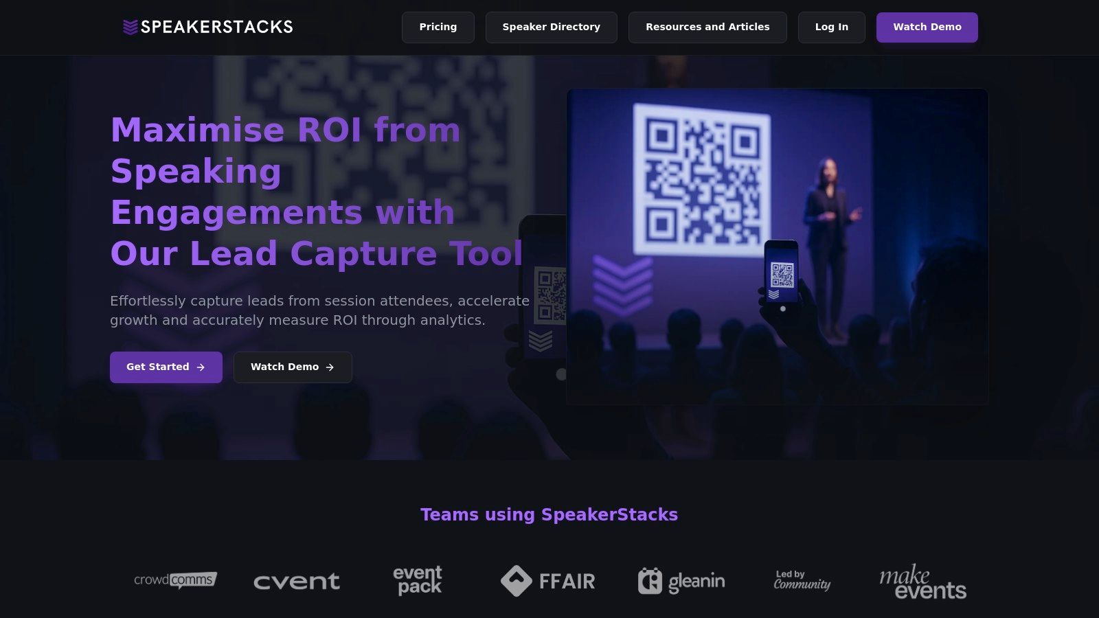
This approach solves a critical challenge for speakers: how to bridge the gap between audience engagement and tangible follow-up. Instead of relying on passive calls-to-action like "connect with me on LinkedIn," SpeakerStacks provides a direct, low-friction path for an attendee to download resources, book a meeting, or request a demo, all while the speaker's message is still top of mind. This focus on immediate, measurable action is what makes its form design so effective.
Strategic Analysis: Context-Driven Conversion
The genius of the SpeakerStacks model lies in its deep understanding of the user's context. An attendee in a conference hall has limited time and attention. They are not going to fill out a long, multi-field form on their phone. SpeakerStacks addresses this head-on with a form design that is minimalist, goal-oriented, and optimized for mobile screens.
Key Takeaway: The most effective web form design examples are those built for a specific user journey. SpeakerStacks wins by designing for the "in-the-moment" context of a live event, prioritizing speed and clarity over comprehensive data collection at the initial touchpoint.
The platform’s design choices are deliberately strategic. The forms are clean, single-column layouts that guide the user’s eye directly to the call-to-action. By integrating directly with tools like Calendly, it replaces the need for a "request a meeting" field with an instant booking action, removing a step and collapsing the sales cycle. This is a masterclass in reducing friction to maximize conversion.
Core Features and Actionable Insights
SpeakerStacks combines several powerful features into one cohesive system, making it a standout choice for any professional using speaking as a growth channel.
- Frictionless Attendee Experience: The process is seamless. An attendee scans a QR code and is taken to a simple, branded page. There are no apps to download or complex websites to navigate. The form itself typically asks for minimal information, like a name and email, because the primary goal is capturing the lead for immediate follow-up.
- Built-in ROI Tracking: Unlike standard form builders, SpeakerStacks connects form submissions directly to business outcomes. Its dashboard includes a real-time ROI calculator that tracks leads captured, meetings booked, and ultimately, pipeline generated from each event. This transforms a speaking gig from a brand-building exercise into a quantifiable revenue driver.
- Deep CRM Integration: Leads don’t just sit in a spreadsheet. They flow directly into CRMs like HubSpot, Salesforce, and Pipedrive. This automates follow-up sequences and ensures that marketing and sales teams can act on high-intent leads immediately after an event.
- Compliance and Gamification: The platform handles GDPR and CCPA compliance automatically, a crucial detail for speakers addressing international audiences. It also includes a unique credit-based rewards system to encourage platform adoption and referrals, a smart growth loop that benefits active users.
Practical Application and Use Cases
For marketers, founders, and consultants, SpeakerStacks provides a replicable playbook for event lead generation.
- SaaS Founders: Use it on a demo day or webinar to capture demo requests and trial sign-ups. The form can be configured to gate a special offer, driving urgency.
- Marketing & Sales Leaders: Place a unique QR code in breakout session slides to distribute gated content (e.g., ebooks, case studies) and capture MQLs for nurture campaigns.
- Consultants & Coaches: End a keynote with a call-to-action to book a free 15-minute discovery call, linking directly to a Calendly-integrated form.
While pricing details are not public and require contacting their sales team, the platform's value is positioned around the ROI it generates, not just its features. Its primary constraint is its reliance on audience members having and using a smartphone, but in most professional settings, this is no longer a significant barrier. SpeakerStacks exemplifies how a web form, when designed with a deep understanding of its specific use case, can become a powerful engine for business growth.
Website: https://speakerstacks.com
2. Figma Community
For designers, developers, and product teams looking to go beyond static images, the Figma Community is an interactive goldmine. It's not just a gallery of pictures; it's a massive, searchable library of actual Figma files containing complete form patterns, UI kits, and design systems. This platform provides direct access to the building blocks of exceptional web form design examples, allowing you to deconstruct and adapt professional-grade components right inside your design tool.
The primary advantage is its direct-to-tool workflow. Instead of trying to replicate a design from a screenshot, you can find a form you like and click "Open in Figma" to instantly duplicate the source file into your own workspace. This hands-on approach is invaluable for understanding the nuances of layout, component states (like hover, active, disabled), and validation logic.
Strategic Analysis & Key Features
The Figma Community stands out by providing unparalleled access to the source files of well-designed forms. This lets you inspect every detail, from typography and spacing variables to interactive component variants.
- Production-Grade UI Kits: You can find complete design systems like Google's Material 3 or Apple's Human Interface Guidelines. These kits include meticulously crafted form inputs, buttons, checkboxes, and error states that are ready for production.
- Live Inspection: Duplicating a file allows you to see how designers use auto-layout, constraints, and component properties to build responsive and scalable forms.
- Plugins and Widgets: The community also offers powerful plugins that can automate form creation, populate fields with realistic data, or check for accessibility compliance.
Actionable Takeaways & Best Practices
To get the most out of the Figma Community, start with a specific goal. Don't just browse aimlessly.
Pro Tip: Use specific search terms like "SaaS login form," "event registration UI kit," or "multi-step form component" to find relevant and high-quality files. Pay attention to the number of duplicates and likes as an indicator of quality and popularity.
For your next project, try this:
- Search & Filter: Look for a free, highly-rated UI kit that matches your brand's aesthetic.
- Duplicate the File: Open the kit in your Figma account.
- Deconstruct Components: Analyze the input field component. Look at its variants for different states like
default,hover,focus,disabled, anderror. - Adapt and Restyle: Copy the components into your own project and use Figma's style tools to apply your brand's colors and fonts. This saves hours of work while ensuring you follow best practices.
While many resources are free, the platform also features premium assets sold by individual creators or agencies. The quality can vary, so always check reviews and preview files before purchasing. The Figma Community is a must-use resource for anyone serious about creating polished, functional, and visually appealing web forms. You can explore the vast library of form design files on Figma Community to get started.
3. Mobbin
For marketers and product teams who want to validate their design choices against what's already working in the market, Mobbin is an essential research tool. Instead of providing design files, it offers a massive, curated library of real-world screenshots and user flows from leading apps and websites. This platform is a treasure trove of web form design examples because it shows how successful companies handle everything from user onboarding and sign-up flows to complex settings and checkout processes.
Mobbin allows you to reverse-engineer success by studying proven UI patterns directly from the source. You can see precisely how brands like Airbnb, Stripe, or Notion structure their forms, what microcopy they use, and how they implement error handling. This real-world context is invaluable for making informed design decisions and gaining stakeholder buy-in, as you can reference patterns that are already live and validated in the market.
Strategic Analysis & Key Features
Mobbin’s key differentiator is its focus on real, production-level user interfaces rather than templates or UI kits. It provides concrete evidence of what top-tier companies are shipping, which is critical for benchmarking your own form designs against the competition.
- Extensive UI Pattern Library: The platform includes thousands of screens that can be filtered by specific UI patterns like "Forms," "Sign Up," "Onboarding," or "Login." This makes it easy to find relevant examples quickly.
- Complete User Flows: Beyond individual screens, Mobbin documents entire user journeys. You can analyze a complete multi-step registration flow to understand the sequence, logic, and user experience from start to finish.
- Web and App Examples: The library covers both mobile apps and web platforms ("Sites"), allowing you to study form design conventions across different devices and contexts.
Actionable Takeaways & Best Practices
To leverage Mobbin effectively, approach it as a competitive analysis tool. Use it to de-risk your design process by adopting patterns that are already familiar to users.
Pro Tip: Use the advanced filters to narrow your search. Filter by industry (e.g., "SaaS," "FinTech"), specific app, and UI element to find the most relevant form examples for your project. This saves hours of manual research.
For your next project, try this:
- Define Your Goal: Identify a specific form you need to build, like a "book a demo" or "gated content download" form.
- Search & Analyze: In Mobbin, search for that specific flow within your industry. Look at 3-5 examples from top competitors.
- Benchmark Key Elements: Pay close attention to the number of fields, the labels and placeholder text, the call-to-action (CTA) button copy, and how they handle validation or error messages.
- Adopt and Innovate: Use your findings as a baseline. Adopt the common patterns to meet user expectations, but look for opportunities to simplify or improve the experience based on your unique goals.
While Mobbin offers a useful free plan, its most powerful features, such as advanced filtering and full access to user flows, are part of its paid Pro and Team tiers. The platform is an indispensable resource for anyone looking to build high-converting forms based on proven, real-world examples. You can start exploring the library at Mobbin.
4. UI8 (UI8 Studio / UI8 Gumroad)
For teams seeking premium, production-ready assets without starting from scratch, UI8 is a curated marketplace for high-fidelity UI kits, templates, and design systems. Unlike open communities, UI8 focuses on commercially licensed products that often include fully designed form components and states. This platform is an excellent source for web form design examples that are part of cohesive, aesthetically polished product and marketing page kits.
The core value of UI8 lies in its time-saving potential. Instead of building every form state from the ground up, designers and developers can purchase a comprehensive kit that includes inputs, selectors, validation states, and button styles. These kits are often available in multiple formats (Figma, Sketch, HTML/CSS), allowing teams to move from design to implementation much faster.
Strategic Analysis & Key Features
UI8 stands out by providing high-production-value kits where forms are not an afterthought but an integrated part of a larger design system. This contextual view is critical for ensuring forms match the overall user experience.
- Cohesive Design Systems: Most kits on UI8 include comprehensive form elements like text inputs, dropdowns, radio buttons, and checkboxes, all designed to work together harmoniously within landing pages, dashboards, or app interfaces.
- Multi-Format Availability: Many products offer files for Figma, Sketch, and even coded HTML/CSS or React components. This bridges the gap between design and development, speeding up the entire workflow.
- Live Previews: Detailed product pages with live previews allow you to thoroughly evaluate the form components, interaction states, and overall quality before committing to a purchase.
Actionable Takeaways & Best Practices
To leverage UI8 effectively, focus on finding a kit that aligns with your project's scope and technical stack. The goal is acceleration, not just inspiration.
Pro Tip: Use the search filters to narrow down by file type (e.g., "Figma," "HTML") and category (e.g., "UI Kits," "Websites"). Carefully read the product description to understand what's included, paying close attention to the number of screens and component states.
For your next project, try this:
- Identify a Need: Define the type of form you need, such as a SaaS signup flow or a complex settings dashboard.
- Search & Evaluate: Search UI8 for a complete UI kit that includes these specific forms. Use the live preview to inspect the quality and style.
- Check Licensing: Review the license terms to ensure they fit your commercial needs. Licensing and included assets can vary significantly by creator.
- Integrate and Customize: After purchasing, integrate the assets into your project. Customize the colors, typography, and spacing to match your brand guidelines, using the kit as a robust foundation.
While UI8 is a premium marketplace with associated costs, the investment can yield a massive return by saving hundreds of design and development hours. It's an indispensable resource for teams who need to ship beautiful, functional forms quickly. You can browse the extensive collection at UI8 Studio.
5. Creative Market
For marketers and founders who need a ready-made design solution without the deep dive into a design tool’s community, Creative Market offers a vast commercial marketplace. It's an enormous digital storefront where independent creators sell high-quality design assets, including comprehensive UI kits with polished web form design examples. This platform is ideal for finding specific, niche styles that go beyond standard templates, from minimalist SaaS interfaces to vibrant event registration pages.
The key benefit is its curated, purchase-driven model. Instead of sifting through countless free files of varying quality, you can buy a professional-grade kit with the confidence that it includes a full suite of components, documentation, and often, support from the creator. This is perfect for teams that need to move fast and want to purchase a complete design system that includes everything from form inputs to iconography in one package.
Strategic Analysis & Key Features
Creative Market excels by providing a commercial-grade alternative to community-driven libraries. The assets are packaged as products, which means they typically come with better previews, detailed descriptions, and a clear scope of what's included. This saves significant time in the evaluation process.
- Vast & Diverse Selection: The marketplace contains thousands of UI kits for Figma, Sketch, and Adobe XD. You can find everything from comprehensive design systems to specialized packs focusing solely on form elements like date pickers, multi-select dropdowns, and file uploaders.
- One-Off Purchase Model: Unlike subscription services, you can buy exactly what you need with a simple one-time payment. This is cost-effective for single projects or for teams wanting to build their own internal asset library without recurring fees.
- Quality Indicators: Each product page features reviews, creator ratings, comments, and detailed previews. This social proof helps you vet the quality and relevance of a UI kit before committing to a purchase.
Actionable Takeaways & Best Practices
To leverage Creative Market effectively, approach it with a clear visual direction and a checklist of required components. The sheer volume of options can be overwhelming otherwise.
Pro Tip: Use the powerful search filters to your advantage. Filter by file type (e.g., "Figma"), category ("UI Kits"), and add specific keywords like "booking form," "checkout flow," or "contact form" to zero in on the most relevant assets. Always read the product description to confirm it includes the form states you need (e.g., error, success, disabled).
For your next project, try this:
- Define Your Needs: Create a list of all required form elements for your project (e.g., text inputs, radio buttons, sliders, multi-step progress bar).
- Search & Vet: Search on Creative Market and shortlist 3-5 UI kits that match your brand aesthetic and technical requirements. Carefully examine their live previews and screenshots of the form components.
- Check Compatibility: Read the creator's notes to ensure the kit uses modern design tool features like auto-layout, variants, and variables, which will make customization much easier.
- Purchase & Integrate: After purchasing, download the asset and begin integrating the pre-built form components into your project, restyling them with your brand's color palette and typography.
While the quality is generally high, it's not uniform, so due diligence is crucial. By carefully selecting a well-reviewed and comprehensive kit, you can acquire a powerful toolkit for building beautiful and functional web forms with a fraction of the effort. You can start browsing the marketplace for UI kits and form templates on Creative Market.
6. Dribbble
For marketers and creators seeking a constant stream of visual inspiration, Dribbble is the go-to digital mood board. It functions as a massive, high-fidelity gallery where designers showcase their latest work, including polished concepts for forms, inputs, and entire user flows. While less about deconstructing files, Dribbble excels at providing a top-level view of emerging visual trends and interaction patterns in web form design examples.

The platform's core strength is its visual, search-driven nature. You can quickly scan hundreds of designs to benchmark your own work against contemporary aesthetics, find novel approaches to layout, or see how others are animating form validation and submission feedback. It’s an ideal starting point for defining the look and feel of a project before diving into the technical build.
Strategic Analysis & Key Features
Dribbble's value lies in its role as a trend validator and visual discovery engine. It allows you to see what styles, color palettes, and micro-interactions are currently popular, ensuring your forms feel modern and engaging.
- Tag-Based Search: The platform’s robust tagging system allows you to filter results for highly specific needs like "sign up form," "payment form UI," or "form error state," providing targeted visual references.
- Motion and Interaction: Many designers post animated GIFs or short videos showcasing form interactions, such as input focus, button clicks, or loading states. This is invaluable for planning engaging user feedback.
- Creator Ecosystem: While most "shots" are for inspiration only, designers often link to their portfolios, case studies, or external shops where they sell UI kits and design assets. This creates a pathway from inspiration to acquisition.
Actionable Takeaways & Best Practices
To use Dribbble effectively, approach it with a specific research question rather than browsing without a goal. Focus on gathering ideas for a particular element you need to design.
Pro Tip: Use Dribbble's color filter to search for form designs that align with your brand's palette. This can spark ideas on how to apply your specific brand identity to standard form components in a creative way.
For your next project, try this:
- Define a Focus: Start by searching for a specific component, like "contact form motion" or "multi step form mobile."
- Create a Mood Board: Save your favorite shots to a Dribbble "Collection" (or a folder on your computer) to create a visual style guide for your project.
- Analyze the Details: Look closely at the microcopy, use of iconography, and spacing in your selected examples. What makes them feel clear and modern?
- Translate to Your Tool: Sketch out your form layout based on the common patterns you observed, then build the components in your design tool of choice, applying the aesthetic direction you've gathered.
Dribbble is free to browse, though a Pro account unlocks more features like advanced search and the ability to create mood boards. It is primarily an inspiration platform, so you won’t be downloading source files directly. For those looking for visual direction on how to create a standout contact form, you can find more detailed breakdowns in our guide to high-performing contact forms. You can explore thousands of fresh designs now on Dribbble.
7. CodePen
For developers, designers, and marketers who want to bridge the gap between static design and functional implementation, CodePen is an essential front-end playground. It serves as a vast, interactive library where you can find thousands of live web form design examples, complete with the underlying HTML, CSS, and JavaScript. This platform is ideal for testing concepts, validating complex interactions, and grabbing code snippets to accelerate development.
The key benefit of CodePen is its "show, don't tell" approach. Instead of static images, you get runnable code that you can edit and see update in real-time. This hands-on experience is perfect for understanding how to implement custom input styles, complex validation logic, or subtle micro-interactions that enhance the user experience. You can "fork" any public project to create your own version, making it a powerful tool for experimentation and learning.
Strategic Analysis & Key Features
CodePen excels by providing immediate, functional proof-of-concepts for form designs. It demystifies the technical implementation, allowing you to see exactly how a polished design is brought to life with code.
- Runnable Code Snippets: Every example (called a "Pen") is a live, self-contained environment. You can directly copy the HTML, CSS, and JavaScript to test in your own projects or adapt for production use.
- Vast Searchable Library: The community has created a massive collection of forms, from simple, accessible contact forms to sophisticated multi-step wizards with advanced animations and validation.
- Curated Collections: Users and the CodePen team often curate collections of high-quality examples, such as "Accessible Form Patterns" or "Creative Input Animations," which helps in discovering best practices.
- Interactive Learning: By tweaking the code in a Pen, you can immediately see the impact of your changes. This is invaluable for exploring how different CSS properties affect layout or how JavaScript can create dynamic validation feedback. For those interested in broader applications, you can discover more interactive web page examples on Speaker Stacks.
Actionable Takeaways & Best Practices
To leverage CodePen effectively, approach it as a validation and inspiration tool for your development team. It's the perfect resource to find working models for features you've designed.
Pro Tip: Use specific, technical search terms to find what you need. Instead of "good form," search for "CSS-only form validation," "floating label input," or "accessible custom select menu." This will yield much more relevant and useful results.
For your next project, try this:
- Identify a Feature: Pinpoint a specific form interaction you want to build, like an animated checkbox or a credit card input formatter.
- Search & Filter: Go to CodePen and search for that feature. Browse the top results, looking for Pens with many views and hearts, which often indicates quality.
- Inspect the Code: Open a promising Pen and analyze the code. Pay attention to how the HTML is structured for accessibility and how the CSS and JavaScript work together.
- Fork and Adapt: Click "Fork" to create your own copy. Experiment by changing colors, fonts, and logic to match your project's requirements. Once satisfied, you can use the refined code as a robust foundation for your production build.
While browsing and forking public Pens is free, CodePen offers a PRO subscription for features like private Pens and collaborative editing. The quality of community submissions can vary, so always vet the code for best practices and accessibility before using it in a live product.
7-Platform Web Form Design Comparison
SpeakerStacks
- Implementation Complexity: Low — no code, plug‑and‑play QR landing pages.
- Resources & Speed: Fast setup (<90s); subscription pricing (contact sales); requires attendee mobile access.
- Expected Outcomes: High pipeline & measurable ROI via CRM syncs and ROI calculator (⭐⭐⭐).
- Ideal Use Cases: Live talks, webinars, demos, converting presentations into leads.
- Key Advantages: Conversion‑first pages, built‑in ROI tracking, GDPR/CCPA, gamified adoption.
Figma Community
- Implementation Complexity: Low for designers — one‑click duplicate and edit.
- Resources & Speed: Instant access; many free resources; requires design time to adapt.
- Expected Outcomes: Variable — speeds up design prototyping and component reuse (⭐⭐).
- Ideal Use Cases: Designers prototyping UIs, copying components into files.
- Key Advantages: Direct‑to‑tool workflow; large ecosystem; free + paid options.
Mobbin
- Implementation Complexity: Low for research; subscription for pro features.
- Resources & Speed: Quick discovery; free tier available but pro needed for advanced search.
- Expected Outcomes: Strong benchmarking & pattern validation from real product screens (⭐⭐).
- Ideal Use Cases: UX research, pattern cataloging, stakeholder alignment.
- Key Advantages: Real product examples, advanced filters, contextual flows.
UI8 (UI8 Studio)
- Implementation Complexity: Medium — purchased kits may need integration and licensing review.
- Resources & Speed: One‑off purchases; high‑quality kits often include code/assets.
- Expected Outcomes: Faster high‑fidelity builds when kit matches needs (⭐⭐⭐).
- Ideal Use Cases: Building marketing pages, dashboards, production UI kits.
- Key Advantages: High production value; multi‑format files and sometimes code included.
Creative Market
- Implementation Complexity: Low to medium — simple purchase but quality varies.
- Resources & Speed: Fast checkout; one‑off purchases; large marketplace.
- Expected Outcomes: Good for finding matching assets; outcomes depend on kit quality (⭐⭐).
- Ideal Use Cases: Buying specific form modules or site kits without subscriptions.
- Key Advantages: Huge selection; clear product pages and simple licensing.
Dribbble
- Implementation Complexity: Very low — inspiration gallery, not implementation.
- Resources & Speed: Immediate visual scanning; many posts lack downloadable files.
- Expected Outcomes: Visual direction and trend validation rather than production use (⭐).
- Ideal Use Cases: Moodboards, visual direction, microinteraction ideas.
- Key Advantages: Fresh styles, motion references, creator links to assets.
CodePen
- Implementation Complexity: Medium — runnable code examples; requires developer adaptation.
- Resources & Speed: Instant runnable demos to fork; free to use; PRO for private pens.
- Expected Outcomes: Effective for validating interactions and prototypes; needs refactor for prod (⭐⭐⭐).
- Ideal Use Cases: Front‑end devs implementing behaviors, testing accessibility/validation.
- Key Advantages: Live, forkable code; broad spectrum from simple to advanced patterns.
From Inspiration to Implementation: Your Next Steps
We have journeyed through a diverse landscape of tools and platforms, each offering a unique perspective on high-converting web form design examples. From the hyper-focused, event-driven templates found in SpeakerStacks to the vast, searchable mobile and web UI libraries of Mobbin and Figma Community, a powerful theme emerges: the most effective forms are built with deep empathy for the user's context and a clear understanding of the business objective.
The examples showcased from Dribbble, UI8, and Creative Market highlight the importance of aesthetic appeal and brand alignment, proving that a visually engaging form can significantly lower user apprehension. Meanwhile, the interactive snippets on CodePen demonstrate how subtle animations and real-time validation can transform a static data entry task into a dynamic, satisfying interaction. The core lesson is that a form is not merely a set of fields; it is a critical conversation between you and your audience.
Synthesizing the Key Takeaways
Distilling our analysis, several core principles stand out as universally applicable for anyone looking to optimize their conversion funnels, especially in event-driven marketing and lead generation.
- Context is King: The most successful forms, whether for a gated download or a post-keynote booking flow, are tailored to the user's immediate situation. A QR-code-driven form for a live audience has different constraints and expectations than a form on a detailed landing page.
- Friction is the Enemy: Every unnecessary field, ambiguous label, or confusing step adds friction that kills conversion rates. The best web form design examples streamline the user journey, asking only for what is essential at that specific moment.
- Clarity Builds Trust: Microcopy matters immensely. Clear, concise, and human-toned language on labels, placeholders, and error messages reassures the user and guides them confidently toward submission.
- Visual Hierarchy Guides Action: Strategic use of color, spacing, typography, and button design creates a clear path for the user's eye. This visual guidance makes the form feel intuitive and effortless to complete.
Your Action Plan for Building Better Forms
Moving from inspiration to implementation requires a structured approach. Simply copying a design is not enough; you must adapt the underlying principles to your unique goals and audience. Use the following steps as your roadmap.
- Define Your Primary Objective: Before you write a single line of code or design a single pixel, clarify the form's one true purpose. Is it to book a sales demo, capture a lead for a newsletter, or register attendees for a webinar? Every subsequent decision should serve this core goal.
- Map the User Journey: Consider where your user is coming from. Are they scanning a QR code from the back of a room, clicking a link in an email, or landing from a social media ad? This context dictates the form's length, tone, and complexity.
- Choose Your Tools Wisely: Your technology stack should support, not hinder, your design goals. For presenters and event marketers, a specialized tool like SpeakerStacks can provide pre-optimized, context-aware forms. For broader design exploration, Figma and Mobbin are invaluable. For custom interactions, CodePen offers a sandbox for innovation.
- Benchmark and Ideate: Revisit the web form design examples in this article. Don't just look at the final product; analyze the strategic choices behind it. How did they handle multi-step flows? What kind of social proof did they use? Use these insights to inform your own design sprints.
- Test, Measure, and Iterate: A form is never truly "finished." Deploy your form and immediately start tracking metrics like completion rate, drop-off points, and time-to-complete. Use tools like heatmaps and session recordings to understand user behavior, then use that data to make iterative improvements.
By internalizing these principles and following a deliberate implementation process, you can transform your web forms from passive data collectors into proactive conversion engines. The ultimate goal is to create a seamless, valuable exchange that leaves users feeling accomplished, not exhausted.
Ready to stop guessing and start converting? The examples we've explored show what's possible, but for speakers, consultants, and event marketers, speed and context are everything. SpeakerStacks provides pre-built, high-converting form funnels specifically designed for these use cases, allowing you to launch a professional lead capture system in minutes. Explore the templates at SpeakerStacks and see how the best practices in web form design are already built-in for you.
Ready to capture leads from your next talk?
SpeakerStacks helps you display QR codes, capture attendee information, and sync leads directly to your CRM. Get started free.


Want More Insights?
Subscribe to get proven lead generation strategies delivered to your inbox.
Subscribe to Newsletter