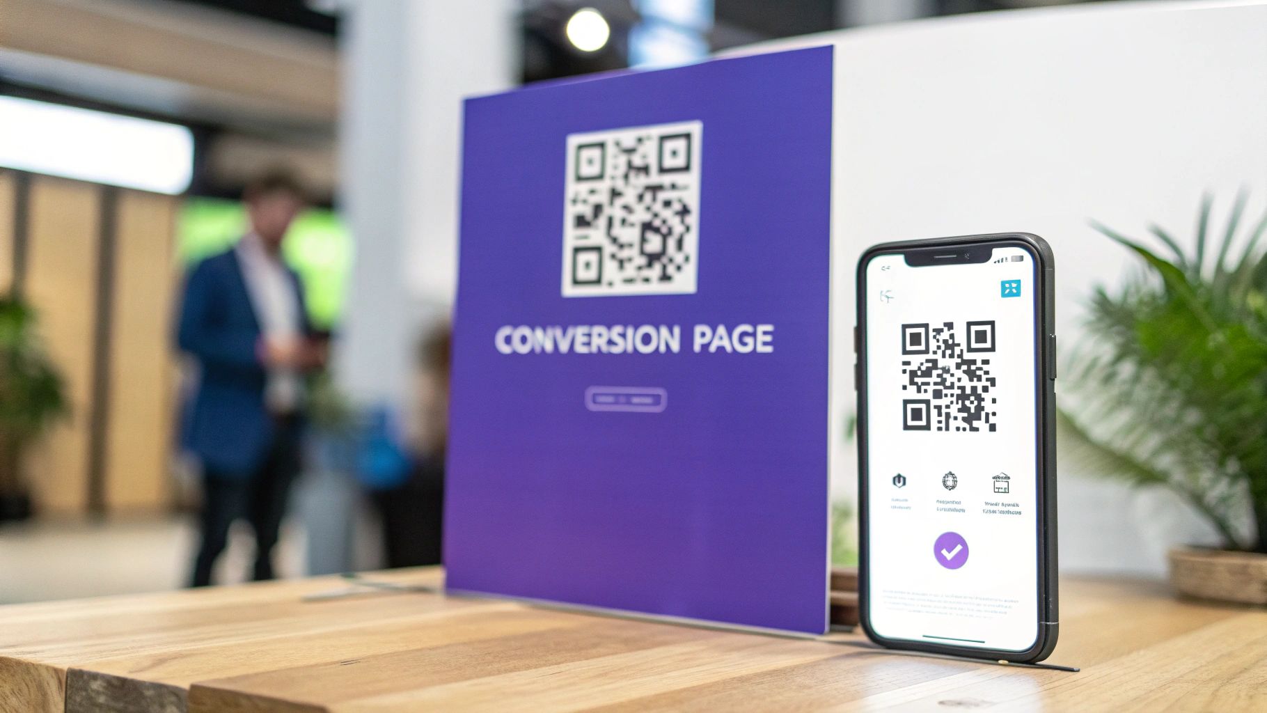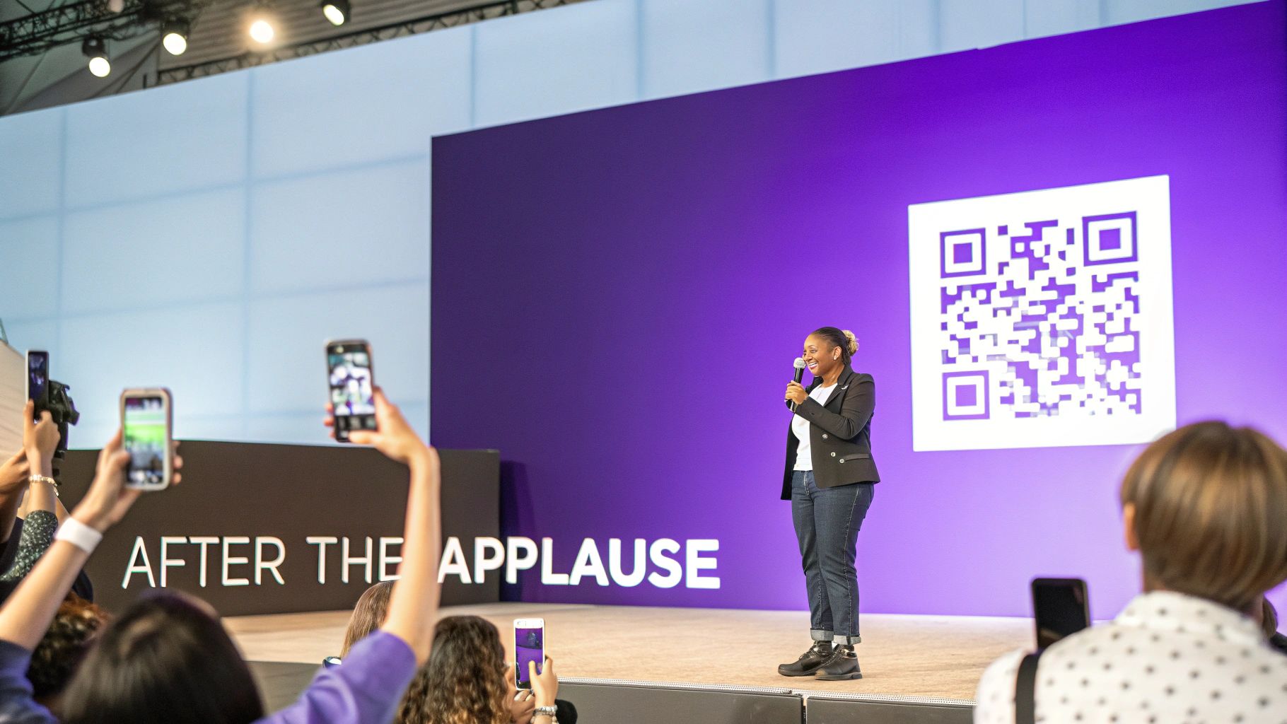
Think of a conversion landing page as your digital handshake. It’s what turns the applause after your talk into a real business connection. This isn't just any webpage; it's a laser-focused tool built for one single goal: to grab an attendee's interest and guide them to the next step before that post-talk buzz wears off.
Turn Audience Applause into Actionable Leads
You’ve just crushed your presentation. The room is electric, people are inspired, and your message has landed perfectly. Now what?
Do you just cross your fingers and hope they’ll remember your name, find your website, and somehow become a lead? Or do you give them a dead-simple way to connect with you right now? This is exactly where a conversion landing page becomes your secret weapon.
A typical website homepage is full of distractions—dozens of links, different sections, and competing messages. A landing page, on the other hand, is a one-way street. It’s a focused conversation with a clear start, a compelling middle, and a single, obvious end. For speakers, consultants, and founders, it’s the bridge that carries the energy from your talk straight into your sales pipeline.
Why a Standard Website Fails at Events
Your main website is built to be a general-purpose brochure. It has to serve everyone: potential clients, existing customers, job applicants, you name it. For someone who just heard you speak and wants that one specific thing you mentioned—like your slides or a free guide—navigating your full site is a chore.
A dedicated landing page is completely different. It's like a personalized follow-up note written just for your event audience. Its job is simple:
- Grab their attention with a headline that echoes the core message of your talk.
- Deliver instant value by offering the exact resource you promised on stage.
- Push for a single action, whether that's downloading a file, booking a demo, or joining your newsletter.
A landing page isn’t just another page on your site. It's a purpose-built tool designed to turn interest into a measurable business outcome. It’s the difference between a forgotten speech and a new customer.

The Power of a Singular Focus
The numbers don't lie. Landing pages blow other signup methods out of the water, converting 160% better on average. The median conversion rate sits at a healthy 6.6% across all industries, which is exactly why this tool is a game-changer for anyone trying to get real ROI from a speaking gig. You can dig into more landing page conversion statistics to see just how consistently they outperform.
By stripping away all the usual website clutter—navigation menus, sidebars, and competing calls-to-action—you create an incredibly clear path for your audience to follow. This singular focus is what makes a conversion landing page an non-negotiable part of any modern speaker's toolkit, ensuring the momentum from your talk translates directly into tangible business growth.
What Makes a Great Landing Page Actually Work?
A high-converting landing page isn’t really a webpage at all. It’s a finely tuned argument, where every single element works in harmony to lead a visitor from a flicker of curiosity straight to a decisive action. It’s all about stripping away the noise and focusing every ounce of energy on one single, compelling goal.
Think of it this way: your main website is like a sprawling department store. There are dozens of aisles, endless distractions, and no clear path. A great landing page, on the other hand, is a boutique shop. It has one perfect item in the window, a velvet rope guiding you inside, and a direct line to the cashier. That laser focus is what separates a page that merely gets views from one that actually grows your speaking business.
The Essential Building Blocks of Persuasion
To build a page that truly converts, you have to get inside the head of your audience. The components aren't just boxes to check; they're answers to the silent questions every visitor has. When you answer them well, the decision to sign up feels like their own brilliant idea.
Let's break down the must-have elements:
A Magnetic Headline: This is your handshake. It has to instantly grab the attention of someone who just heard you speak and promise them exactly what they came for. It answers their first question: "Am I in the right place?"
A Clear Value Proposition: This is your core promise, boiled down to one or two sentences. It tells them what they get and why it’s a game-changer for them. It answers the all-important question: "What's in it for me?"
Compelling Social Proof: People are wired to trust other people. Testimonials from happy clients, logos of companies you’ve wowed, or a killer statistic about your results—these things build instant credibility. This element answers: "Can I really trust this person?"
A Frictionless Form: Your form is the final gateway. Be ruthless in its simplicity. For most speakers, a name and an email address are all you need to get the ball rolling. Anything more creates hesitation. For a deep dive into this, our guide on crafting the perfect https://speakerstacks.com/resources/landing-page-form has some advanced strategies.
Now, let's look at the key components that make a speaker's landing page genuinely effective.
Essential Elements of a Conversion-Focused Landing Page
Headline
- Purpose: Grab attention and confirm relevance.
- Best-Practice Example for a Speaker: "Get the Presentation Slides & Bonus Checklist from My Talk"
Value Proposition
- Purpose: Clearly state the benefit of converting.
- Best-Practice Example for a Speaker: "Instantly download the tools I shared on stage to implement these strategies today."
Visuals
- Purpose: Create a connection and reinforce the message.
- Best-Practice Example for a Speaker: A high-quality photo of you on stage or a short video clip.
Social Proof
- Purpose: Build trust and credibility.
- Best-Practice Example for a Speaker: "As seen at INBOUND and TEDx," or a testimonial from an event organizer.
Call-to-Action (CTA)
- Purpose: Tell the user exactly what to do next.
- Best-Practice Example for a Speaker: A bright, clickable button that says "Send My Toolkit Now."
Form
- Purpose: Capture lead information with minimal friction.
- Best-Practice Example for a Speaker: Two fields: "First Name" and "Email Address."
By integrating these elements thoughtfully, you create a seamless experience that feels helpful, not demanding.
The Most Important Piece: Your Call to Action
If there’s one element that can single-handedly make or break your page, it’s the Call-to-Action (CTA). This is the final nudge, the clear instruction that pushes your visitor over the finish line. A weak, generic CTA like "Submit" is a conversion killer because it offers zero value.
A great CTA doesn't just tell users what to do; it reminds them what they're about to get. It transforms the exchange from a transaction into a gift.
Think about it. A button that says "Submit" feels like a chore. It's bland and uninspiring. Now, let’s rephrase that to reinforce the value you just promised.
Instead of "Submit," try something like:
- "Get My Exclusive Presentation Toolkit"
- "Download the Free Chapter Now"
- "Book Your Free Strategy Call"
See the difference? Each one is specific, benefit-driven, and gives the visitor a sense of ownership. You're not just taking their info; you're giving them something valuable in return. To learn more about pulling all these pieces together visually, check out these excellent landing page design best practices.
When you master these core components, you’re not just building a page—you’re creating a repeatable system for turning audience attention into real, measurable business results every time you leave the stage.
Designing for the In-Person Mobile Experience
Picture this: you’ve just delivered a killer talk, and you flash a QR code on the final slide. In that instant, a powerful shift happens. Your entire audience—every single person you want to connect with—pulls out their phone. This isn't just a mobile-friendly scenario; it's a mobile-only moment. Forget the desktop experience. It’s completely irrelevant here.
This context changes absolutely everything about how you need to design your conversion landing page. You don't have the luxury of a leisurely browse. You have just a few seconds of focused attention before the MC comes back on stage or your audience member gets pulled into a conversation. Your page has to be built for one thing: immediate action.
Think about it from their perspective. An attendee, let's call her Sarah, was captivated by your talk and scans your code to get the bonus resource you offered. If your page takes more than a couple of seconds to load, she's gone. If the text is microscopic and she has to pinch and zoom, she's gone. If the form has seven different fields to fill out? You've definitely lost her.
Building a Frictionless Mobile Journey
The whole point is to make saying "yes" to your offer feel completely effortless. Every single design choice has to be made with that in-person, on-the-spot mobile user in mind. We're talking about building a page so intuitive that someone can sign up with one thumb while holding a coffee in their other hand.
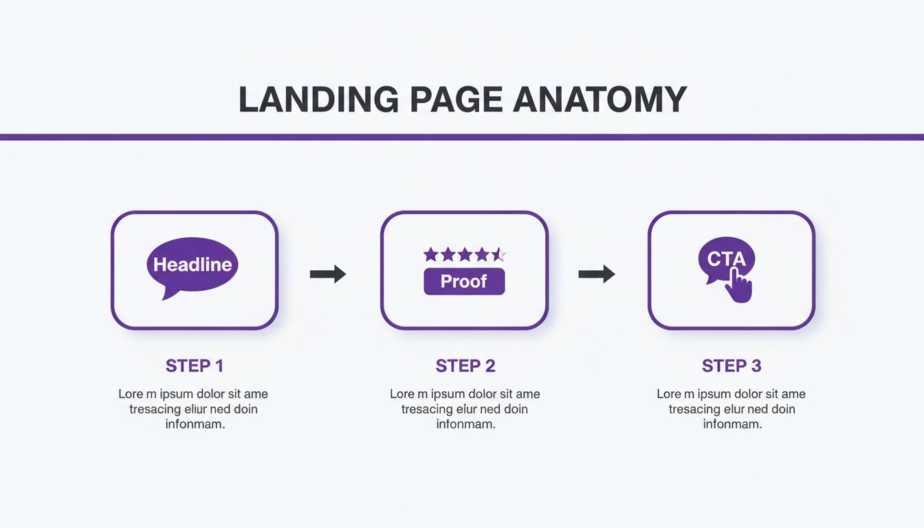
This is the classic anatomy of a page that works, breaking down the flow from the initial hook to the final click.

As you can see, it follows a simple, linear path: a bold headline grabs their attention, a bit of social proof builds confidence, and a can't-miss call-to-action drives the conversion.
Success in this environment comes down to ruthlessly eliminating friction. Every extra form field, every unnecessary word, and every slow-loading image is a roadblock. In a live event setting, these little frustrations don't just cause annoyance; they instantly shatter the credibility and authority you just spent an hour building on stage.
Your mobile landing page is a direct extension of your professionalism. A clunky, slow, or confusing experience sends a clear message that you don’t value your audience's time.
To make sure your page is truly optimized for this critical moment, focus on these non-negotiable elements:
- Single-Column Layout: Keep it simple. Force all your content into one easy-to-scroll column that guides the eye straight down the page to your call-to-action.
- Thumb-Friendly Buttons: Your CTA buttons should be big, bold, and high-contrast. No one should have to struggle to tap the right spot.
- Minimalist Forms: Ask only for what you absolutely need right now. For most speakers, a first name and email address are all it takes to start the conversation.
- Lightning-Fast Load Times: Optimize your images and get rid of any heavy code. Remember, conference Wi-Fi can be notoriously bad, and your page has to load in a snap, even on a weak signal.
When you design with these constraints in mind, you create a seamless experience that feels professional and respectful. For a deeper dive, check out our guide on creating effective mobile landing pages. This approach ensures the momentum from your talk flows directly into a valuable new business connection, all in an instant.
Actionable Tactics to Optimize Page Performance
A great conversion landing page is never really "done." Think of it less as a finished product and more as a living experiment. With every event, every test, and every little tweak, you can make it better at turning audience interest into genuine action. Getting from theory to practice is all about adopting an optimization mindset.
This whole process kicks off by asking some simple, direct questions. Does your headline actually nail the core value you're offering? Is your call-to-action button strong enough to make someone want to click it? You'd be surprised how small changes in these areas can lead to huge wins.
Test Headlines to Find Your Hook
Your headline is the very first thing an attendee sees after they scan your QR code. You've got about three seconds, tops, to make it count. It needs to instantly confirm they're in the right place and promise them something valuable. The only real way to know what works is through A/B testing, sometimes called split testing.
It’s pretty straightforward: you create two versions of your page that are identical except for one thing—the headline. Then, you show each version to half your audience. For instance, you could test:
- Version A (Direct): "Get My Presentation Slides Now"
- Version B (Benefit-Driven): "Unlock the Framework I Shared On Stage"
By seeing which version gets more signups, you're letting your audience tell you exactly what message clicks with them. This isn't about guessing; it's about using data to make your page better every single time.
Your goal isn't just to get your page live; it's to create a feedback loop. Every event is a chance to learn what your audience wants and refine your message for the next one.
Refine Your CTAs and Lead Magnets
Just like your headline, your call-to-action (CTA) button and the "lead magnet" you're offering are ripe for improvement. Your CTA should feel active and focused on the value they're about to receive. Ditch generic words like "Submit" or "Download." Try experimenting with things like "Send My Toolkit" or "Claim Your Free Guide" and see which one gets more taps.
On top of that, the actual resource you offer can make or break your conversion rates. Presentation slides are a decent starting point, but why not test other high-value freebies?
- Exclusive Checklists: A simple one-page guide that helps people put your advice into practice immediately.
- Bonus Video Content: A short, unlisted video that goes deeper on a key point from your talk.
- Resource Libraries: A curated list of all the tools and articles you mentioned on stage.
A key part of this is to continually optimize the user experience to boost conversions by making sure every element on the page pushes people smoothly toward your end goal.
Use Personalization to Your Advantage
Personalization might be the most powerful trick up your sleeve. Instead of a one-size-fits-all landing page for every speaking gig, create unique pages designed for each specific event, topic, or even audience type. It’s a game-changer.
For example, a page you create for a highly technical conference should use different language and offer a more in-depth resource than one for a general marketing summit. This targeted approach makes your offer feel more relevant and exclusive, which naturally makes it more appealing. The data backs this up, too. In B2B, landing pages tailored to specific customer types hit the highest average conversion rate of 3.5%, easily beating out more generic pages.
For speakers, this proves that using a targeted workflow—like you can with SpeakerStacks—doesn't just collect contacts. It builds a pipeline of qualified leads who are genuinely interested in what you have to say.
How to Measure Success and Prove Your ROI
A great conversion landing page isn't measured by how many people see it, but by how much business it actually drives. To prove the value of your speaking gigs, you have to look past vanity metrics like page views and focus on what directly impacts your bottom line. This is where you draw a straight line from your time on stage to real revenue.
Think of it like a fitness tracker. Counting your steps is nice, but it doesn't tell you if you're actually getting healthier. You need to look at heart rate, endurance, and recovery time—the numbers that show real progress. For a speaker, those vital signs are your conversion metrics.
Key Metrics That Actually Matter
To get a clear picture of your landing page's performance, you need to zero in on a few crucial key performance indicators (KPIs). These are the numbers that tell the complete story, from the moment someone shows interest to the moment they become a customer.
Here are the three most important ones to watch:
- Conversion Rate: This is the big one. It’s simply the percentage of visitors who do what you want them to do, like filling out your form. If 100 people scan your QR code and 20 sign up, you’ve got a strong 20% conversion rate.
- Cost Per Lead (CPL): This tells you exactly what you paid to get one new lead from an event. Just divide the total cost of the event (your travel, ticket, etc.) by the number of leads you captured. It’s the hard cost for each new contact.
- Lead-to-Customer Rate: This tracks how many of those leads eventually turn into paying customers. This is the ultimate test of your lead quality and how well your sales process works.
From Lead Capture to Closed Won
Trying to track all of this by hand in a spreadsheet is a recipe for a headache. The real magic happens when you connect your landing page directly to a CRM like HubSpot or Salesforce. This integration builds an automated data pipeline, letting you follow a lead’s entire journey without lifting a finger.
By linking your landing page to your CRM, you transform a simple contact list into a dynamic report on revenue generation. You can see exactly which speaking engagement produced your most valuable customers.
This kind of setup allows you to follow an attendee from the moment they scan your QR code all the way through your sales process. You can see when they book a meeting, when they become a qualified lead, and the final dollar amount when the deal closes. This isn't just guesswork; it's a clear, data-backed line connecting your presentation to profit.
With this data in hand, calculating your true return on investment becomes straightforward. You can walk up to any stakeholder and show them that a single conference talk generated a specific amount in the sales pipeline, giving you the hard evidence needed to justify event budgets and prove your impact. To dive deeper, check out our guide on how to calculate marketing ROI and apply those same principles to your speaking.
Common Landing Page Mistakes to Avoid
Even the most electrifying talk can fall flat if your landing page stumbles. Building a page that actually converts isn't about some secret design trick; it's mostly about dodging the common mistakes that absolutely kill the momentum you just built on stage.
Learning to spot these conversion killers is the fastest way to get more out of every presentation.

The number one offender? Multiple, competing calls-to-action (CTAs). When you ask someone to download your slides, book a demo, and follow you on LinkedIn all at once, you’re creating decision paralysis. A confused mind almost always says no.
The rule is simple: one page, one goal. Any link or button that doesn't directly support that single conversion goal is a distraction—it's actively working against you.
This laser-like focus has to be backed up by a value proposition that hits them right between the eyes.
Vague Promises and Information Overload
Another classic blunder is a fuzzy, unclear value proposition. If an audience member scans your QR code and can't figure out exactly what's in it for them within five seconds, they're gone. Ditch the vague promises and get crystal clear about the specific benefit.
In the same vein, speakers often shoot themselves in the foot by asking for too much information right away. Someone who just heard you speak is probably happy to trade their name and email for your amazing resource. They are not going to fill out a ten-field form about their company size, annual budget, and job title.
Run a quick audit on your own page. Are you making any of these common mistakes?
- Too Many CTAs: Does your page have more than one primary button or objective? Pick one and get rid of the rest.
- Asking for Too Much: Is every single form field absolutely essential for this first touchpoint? If not, cut it.
- Unclear Value Proposition: Can a brand-new visitor instantly understand the benefit of taking action?
- Brand Inconsistency: Does the look, feel, and tone of your landing page match the presentation you just delivered?
By checking your page against this list, you can quickly find and fix the leaks that are costing you leads. This ensures the interest you worked so hard to generate on stage actually turns into real, measurable results for your business.
Frequently Asked Questions
Alright, we've covered the strategy, but I know from experience that when you sit down to actually build your first event landing page, a few questions always pop up. Getting these small details right can be the difference between a handful of leads and a flood of them. Let's tackle some of the most common ones I hear.
Think of this as the final check-in to make sure you can put all this theory into practice and nail your post-presentation follow-up.
What’s the Best Lead Magnet to Offer?
The best lead magnet is whatever provides an immediate, logical next step to the problem you just solved on stage. Don't overcomplicate this. The most powerful offers are often the simplest ones that deliver instant value.
Try one of these proven formats:
- The presentation slides are a classic for a reason. Your audience was just taking it all in; now they want a copy to review.
- A simple checklist or worksheet is perfect for helping them apply your ideas the moment they get back to their desk.
- An exclusive video that goes deeper on a key point from your talk adds a personal, high-value touch.
- A curated list of the tools and resources you mentioned on stage is a huge time-saver for them.
The goal is simple: offer something that directly continues the conversation you started.
How Many Form Fields Should I Use?
As few as humanly possible. When you’re at a live event, you’re battling distraction and short attention spans. Your job is to make saying "yes" ridiculously easy. Every single field you add is another reason for someone to give up.
For a speaker capturing leads in the room, start with the absolute bare minimum: first name and email address. That's it. That's all you need to start the follow-up. You can always ask for more information later once you've earned their trust.
Your form should feel like a quick note, not an interrogation. Make it fast, make it easy, and respect their time.
What’s the Best Way to Follow Up?
The page is just the start; your follow-up is where the magic really happens. Email is your best friend here. Don’t just take my word for it—email traffic sent to landing pages converts at an average rate of 19.3%. That’s a staggering 77.06% higher than paid search. You can see more landing page performance statistics that prove just how powerful this channel is.
Your first step is to send the promised resource instantly with an automated email. From there, a short sequence of two or three more emails works wonders. Use them to deliver more value, build on your relationship, and then gently guide them toward your main goal, whether that's booking a demo or joining a program.
Ready to turn every speaking gig into a powerful lead generator? With SpeakerStacks, you can launch a high-converting landing page in minutes, capture attendee interest with a simple QR code, and see your ROI in one place. Start building your pipeline today at speakerstacks.com.
Want More Insights?
Subscribe to get proven lead generation strategies delivered to your inbox.
Subscribe to Newsletter

