So, what exactly is a mobile landing page? Think of it as a single, laser-focused webpage built for one reason: to get a smartphone user to take a specific action. That could be signing up for your newsletter or downloading your presentation slides.
It’s not your full website. In fact, it's the opposite. It strips away all the usual distractions to turn that flicker of audience attention into a real, tangible result. For speakers and event marketers, this is your secret weapon for making a great first impression and guiding people exactly where you want them to go.
Turn Audience Engagement Into Action

Picture this: you've just nailed your presentation. The room is buzzing, and people are leaning in, genuinely interested in what you have to say. How do you grab that energy before it evaporates? This is the moment a mobile landing page shines.
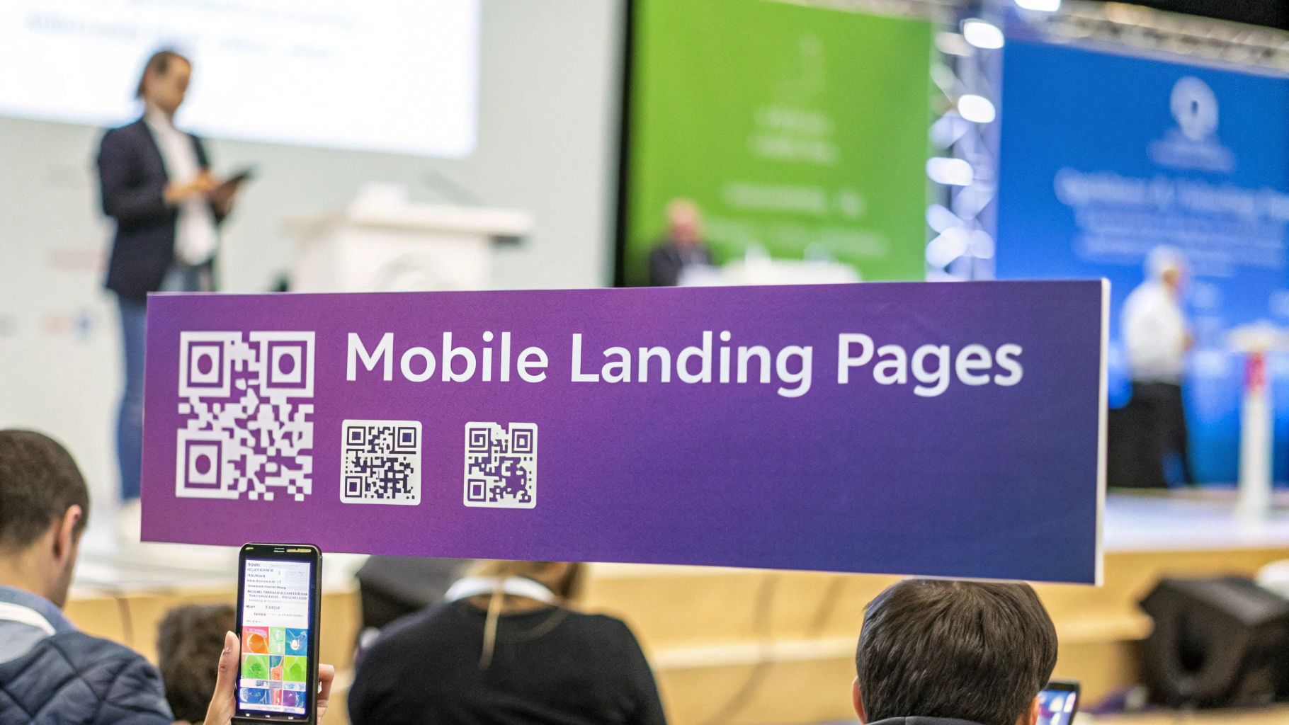
When you flash a simple QR code on your final slide, you’re not just ending your talk—you're opening a door. In seconds, attendees can scan it and land on a page you’ve built just for them. This needs to be a smooth, instant connection. After all, with over 60% of all web traffic now coming from mobile devices, any friction or clunky design will send potential leads running for the virtual hills.
Why a Dedicated Page Is Non-Negotiable
I see this mistake all the time: speakers send their audience to their website's homepage. It feels like the logical thing to do, but it’s a conversion killer. Your homepage is built for browsing and exploring, offering dozens of different paths. It’s overwhelming for someone who just wants the one thing you promised them on stage.
A dedicated mobile landing page cuts through all that noise. It creates a straight, clean line to the finish.
- Capture Leads Seamlessly: A simple form lets people trade their contact info for your slide deck, an exclusive guide, or a quick consultation call.
- Provide Instant Value: Give them immediate access to bonus materials, a special download, or a link to book time directly on your calendar.
- Open a Direct Line of Communication: This is where you start a real conversation that lasts long after the event wraps up, allowing you to nurture those new relationships.
The real shift in thinking is from just giving a speech to creating a powerful, ongoing conversion opportunity. Your time on stage is incredibly valuable; a mobile landing page is how you make sure you capture every bit of that value.
Ultimately, these pages aren't just for grabbing email addresses. They're about turning a room full of interested listeners into a pipeline of qualified leads and proving the ROI of every single speaking gig you do.
Designing a Page That Converts on Mobile
Let's get one thing straight: a high-converting mobile landing page is not your desktop site shrunk down. It's a totally different beast, built from the ground up for quick glances, thumb-scrolling, and getting someone to act right now. The entire game is about removing every last bit of friction and funneling your audience toward one single, specific action.
This focus is non-negotiable. While mobile drives a huge amount of traffic, it notoriously struggles to convert. I've seen the data time and again: mobile devices account for a staggering 83% of landing page visits, yet those same pages convert 8% worse than their desktop versions. That gap, which you can read more about over at searchenginejournal.com, is a massive opportunity you can seize with smart design.
Craft a Headline That Captures Attention Fast
You have maybe three seconds. That's it. Your headline is the first thing an attendee sees, and frankly, it might be the only thing they read. It needs to be punchy, crystal clear, and directly tied to the promise you just made on stage.
So, ditch generic titles like "Download My Resources." Instead, think about the benefit. If you just gave a killer talk on sales tactics, a headline like "Get the 5 Sales Scripts That Closed $1M in Deals" is infinitely more powerful. It screams value and gives them a reason to care immediately.
Keep Your Copy Clean and Scannable
Nobody reads a wall of text on their phone, especially not in a loud, distracting conference hall. Your copy should act like a set of signposts, each one pointing straight to your call-to-action.
I stick to a few simple rules to keep my mobile copy tight and effective:
- Bullet points are your friend: They break down complex ideas into an easy-to-digest list.
- Use bold text strategically: Make your most important words or results pop off the screen.
- Write short, simple sentences: One idea per sentence. Period.
Your mobile copy needs to answer three questions in a heartbeat: What is this? Why should I want it? And how do I get it? Anything else is just noise that’s killing your conversion rate.
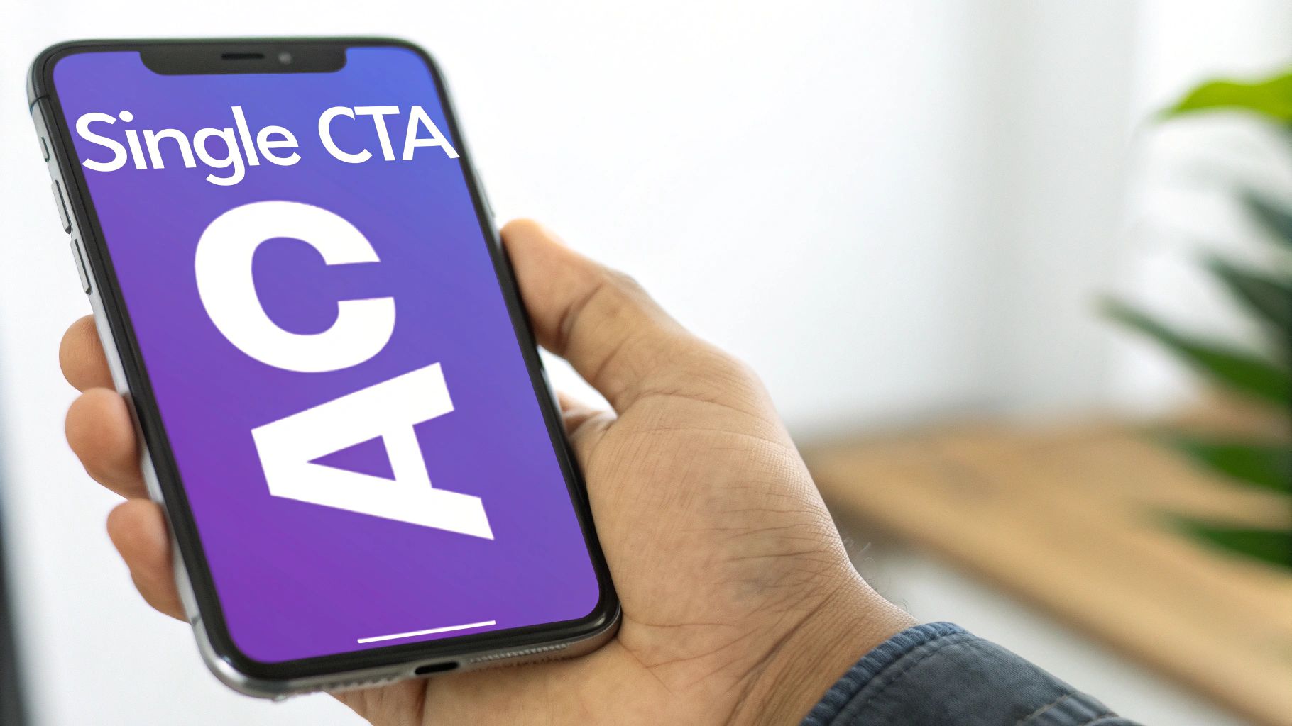
Make Your Call-to-Action Unmissable
The single most important element on your page is the call-to-action (CTA) button. It's the whole point. Every design choice—from the colors to the spacing—should guide your visitor’s eye right to it.
Your CTA needs to be impossible to miss. Use a bold, contrasting color that stands out from the background. Make the button big enough for a thumb to tap easily without a second thought. And use clear, action-oriented text like "Download the Guide Now" or "Book My Free Consult." If you need more ideas, check out our in-depth guide to building a landing page for conversion. You want to remove all guesswork and make the next step completely obvious.
Building Your Page With The Right Tools

Alright, you’ve got a solid plan. Now it's time for the fun part: actually bringing your mobile landing page to life. The great news is you don't need a computer science degree to build something that looks great and gets results. The tools available today make it incredibly simple.
The real focus here isn't on the tech, but on assembling the core pieces that get people to act. And it all starts with your signup form.
This little form is the heart of your page. A huge mistake I see speakers make all the time is asking for way too much information. Think about it from the audience's perspective—they’re in the middle of an event, maybe even standing up, and they scan your QR code. They aren't going to stick around to fill out ten different fields.
Keep it dead simple. I mean ruthlessly simple. Just ask for a name and email. That’s it. Every single extra field you add is another reason for someone to abandon the page. The goal is to open the door for a future conversation, not to get their entire life story on the first go.
Win Them Over Instantly With Social Proof
You have maybe five seconds to earn an attendee’s trust. That’s where social proof comes in as your secret weapon.
Slapping a few logos of companies you've worked with or a short, punchy testimonial right on the page can dramatically boost your credibility. When someone sees that other well-known brands or people trust you, it creates a powerful mental shortcut. It screams "this person is legit" without you having to write a single word about it.
I always recommend placing these trust signals right near your main call-to-action button. It gives people that final bit of confidence they need to click. If you're looking for more ideas on this, we've got a whole guide on what makes truly https://speakerstacks.com/resources/high-converting-landing-pages so effective.
The best mobile landing pages feel like a fair trade, not a one-sided transaction. You're offering genuine value, and in exchange, your audience is happy to give you their email.
Choosing Your Tools: Page Builders and QR Codes
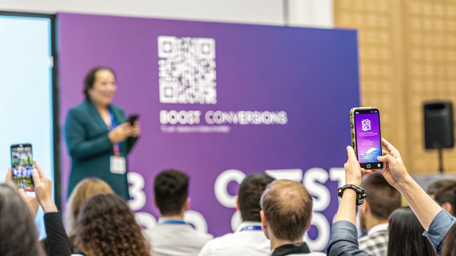
So, how do you connect your slide on the big screen to the page on their phone? With a QR code, of course. But don't just grab the first free one you find. You need a dynamic QR code. This is non-negotiable.
Why? Because a dynamic code lets you track how many people are actually scanning it during your talk. That’s gold. Plus, you can change the destination URL later without ever having to create a new QR code.
Now for the page itself. Using a dedicated landing page builder is the fastest way to get this done. You can find tons of free landing page templates to kickstart the process. These platforms are built for people like us:
- No Coding Needed: It’s all drag-and-drop. If you can make a PowerPoint slide, you can build a landing page.
- Mobile-Ready from the Start: Good templates are already designed to look perfect on a phone, saving you tons of headaches.
- Easy Connections: Hooking up your email provider or CRM is usually just a few clicks, so your follow-up is automated from the get-go.
I’ve seen clients go from a blank slate to a live, professional-looking page in less than an hour. That kind of speed is essential when you need to focus on your presentation, not on fighting with code.
Mobile Landing Page Builder Comparison
To help you choose the right tool for the job, I've put together a quick comparison of some of the most popular options out there, specifically with a speaker's needs in mind.
Leadpages is an excellent choice for speakers needing fast, high-converting pages without technical fuss. It offers strong mobile-responsive templates, device-specific previews, and extensive integration options with email, CRM, and webinar platforms.
Unbounce is very good for marketers focused on conversion optimization and A/B testing. It provides an advanced mobile editor, A/B testing capabilities, dynamic text replacement, and robust integration options with custom script support.
Instapage is another very good option, especially for teams running paid ad campaigns to their event pages. It features an excellent mobile editor, AdMap for ad-to-page personalization, and strong integrations with advertising platforms.
Carrd is excellent for creating simple, elegant, and highly affordable one-page sites quickly. It is fully responsive and has basic integration options through Zapier and email forms.
Each of these platforms has its strengths, but for most speakers, a tool like Leadpages or Carrd offers the perfect balance of simplicity, power, and speed. They let you get back to what you do best: delivering an amazing presentation.
Optimizing for Speed and User Experience
At a live event, you’re in a constant battle for attention. Your audience is juggling your presentation, their phone, and a dozen other distractions. When someone scans your QR code, you have a fleeting moment to make a connection. If that page doesn't pop up almost instantly, that moment is gone. Forever.
Think about the typical conference Wi-Fi—it's notoriously slow and unreliable. Every millisecond of delay is another reason for them to close the tab and forget they ever scanned. This is where the technical side of your landing page directly translates into real-world results. Speed isn't just a feature; it's the entire foundation.
Make Every Second Count
The numbers don't lie. Research shows that 53% of mobile visitors will bounce if a page takes more than three seconds to load. It's a brutal, unforgiving benchmark.
Even more compelling, fast pages see sessions that are 70% longer and can pull in double the revenue of their slower counterparts. If you want to dig into the data yourself, check out this detailed landing page statistics breakdown.
So, how do you hit that three-second window? It usually comes down to a few key culprits:
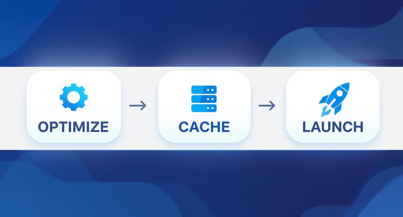
- Image Bloat: This is the #1 killer of page speed. Huge, high-resolution images look great, but they destroy load times. Always run your images through a compression tool before uploading them.
- Code Clutter: Minifying your code strips out all the unnecessary characters (like extra spaces) that browsers don't need. Most modern page builders handle this for you, but it’s good to be aware of.
- No Caching: Browser caching is like giving a visitor's device a "memory" of your site. It stores elements like your logo and background images, so it doesn't have to re-download everything on a return visit.
A fast, frictionless experience isn't a luxury; it's a non-negotiable for capturing leads in the heat of the moment. The goal is a journey so smooth, from QR scan to conversion, that your audience doesn't even have to think about it.
Designing for a Smooth User Journey
Speed gets them in the door, but a good user experience (UX) is what convinces them to stay. A clean, intuitive layout is your best friend here. It eliminates confusion and steers people right where you want them to go: your call-to-action.
And don't assume this has to be expensive. Small businesses can find great value by focusing on simple strategies for making web performance optimization affordable.
You have to design for the reality of the situation. They're on a small screen, probably navigating with one thumb. This means short forms, big and tappable buttons, and text that's easy to read without any pinching or zooming. Every single element should serve the purpose of making the interaction effortless.
If you want to explore more advanced techniques, our guide on interactive web page design is a great next step. Ultimately, this relentless focus on a clean user journey is what separates a mobile landing page that converts from one that just gets closed.
Launch, Measure, and Iterate for Better Results
Alright, your mobile landing page is built and ready to go. But launching isn't just about flipping a switch—the real work starts the moment you put that QR code on screen. How you introduce it to your audience can make or break your results.
Timing is everything. From my experience, the sweet spot is right at the end of your presentation, just after you've delivered your biggest takeaway or most compelling point. This is when the audience is most engaged and hungry for more.
Don't just show the code; you have to verbally walk them through it. A direct command works wonders. Something like, "Okay, everyone pull out your phones right now. Scan this code on the screen to get a copy of my slides and my complete guide." This simple instruction creates a sense of urgency and focuses the entire room on one single action. The difference in scan rates is night and day.
Measuring What Truly Matters
Once people start scanning, the data will begin to flow in. This is where you separate a good landing page from a great one. It's easy to get lost in a sea of metrics, so my advice is to ignore the noise and focus on the vital few that actually tell you what's working.
To get a clear picture of your page's performance, you’ll want to keep a close eye on these key indicators:
- Conversion Rate: This is your north star. It’s the percentage of visitors who actually do the thing you want them to do, like filling out your form. It's the ultimate measure of success.
- Bounce Rate: This tells you how many people hit your page and leave immediately. A high bounce rate is a red flag, often signaling a mismatch between what your QR code promised and what your page delivered.
- Time on Page: How long are people sticking around? For a simple lead capture page, this might not seem critical, but it can tell you if your headline and copy are compelling enough to hold their attention.
A solid workflow is key here. You need to connect the dots between your technical prep—like optimizing images and setting up caching—and a successful launch.
Think of it this way: a smooth, fast-loading experience is the foundation. Without it, even the best presentation and offer will fall flat.
The Power of A/B Testing
So, you have the data. Now what? You use it to make smart, informed decisions. This is where iteration comes in, specifically through A/B testing. All this means is comparing two versions of your page (an 'A' version and a 'B' version) to see which one gets more people to convert.
The cycle of launching, measuring, and optimizing is what turns a good page into a reliable, predictable lead generation machine for your speaking events. Never treat your page as "finished."
This doesn't have to be complicated. Start with small but meaningful tests. For example, you could test the color of your call-to-action button—maybe green vs. orange. Or you could try out two different headlines. Version A might say "Download the Ebook," while Version B says "Get Your Free Guide."
You’d be amazed at how tiny tweaks can produce huge lifts in your conversion rate. Industry data shows that while the average landing page converts at around 6.6%, the top-tier pages are hitting 11.45% or higher. What’s their secret? A big one is that 86% of these top-performing pages are designed for mobile first. If you want to dive deeper, these landing page performance statistics show what's possible.
This constant process of testing and refining is how you close that gap and truly maximize the return you get from every single presentation.
Common Questions I Get About Mobile Event Pages
When you start using mobile landing pages for your events, a few key questions always pop up. Trust me, I've heard them all. Getting the answers right is the difference between a smooth, lead-generating machine and a clunky experience that leaves everyone frustrated.
Let's walk through the most common hurdles speakers and marketers face so you can build your page with confidence.
"Can't I Just Send People to My Website?"
This is, without a doubt, the most frequent question I hear—and the biggest mistake I see. Sending a captive audience to your website's homepage after a powerful talk is like leading them into a maze. Your website is built for exploration, with navigation menus, blog links, and a dozen different rabbit holes for them to fall down. A mobile landing page is the exact opposite.
Its entire purpose is to have a singular focus. It’s designed to do one thing and one thing only: get the person to take a specific action right now.
Think of your website as a sprawling department store with hundreds of aisles. Your mobile landing page is an express checkout lane with a single, unmissable "Buy Now" button. It eliminates all distractions and guides people to the one outcome you want.
This laser-focused approach is what makes it work. When someone scans your QR code, they shouldn't have to think, search, or wonder what to do next. The page should instantly fulfill the promise you just made from the stage, whether that's downloading your slide deck or scheduling a call.
"What's the Best Way to Use a QR Code on My Slides?"
Your QR code is the gateway to your landing page, so you have to get it right. A poorly placed or un-scannable code will kill your momentum before it even starts. I’ve seen it happen, and it’s painful to watch.
Here are a few essential tips I’ve picked up from years of doing this:
- Go Big and Keep It Clean: Your QR code needs to be large enough for the person in the last row to scan it easily. Place it on a slide with a simple, high-contrast background. Don't stick it on top of a busy photograph where phone cameras will struggle to find it.
- Test It Like Your Talk Depends on It (Because It Does): Before you step on stage, pull out your phone—and a friend's phone—and test that code. Scan it from up close, from far away, and from different angles. Conference lighting and projector quality are wildly unpredictable, so you need to know it works.
- Always Have a Backup: What happens when someone’s phone camera is acting up? You need a fallback. Always include a short, memorable URL right below the QR code (think YourSite.com/Event). This gives people a manual way to get to your page, no questions asked.
"How Do I Stay on the Right Side of GDPR and Privacy Laws?"
Handling personal data is serious business. When someone trusts you with their email, you have a responsibility to be transparent and protect their information. The good news is that compliance doesn't have to be a headache.
It all comes down to clear consent. On your form, you need a simple, unticked checkbox that spells out exactly what they're signing up for. Something like, "Yes, send me the guide and occasional marketing updates." You also absolutely must include a link to your privacy policy near the submit button. This simple act of transparency not only keeps you compliant with rules like GDPR and CCPA but also builds crucial trust with your new contacts.
"What's the #1 Metric I Should Be Tracking?"
It's easy to get lost in a sea of data—bounce rate, page views, time on page. While those can be interesting, they don't tell the real story. For a mobile event page, the one metric that matters above all else is your conversion rate.
This is the percentage of people who landed on your page and actually did the thing you asked them to do. It’s the ultimate report card for your page. A high conversion rate proves that your message, your offer, and your page design all clicked with that specific audience. More importantly, it’s the number that directly measures the ROI of your speaking gig.
Ready to turn that fleeting audience attention into real, measurable leads? With SpeakerStacks, you can build a branded, high-converting mobile landing page in less than 90 seconds. Stop letting valuable connections slip away after your talk and start capturing the true value of your presentations. Get started with SpeakerStacks today!
Ready to capture leads from your next talk?
SpeakerStacks helps you display QR codes, capture attendee information, and sync leads directly to your CRM. Get started free.


Want More Insights?
Subscribe to get proven lead generation strategies delivered to your inbox.
Subscribe to Newsletter