8 High-Converting Examples of Form Design for 2025
Forms are the unsung heroes of digital interaction, acting as the critical bridge between user interest and business goals. Yet, so many are clunky, confusing, and kill conversion rates. A well-designed form, however, feels effortless. It guides users, builds trust, and makes providing information feel like a simple, logical step rather than a chore. For forms to truly act as conversion engines, they must be effectively integrated within relevant contexts, such as understanding the different types of landing pages where they will live.
This article moves beyond generic advice to dissect powerful, real-world examples of form design that master the art of conversion. We will break down what makes each one effective, from single-column layouts to conversational interfaces, providing you with strategic insights and actionable takeaways to implement immediately. We will explore specific tactics behind high-performing designs, including multi-step wizards, inline validation, and progressive disclosure. Forget frustrating user experiences; it's time to build forms that not only capture data but actively drive results, turning a simple point of contact into a powerful asset for your business.
1. Single-Column Linear Form
The single-column linear form is a cornerstone of modern UI design, particularly for mobile-first experiences. This approach arranges all input fields vertically, creating one clear, top-to-bottom path for the user to follow. By eliminating horizontal scanning, it significantly reduces cognitive load and simplifies the completion process, making it one of the most effective examples of form design for driving conversions.
This design is popular for its simplicity and efficiency. Companies like Mailchimp and Stripe use it for critical user flows like account creation and checkout. The predictable, linear progression helps users maintain momentum, reducing the likelihood of abandonment. It’s an ideal choice for any form where speed and clarity are paramount, from simple newsletter signups to multi-step booking processes.
Strategic Breakdown
The power of the single-column form lies in its ability to guide user attention. It removes ambiguity about where to look next, creating a natural conversational flow. A well-executed single-column form asks one question at a time, just like a person would.
A single-column layout helps users complete forms faster and with fewer errors because their eyes can move in a natural, uninterrupted line from top to bottom.
Actionable Takeaways
- Top-Align Labels: Place labels directly above their corresponding input fields. This placement requires fewer eye fixations and is proven to be the most efficient for scanning and completion, especially on mobile devices.
- Group Related Information: If your form is longer, use visual cues like subtle section dividers or headings to group related fields (e.g., "Personal Information," "Shipping Address"). This breaks the form into manageable chunks without disrupting the vertical flow.
- Prominent Call-to-Action (CTA): The primary action button should be full-width and placed at the very end of the column. This provides a clear and unmissable final step for the user.
The following infographic outlines a simple, three-step process for implementing a high-performing single-column form.
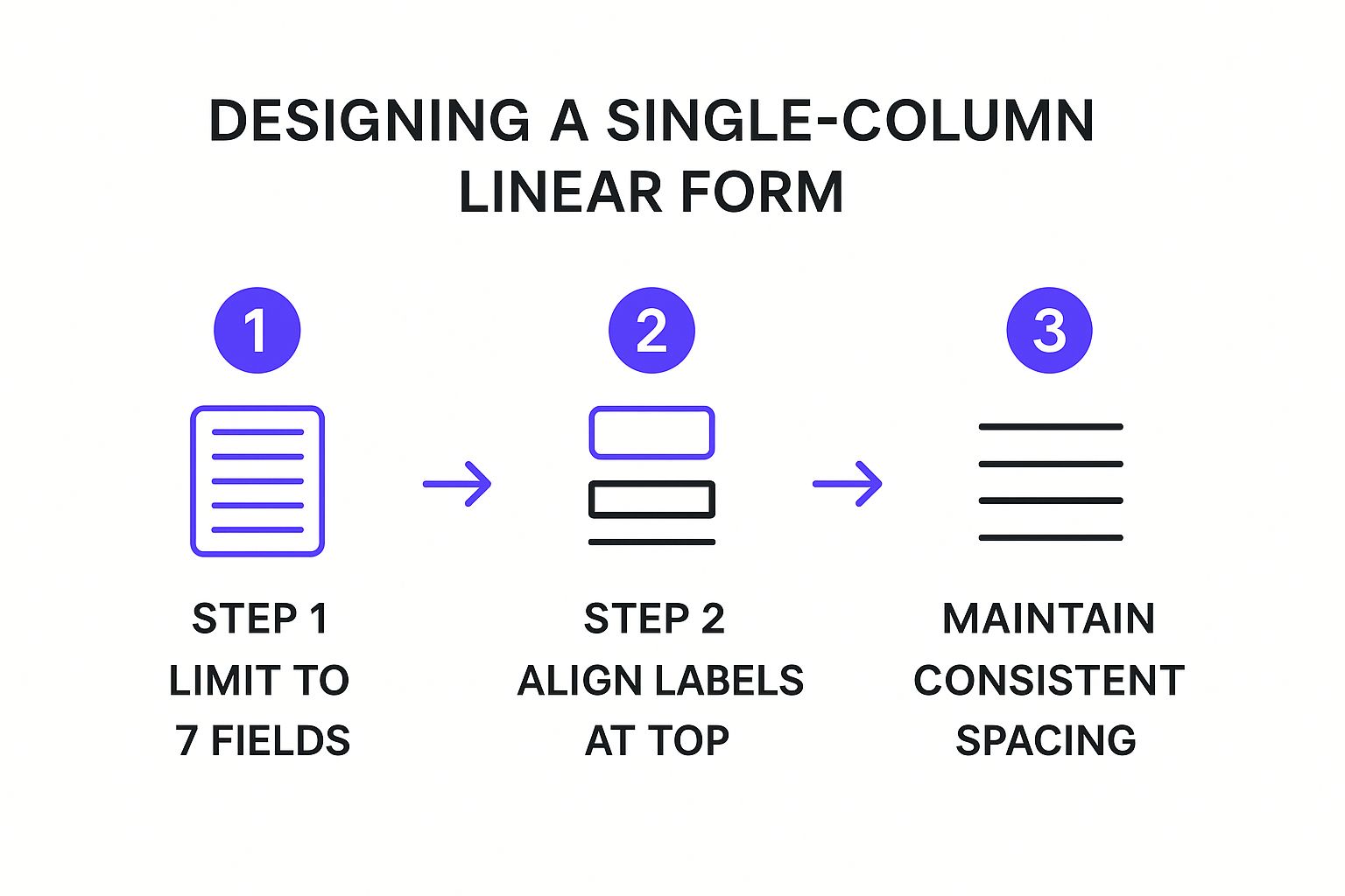
This process flow emphasizes that successful design starts with minimalism, progresses to optimal usability with top-aligned labels, and is refined with consistent visual rhythm.
2. Multi-Step Wizard Form
The multi-step wizard form is a powerful pattern that deconstructs complex processes into a series of smaller, digestible steps. Instead of overwhelming users with a long, intimidating list of fields, this approach guides them through a sequential journey, focusing their attention on one group of related questions at a time. This method is one of the best examples of form design for tackling lengthy information-gathering tasks, such as tax filing or setting up a detailed professional profile.
This design is famously used by companies like TurboTax and survey platforms like Typeform to make daunting tasks feel achievable. By breaking the process down and showing a clear progress indicator, the wizard form leverages the psychological principle of goal-gradient effect, where motivation increases as one gets closer to the goal. It excels in scenarios requiring detailed user input, such as insurance quotes, e-commerce checkouts, and complex application processes.
Strategic Breakdown
The core strategy of a multi-step form is to reduce cognitive friction and build momentum. Each completed step provides a small sense of accomplishment, encouraging the user to continue. This structured, step-by-step interaction transforms a potentially frustrating experience into a guided conversation, significantly lowering abandonment rates for complex forms.
By breaking a long form into multiple steps, you frame the task as a series of simple questions rather than a single, overwhelming challenge. This dramatically improves user persistence and completion rates.
Actionable Takeaways
- Show Clear Progress: Implement a highly visible progress bar or step counter. This manages user expectations, shows them how much is left, and provides a sense of control over the process.
- Allow Easy Navigation: Include clear "Back" and "Next" buttons. Allowing users to go back and edit previous answers without losing their data is crucial for a positive user experience.
- Validate Each Step: Use real-time validation at the end of each step, not after the final submission. This catches errors early and prevents the user from having to go all the way back to fix a mistake discovered at the end.
This video demonstrates how a multi-step form can improve the user experience by making complex data entry feel more intuitive and less burdensome.
By managing cognitive load and creating a clear path forward, the multi-step wizard is an essential tool for any process that requires substantial user input.
3. Conversational Form Interface
The conversational form interface transforms the traditionally static task of filling out a form into a dynamic, interactive dialogue. This approach presents one question at a time in a chat-like format, mimicking a natural conversation. By breaking down the form into a series of simple, digestible questions, it makes the process feel more personal and engaging, making it one of the most effective examples of form design for gathering detailed information without overwhelming the user.
This design is famously championed by companies like Typeform and Landbot for everything from complex surveys and lead qualification to customer feedback. The turn-by-turn interaction builds momentum and rapport, reducing user fatigue and significantly boosting completion rates. It is an excellent choice for scenarios where user engagement is critical, such as onboarding wizards, interactive quizzes, or personalized insurance quotes.

Strategic Breakdown
The core strength of a conversational form is its ability to lower the barrier to entry and guide the user psychologically. Instead of presenting a long list of fields that can seem intimidating, it asks for just one piece of information at a time. This simplifies decision-making and leverages the user's innate curiosity about what question comes next.
A conversational interface makes the user feel heard and guided, turning a data-collection chore into a helpful, two-way exchange that improves data quality and completion rates.
Actionable Takeaways
- Use Natural, Human Language: Write questions as if you were speaking to the user. Avoid technical jargon and use a friendly, approachable tone. For example, instead of "Submit your query," use "What can we help you with today?"
- Provide Immediate Feedback: Acknowledge each answer with a quick transition or a brief affirmation. This reassures the user that their input was received and keeps the conversation flowing smoothly. Learning how to create an interactive website can provide more in-depth strategies.
- Vary Input Types: Keep the interaction dynamic by using a mix of input types, such as multiple-choice buttons, sliders, and open text fields. This prevents monotony and makes the form more engaging to complete.
4. Inline Validation Form
The inline validation form provides real-time feedback to users as they fill out each field, a stark contrast to waiting for a final submission click. This conversational approach validates data instantly, guiding users to correct errors on the spot. By preventing mistakes before they happen, this pattern reduces user frustration and significantly improves completion rates, making it one of the most user-centric examples of form design.
This design pattern is ubiquitous in modern web applications, from Google’s account creation process to e-commerce checkout forms. Features like password strength indicators or username availability checks give immediate, helpful feedback. This proactive guidance transforms the form from a static document into a responsive, interactive dialogue, boosting user confidence and ensuring data integrity from the start.
Strategic Breakdown
The core strategy behind inline validation is to shorten the feedback loop. Instead of letting users complete an entire form only to be met with a list of errors, this method provides micro-interactions that confirm success or flag issues field by field. It respects the user's time and effort by catching mistakes early.
Inline validation turns form filling into a guided process, reducing cognitive load and preventing the "wall of errors" that causes form abandonment.
Actionable Takeaways
- Validate on "Blur": Trigger validation when the user moves out of a field (the "onblur" event), not on every keystroke. This avoids premature error messages while the user is still typing.
- Use Clear Success and Error States: Employ distinct visual cues like green checkmarks for correct inputs and red icons with concise, helpful text for errors. For instance, knowing how to effectively validate email inputs is crucial for preventing bad data entry.
- Provide Constructive Guidance: Error messages should be solutions-oriented. Instead of just "Invalid Password," use "Password must contain 8 characters, one uppercase letter, and one number." This empowers users to fix the problem quickly and move forward.
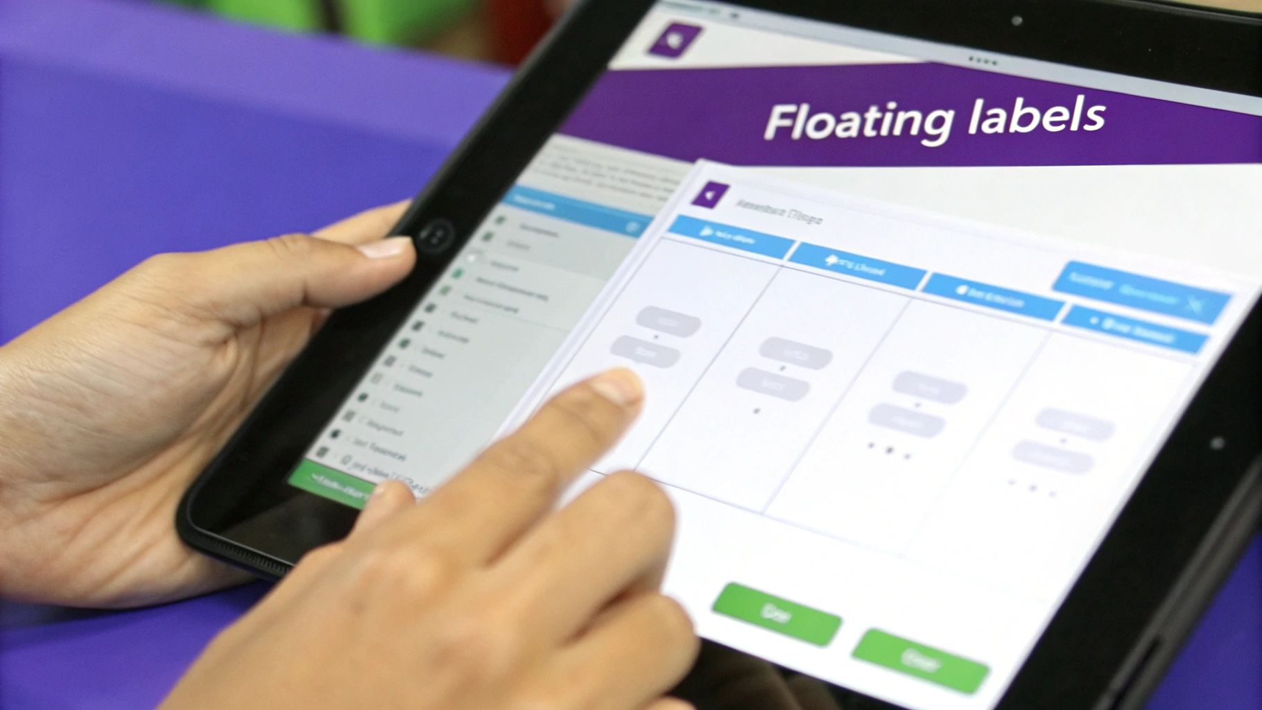
5. Floating Label Form
The floating label form is a sophisticated and space-efficient design pattern where the field label starts as placeholder text inside the input. When a user clicks or starts typing, the label animates smoothly to a new position above the field. This clever interaction combines the compactness of placeholder text with the clarity of a persistent label, making it a popular choice in modern examples of form design.
This approach, popularized by Google’s Material Design, is now a standard component in frameworks like Angular Material and is frequently seen in contemporary web and mobile applications. It excels in contexts where vertical space is limited, such as on mobile screens or within dense user interfaces, offering a clean, minimalist aesthetic without sacrificing usability. Its elegance makes it ideal for login pages, contact forms, and modern checkout processes.
Strategic Breakdown
The core advantage of the floating label is its dynamic context-switching. Initially, it guides the user by indicating what to input. Once the user engages, it transforms into a persistent reference, preventing them from losing context after they have entered data, a common issue with placeholder-only labels.
The animation is not just decorative; it’s a functional micro-interaction that maintains context, reassuring the user they are filling out the correct field, which reduces cognitive friction and potential errors.
Actionable Takeaways
- Ensure High-Contrast Labels: When the label floats above the field, ensure it has sufficient color contrast against the background to remain legible. A common mistake is using a light gray that fades into the background.
- Prioritize Accessibility: The animation can pose challenges for screen readers. Use the
aria-labelledbyattribute to programmatically link the input field to its label, ensuring assistive technologies can correctly announce the field's purpose. - Refine Animation Performance: A slow or janky animation can make the form feel unresponsive. Test the transition across various devices and browsers to ensure it is fast and smooth, creating a polished and professional user experience.
6. Progressive Disclosure Form
The progressive disclosure form is a powerful design strategy that incrementally reveals input fields as the user needs them. Instead of presenting a long, intimidating form at once, this approach starts with a few essential questions and unveils subsequent fields based on the user's previous answers. This dynamic method dramatically reduces initial cognitive load, making complex data collection feel simple and manageable.
This technique is a staple for platforms that need to gather nuanced information without overwhelming the user. Insurance quote applications, travel booking sites like Booking.com, and multi-step job applications all leverage this strategy. By breaking a complex process into a series of smaller, context-aware steps, it creates a guided experience that encourages completion, making it one of the most effective examples of form design for detailed data capture.
Strategic Breakdown
The core principle of progressive disclosure is to manage complexity by showing only what is necessary at any given moment. This creates a conversational, one-question-at-a-time flow that adapts to the user's specific context, preventing them from feeling bogged down by irrelevant fields. It’s an ideal approach for gathering detailed information in a user-friendly way.
Progressive disclosure works by transforming a potentially long and daunting form into a series of simple, logical micro-interactions, which increases user motivation and reduces abandonment.
Actionable Takeaways
- Start with the "Deal-Breakers": Begin the form with the most critical questions that determine the rest of the user's path (e.g., "What type of insurance do you need?"). This ensures the subsequent fields are always relevant.
- Use Clear and Smooth Transitions: When new fields appear, use subtle animations or transitions to guide the user's eye. This prevents jarring changes and helps the user understand why new information is being requested.
- Provide Context for New Fields: Briefly explain why additional information is needed if it's not immediately obvious. A simple label like "Tell us more about your vehicle" can provide necessary context and build trust. This is a key part of making forms feel more interactive, much like the methods used in interactive workshop activities.
7. Card-Based Form Layout
The card-based form layout organizes fields into distinct, self-contained modules or "cards." This approach is excellent for complex forms with multiple, disparate sections, as each card groups logically related information. By creating clear visual boundaries, this pattern enhances scannability and helps users process information in manageable chunks, making it one of the most effective examples of form design for complex user interfaces.
This modular design is prevalent in dashboard configurations, detailed user profiles, and multi-step application processes. Platforms like Google's Material Design have popularized this layout, using cards to manage settings and content. The structured nature of cards allows for a clean, organized appearance that adapts seamlessly across different screen sizes, from wide desktops to narrow mobile views.
Strategic Breakdown
The core strategy behind a card-based layout is compartmentalization. It breaks a potentially overwhelming amount of information into a digestible, hierarchical structure. Each card acts as a mini-form, allowing users to focus on one specific context at a time, such as "Profile Information," "Notification Settings," or "Billing Details."
By grouping related fields within cards, you create a clear information hierarchy that reduces cognitive load and empowers users to navigate complex forms with confidence.
Actionable Takeaways
- Group Logically: Each card should contain a set of closely related fields. Give each card a clear, concise title (e.g., "Login Credentials") to instantly inform the user of its purpose.
- Maintain Visual Consistency: Use consistent sizing, padding, and spacing for all cards to create a predictable and harmonious layout. Ample white space between cards is crucial to prevent the interface from feeling cluttered.
- Prioritize Card Order: Arrange cards based on user workflow or importance. The most critical or frequently accessed sections should be placed first, guiding the user through a logical progression. This is similar to creating a clear narrative for an audience, a concept further explored in this presentation evaluation checklist on speakerstacks.com.
8. Minimalist Single-Field Form
The minimalist single-field form is the pinnacle of frictionless data collection, designed to capture one essential piece of information with laser-like focus. This approach strips away all non-essential elements, presenting the user with a single input box and a call-to-action. By drastically reducing cognitive load and decision fatigue, it stands as one of the most powerful examples of form design for high-volume lead capture and initial user engagement.
This design is famously used for newsletter signups, search bars, and the first step of a progressive profiling sequence. Companies like Medium and countless SaaS landing pages leverage this pattern to maximize conversions at the top of the funnel. Its core strength is its simplicity; it asks for a minimal commitment from the user, making it an incredibly low-barrier entry point for starting a customer relationship.
Strategic Breakdown
The strategic power of the single-field form lies in its psychological impact. By asking for just one thing, typically an email address, it makes the user’s task seem effortless. This creates a sense of momentum that can be carried into subsequent steps of an onboarding or checkout process, a technique known as the "foot-in-the-door" principle.
The single-field form is a masterclass in conversion optimization. It isolates the primary action, removing all distractions and making the value exchange undeniably clear to the user.
Actionable Takeaways
- Clarify the Value Proposition: Since you only have one field, the surrounding text must instantly communicate the benefit. Use a clear, compelling headline like "Get Weekly Growth Tips" instead of a generic "Subscribe."
- Use Action-Oriented Button Text: The CTA button should describe the outcome. "Get Started" or "Send My Free Guide" is far more effective than a passive "Submit," as it reinforces the value the user will receive.
- Auto-Focus on Page Load: Program the form field to be automatically selected when the page loads. This small detail prompts immediate interaction, guiding the user to start typing and reducing the time to completion.
Form Design Types Comparison
Here's a breakdown of the form types discussed, comparing their key attributes to help you choose the right one for your needs.
Single-Column Linear Form
- Complexity & Resources: Low. Simple to design and implement.
- Key Advantage: Reduces cognitive load and is highly mobile-friendly.
- Ideal Use Case: Short forms like newsletter signups or contact forms.
- Expected Outcome: High conversion rates due to speed and simplicity.
Multi-Step Wizard Form
- Complexity & Resources: High. Requires careful planning of steps, navigation, and state management.
- Key Advantage: Manages complexity by breaking down long forms into digestible chunks.
- Ideal Use Case: Complex processes like applications, checkouts, or onboarding.
- Expected Outcome: Lower form abandonment and better data quality for complex tasks.
Conversational Form Interface
- Complexity & Resources: Medium. Needs a good UI/UX design for the chat-like flow.
- Key Advantage: Humanizes the interaction, making it feel more personal and engaging.
- Ideal Use Case: Surveys, lead qualification, and customer feedback.
- Expected Outcome: High user engagement and improved completion rates.
Inline Validation Form
- Complexity & Resources: Medium. Requires frontend logic for real-time validation.
- Key Advantage: Provides immediate feedback, preventing user frustration.
- Ideal Use Case: Any form where data accuracy is critical, like registration or payment forms.
- Expected Outcome: Fewer submission errors and a smoother user experience.
Floating Label Form
- Complexity & Resources: Medium. Involves CSS/JS for the animation and requires accessibility considerations.
- Key Advantage: Saves vertical space while keeping the label context visible.
- Ideal Use Case: Modern, clean interfaces, especially on mobile devices.
- Expected Outcome: A polished, space-efficient design.
Progressive Disclosure Form
- Complexity & Resources: High. Demands complex conditional logic and thoughtful UX design.
- Key Advantage: Simplifies the initial view by only showing relevant fields as needed.
- Ideal Use Case: Long, conditional forms like insurance quotes or detailed profiles.
- Expected Outcome: Reduced user intimidation and more accurate, context-aware data capture.
Card-Based Form Layout
- Complexity & Resources: Medium. Focus is on layout, grouping, and spacing.
- Key Advantage: Organizes complex information into scannable, logical sections.
- Ideal Use Case: Multi-section forms like dashboards or detailed settings pages.
- Expected Outcome: A clear, visually appealing layout that's easy to navigate.
Minimalist Single-Field Form
- Complexity & Resources: Low. The simplest form to create.
- Key Advantage: Removes nearly all friction and distractions.
- Ideal Use Case: Top-of-funnel lead capture, like email signups or search.
- Expected Outcome: The highest possible conversion rate for a single action.
Putting It All Together: Designing Forms That Convert
Throughout this deep dive, we've dissected eight powerful examples of form design, moving beyond surface-level aesthetics to uncover the strategic psychology that drives conversions. We saw how the simple, focused path of a single-column linear form excels on mobile, while the structured progression of a multi-step wizard breaks down complex requests into manageable, less intimidating steps.
The journey from a blank field to a submitted entry is fraught with potential friction. Your primary mission is to eliminate it. This means embracing principles like the inline validation we explored, which provides immediate, reassuring feedback, or the elegant space-saving of floating labels that maintain context without clutter. Each design pattern serves a unique purpose, but the unifying principle is a relentless focus on the user's cognitive load.
Synthesizing the Core Principles
The most effective forms are not merely data collection tools; they are crucial touchpoints in the customer journey. They are conversations. A conversational form interface makes this literal, creating an engaging, human-like interaction. Similarly, progressive disclosure respects the user's time by only asking for information when it becomes relevant, building trust and momentum incrementally.
The key takeaway is that there is no single "best" form. The optimal choice is always context-dependent.
- For simple actions: A minimalist or single-column form reduces friction to almost zero.
- For complex applications: A multi-step or card-based layout organizes information and guides the user forward.
- For high-value engagement: A conversational interface can create a memorable, personalized experience.
Ultimately, your goal is to make the process feel effortless. You want the user to complete the form without consciously thinking about the form itself. These curated examples of form design provide a blueprint for achieving that seamless experience, ensuring you're not just collecting data, but building relationships.
Your Actionable Path Forward
Mastering form design has a direct and measurable impact on your key business metrics, from lead generation and sales to user onboarding and customer feedback. By applying these strategic insights, you move from passively hoping for submissions to actively engineering a high-conversion experience. Start by auditing one of your existing forms. Identify the single biggest point of friction and apply one of the principles we've covered, whether it's clarifying a field label, breaking a long form into steps, or implementing real-time validation.
The next time you build a form, don't just add fields to a page. Instead, map out the user's journey. Ask yourself what they need to feel confident and motivated at each step. By prioritizing clarity, momentum, and user respect, you will create forms that don't just function, they convert.
Ready to turn your speaking engagements into a powerful lead-generation engine? SpeakerStacks provides you with a branded, mobile-first landing page and a simple QR code, embodying the best principles of minimalist, high-conversion form design. Capture audience details, share resources, and measure your impact instantly by visiting SpeakerStacks to see how it works.