A B2B landing page isn't just another page on your website; it's a purpose-built tool designed for one specific job: turning a business professional into a qualified lead. Think of it as your digital specialist. While your homepage is a jack-of-all-trades, a B2B landing page is laser-focused on a single marketing campaign goal, whether that's getting sign-ups for a webinar, downloads for a whitepaper, or requests for a product demo.
What Makes a B2B Landing Page Actually Work
It helps to think of your website's homepage like a general practitioner's office. It’s there to help a wide variety of visitors with different needs, pointing them to different areas like "About Us," "Products," or "Contact." It’s the broad, welcoming front door to your entire company online.
A B2B landing page, on the other hand, is the specialist surgeon. It has one very specific job and one clear objective. It’s built to receive highly targeted traffic—say, from a LinkedIn ad campaign or a specific email blast—and guide that visitor toward a single action, stripping away all other distractions. That singular focus is the secret to its success.
The Strategic Role in a Long Sales Cycle
B2B sales are rarely impulse buys. They’re complex, considered decisions that often involve long sales cycles and a whole committee of stakeholders. A manager might need to get buy-in from their team, secure budget approval, and weigh your solution against competitors over weeks or even months. This is where the B2B landing page proves its worth.
Its primary roles are clear:
- Lead Capture: It’s your front-line mechanism for turning anonymous visitors into actual contacts by offering something valuable in exchange for their information.
- Audience Segmentation: The offer on the page itself helps you sort your leads. Someone downloading a deep-dive technical whitepaper is likely in a different stage of their journey than someone using a high-level ROI calculator.
- Education and Nurturing: These pages are often the very first step in educating a potential customer, giving them the ammo they need to build a solid business case for your solution internally.
Logic, ROI, and Trust Over Emotion
This is the biggest fork in the road between B2B and B2C marketing. A B2C landing page might lean heavily on a flash sale or an emotional appeal to spark an immediate purchase. But a B2B landing page has to speak an entirely different language. The business buyer is running a mental checklist of logical, ROI-driven questions:
- "How, exactly, will this save my company time or money?"
- "Can I really trust this vendor with a critical part of our business?"
- "Where's the proof that this works for other companies like mine?"
A successful B2B page doesn't just sell a product; it presents a compelling business case. It methodically builds credibility with hard data, social proof like client logos and case studies, and a crystal-clear explanation of the value. Every single element is there to earn the visitor's trust.
Before we get into the nuts and bolts of what to put on the page, it’s crucial to let this strategic foundation sink in. To really get the hang of it, you need to understand how to create a landing page that converts. Grasping the "why" behind it all is the first step to building pages that don’t just get clicks—they open doors to real business opportunities.
What Makes a Great B2B Landing Page Tick?
A truly effective B2B landing page isn't just a random collection of pretty pictures and clever copy. It's a meticulously engineered conversion machine. Think of it less like a brochure and more like a focused, persuasive argument where every single element—from the headline down to the button color—has a specific job: to guide a visitor toward one, single action.
We can break the page down into two crucial zones: what a visitor sees the moment they arrive (often called 'above the fold'), and the supporting content they see as they scroll down. You absolutely have to nail that first impression, because you've only got a few seconds to convince a busy professional that you're worth their time.
The Critical First Impression: Above the Fold
The screen your visitor sees without scrolling is your most valuable digital real estate. It must instantly answer three questions: "Where am I?", "What can I do here?", and "Why should I bother?". If those answers aren't crystal clear in about 3-5 seconds, they're gone.
Here are the non-negotiable elements for this prime space:
- A Powerful Headline: This isn't the time for cute wordplay. Your headline needs to hit them right between the eyes by directly addressing a known pain point or shouting a can't-ignore benefit. So instead of something vague like "Innovative CRM Platform," try something that resonates, like "Stop Losing Deals to Sloppy Follow-Up."
- A Clear Sub-headline: The sub-headline's job is to immediately back up the headline's big promise. It should briefly explain how you deliver on that benefit. Following our example, you might add, "Our automated CRM tracks every single interaction, freeing up your team to focus on what they do best: closing."
- Compelling Visuals: A picture really is worth a thousand words here. This visual anchor should build instant context and credibility. Think about a short video showing the product in action, a crisp screenshot of the dashboard, or even a professional photo of your target customer finding success. Whatever you do, avoid generic, cheesy stock photos at all costs.
This flowchart shows how a B2B landing page is designed to sharpen the user's focus, moving them from the broad-strokes exploration of a homepage toward a specific conversion goal.
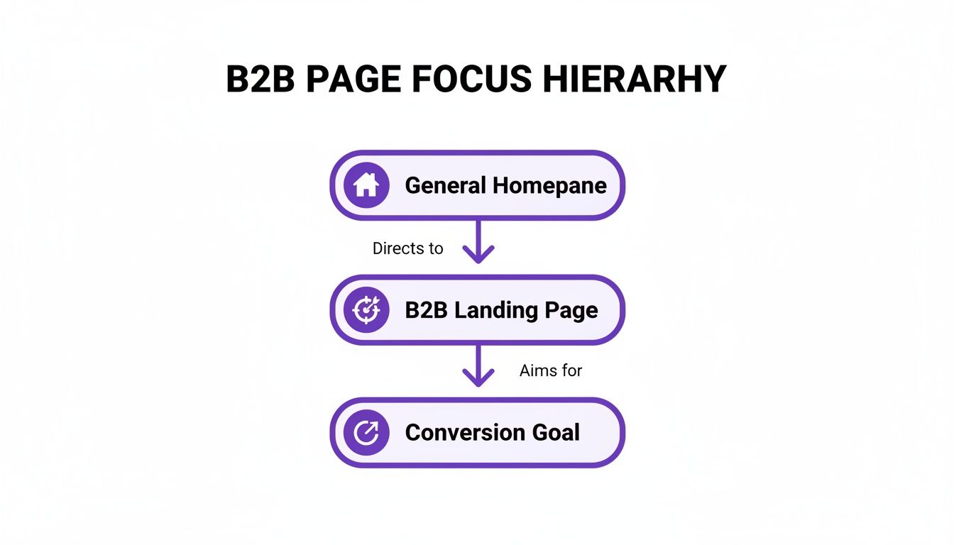
As you can see, it’s all about creating a laser-focused journey that strips away distractions and leads straight to the objective.
Building Trust and Proving Your Value Below the Fold
Okay, so you’ve grabbed their attention. Now the rest of the page needs to build a rock-solid business case. This is where you shift from making a promise to actually proving you can deliver on it. Your copy needs to be obsessed with benefits, always framing things in terms of what the user gains, not just rattling off a list of what your product does.
A feature is what your product does. A benefit is what your customer can achieve with it. B2B buyers don't buy features; they buy better outcomes.
To make your case believable, you need social proof. In the B2B world, trust is everything. Social proof is how you validate your claims and lower the perceived risk for a potential buyer. Here are some of the most powerful forms:
- Client Logos: Showing the logos of companies you work with—especially recognizable ones—is a quick, powerful way to borrow their credibility.
- Specific Testimonials: A quote from a "Marketing Manager" is pretty weak. A quote from "Jane Doe, Marketing Director at [Recognizable Company]" that highlights a concrete result ("we increased lead quality by 40%") is infinitely more persuasive.
- Case Studies: Linking out to a full case study (or even just summarizing one on the page) offers deep, undeniable proof that your solution gets real-world results. For a masterclass on how top companies weave these elements together, check out these excellent B2B landing page examples.
Below is a quick-reference table breaking down these essential B2B landing page elements and what they're meant to accomplish.
Essential B2B Landing Page Elements and Their Purpose
| Element | Primary Function | Best Practice Example |
|---|---|---|
| Headline | Grab attention and communicate the core value proposition instantly. | "Double Your Event ROI with Smarter Lead Capture" |
| Sub-headline | Elaborate on the headline's promise and provide context. | "Our platform integrates with your CRM to track speaker-driven leads from stage to sale." |
| Hero Image/Video | Provide visual context and build an emotional connection. | A 30-second video showing the software in action at a live conference. |
| Benefit-Oriented Copy | Explain how the product solves the visitor's specific problems. | Instead of "AI-powered analytics," say "Get instant insights on which sessions drove the most qualified leads." |
| Social Proof | Build trust and reduce perceived risk through third-party validation. | Displaying logos of well-known clients like Microsoft, Google, and Salesforce. |
| Call-to-Action (CTA) | Guide the user toward the single desired conversion action. | A bright, contrasting button that says "Get My Free Demo" instead of just "Submit." |
| Lead Capture Form | Collect essential visitor information to qualify them as a lead. | A short form asking only for Name, Work Email, and Company Name. |
Each component has a distinct role, but they all work in concert to build a compelling narrative that moves the visitor from curious to convinced.
The Form and the All-Important Call to Action
Finally, every road on the page leads to one destination: the form and the call-to-action (CTA) button. This is the moment of truth, and it's where so many pages fall flat. Your form should be as frictionless as possible. Ask for only the information you absolutely need to qualify a lead. Every extra field you add is another reason for someone to give up and leave.
The CTA itself is the final command. Its design and wording are mission-critical.
- Wording: Ditch generic, lazy words like "Submit" or "Download." Use specific, action-oriented language that reinforces the value proposition. Think "Get Your Free Demo" or "Claim My Strategy Guide."
- Design: The button needs to pop. It should be a contrasting color that stands out from everything else on the page. Its size and placement should make it impossible to miss.
By dissecting your B2B landing page into these fundamental building blocks, you can systematically build new pages—or audit your existing ones—to ensure every last element is working hard to build trust, communicate value, and drive that all-important conversion.
Why B2C Landing Page Tactics Fail in B2B
Trying to use B2C marketing tactics on a B2B audience is like showing up to a corporate board meeting in a clown costume. You might get a reaction, but it won't be the one you want. The psychology, motivations, and the entire decision-making process are worlds apart.
A consumer buys a new pair of sneakers on a whim, maybe because of a slick ad or a "50% off!" banner. A business, on the other hand, invests in new software to solve a painful, expensive operational problem. The stakes are just plain different.
This is the fundamental disconnect. B2C landing pages are built for speed and impulse. They’re masters of urgency ("Sale ends in 1 hour!") and scarcity ("Only 2 left in stock!"). The whole point is to get a single person to make a quick purchase.
But a B2B landing page has to play the long game. The B2B sales cycle isn’t a sprint; it’s a marathon that can take weeks or even months. It involves a whole cast of characters—the end-user, the IT manager, the CFO, and the final decision-maker—and you need to win over every single one of them.
The Journey of Trust vs. The Moment of Transaction
At its core, a B2B page isn’t trying to make a sale. It’s trying to start a relationship.
You’re not going for the "Buy Now" click. Instead, your goal is a much smaller, more thoughtful commitment: "Request a Demo," "Download Our Research," or "Talk to an Expert." This is because the B2B buyer isn't just spending their own money; they're making a strategic bet with company resources. Their decision has to be rooted in logic, data, and a clear return on investment (ROI).
- B2C Goal: Trigger a fast, often low-cost transaction.
- B2B Goal: Capture a qualified lead for a complex, high-value sales cycle.
Because of this, your B2B landing page needs to be an engine of trust and credibility. It has to arm your prospect with the information they need to go back and build a business case for your solution internally.
Why a Longer Form Can Be a B2B Superpower
In the B2C world, a long form is a conversion killer. Ask for anything more than an email and watch your sign-ups plummet. But in B2B, a more detailed form is actually a secret weapon for qualification.
Think about it. A prospect who takes the time to enter their name, company, job title, and phone number in exchange for a whitepaper is sending a powerful signal. They're not just kicking tires; they're serious.
The B2B landing page form isn't a barrier; it's a filter. It helps your sales team separate the truly interested prospects from the casual browsers.
This simple act of self-qualification saves your team countless hours. They can focus their energy on people who are a genuine fit, instead of chasing down dead-end leads. It’s the classic case of quality over quantity.
Different Offers for Different Audiences
The freebies and offers you use also show this strategic split. A B2C page dangles a 20% discount. A B2B page, however, offers value in the form of deep expertise.
Here’s how the offers typically stack up:
| B2C Offers (Impulse-Driven) | B2B Offers (Education-Driven) |
|---|---|
| Percentage Discounts | Industry Whitepapers & Reports |
| Limited-Time Sales | Live or On-Demand Webinars |
| Free Shipping | In-Depth Case Studies |
| Buy-One-Get-One Deals | Free Assessments or Audits |
These B2B offers are designed to educate stakeholders and establish your company as a trusted authority. They build the credibility needed to guide a company through a high-stakes decision. By sidestepping the flash-sale mentality of B2C, you can build a B2B landing page that truly connects with a professional audience and fills your sales pipeline with quality leads.
How to Get More Conversions From Your Page
Getting a solid B2B landing page built is just the first step. The real gains come from what you do next: continuously improving it. This is where we stop thinking like an architect and start thinking like a psychologist, focusing on conversion rate optimization (CRO) to get more qualified leads from the traffic you already have.
It’s all about making small, strategic tweaks that guide your visitor's behavior. Think of it like a carefully planned conversation where every element smoothly leads the prospect to the next logical step, making the decision to convert feel completely natural.
Eliminate All Distractions
One of the most effective—and most overlooked—ways to optimize a landing page is by taking things away. Your main website absolutely needs a navigation bar, footer links, and social icons to encourage exploration. Your B2B landing page needs the exact opposite.
A landing page should be a one-way street, not a busy intersection. The only way out should be through the call-to-action or by closing the tab.
When you remove all the extra links, you plug the "leaks." You create a focused environment where the visitor has just two choices: convert or leave. This simple change drastically increases the odds they'll stick around long enough to complete the action you want them to take.
Craft a Powerful Visual Hierarchy
Visual hierarchy is how you arrange elements to show what’s most important. It’s how you control where a visitor's eyes go first, second, and third. A strong hierarchy isn't an accident; it's meticulously designed to lead the eye straight to your call-to-action (CTA).
You can build a clear hierarchy with a few key techniques:
- Size and Scale: Your headline should always be the biggest text on the page. Sub-headlines come next, followed by the body copy. This instantly tells people what to read first.
- Color and Contrast: Use a bright, contrasting color for your CTA button. If your page is full of blues and grays, a vibrant orange or green button will immediately draw the eye.
- Whitespace: Don't be scared of empty space. Generous whitespace around your form and CTA button makes them stand out and feel much less intimidating.
Understanding the principles of effective website optimization for lead generation is essential here. These core concepts will inform every decision you make, from layout to copy.
Ensure Flawless Message Match
Message match is the critical link between the ad a visitor clicked and the page they land on. If your ad promises a "Free Audit of Your SEO Strategy," your landing page headline must say the exact same thing. Any gap, no matter how small, creates confusion and breaks trust.
Perfect message match instantly tells visitors they’re in the right place. It confirms you’re about to deliver on the promise that made them click, keeping their momentum going. This is especially vital for a B2B landing page, where credibility is everything. To dig deeper, check out our guide on building a highly effective personalized landing page that speaks directly to specific audience segments.
Make Technical Performance a Priority
All the brilliant design and persuasive copy in the world won't matter if your page is slow or broken on a phone. Technical performance is the foundation of a good user experience and a non-negotiable part of CRO.
- Lightning-Fast Load Speed: Every second of delay in page load time sends your bounce rate soaring. Compress your images, minify your code, and use fast hosting to get your page loaded in under three seconds.
- Flawless Mobile Responsiveness: A huge chunk of your B2B audience will see your page on a smartphone. It has to look and work perfectly on smaller screens, with big, easy-to-tap buttons and readable text.
Test Your Way to Success
Optimization isn't about guesswork; it's about disciplined experimentation. Sometimes, the smallest changes produce the biggest results. We've seen case studies where smart design tweaks on a B2B landing page improved conversions anywhere from 13% to 138%.
One B2B software company boosted purchase conversions by 13.47% just by redesigning its CTA buttons and making the content easier to scan. Another doubled its sign-ups from 3% to 6% by simply removing the navigation menu from its landing page. The lesson is clear: methodical testing works.
Start by testing one high-impact element. For example, change your button copy from the generic "Submit" to a value-focused phrase like "Get Your Free Audit." This simple change reframes the action from giving you their information to getting something valuable in return. By continuously testing and refining, you can turn your landing page into a powerful, predictable engine for generating qualified leads.
Measuring Success and Testing Your Page
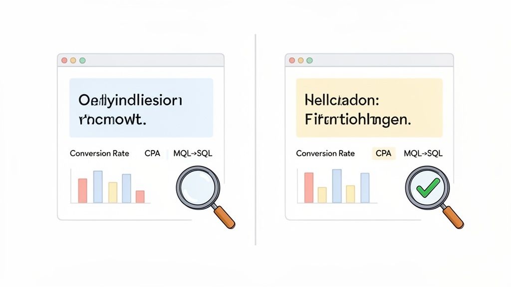
Here's a hard truth: hitting "publish" on your B2B landing page is the starting line, not the finish. A truly great page isn't just built; it’s sharpened and refined over time with cold, hard data. If you want to understand its real impact, you have to look past the vanity metrics and focus on what actually moves the needle for your business.
After all, success isn't just about how many people convert—it's about who converts. A high conversion rate feels good, but it's a hollow victory if none of those leads are the right fit. This is where you switch hats from a creator to an analyst, using data to prove your page is delivering real ROI.
Defining Your Key Performance Indicators
First things first, you need to establish your Key Performance Indicators (KPIs). Think of these as the vital signs for your landing page’s health. They tell you if your strategy is actually working or just spinning its wheels. While the conversion rate is a good starting point, a sophisticated B2B marketer tracks the whole story.
Here are the core KPIs you should be watching:
- Conversion Rate: The percentage of visitors who take the action you want them to take (like filling out your form). This is your foundational metric for overall page effectiveness.
- Lead Quality Score: This is a score you assign to leads based on their company data and on-page behavior. It answers the crucial question: are we attracting prospects who can actually become customers?
- Cost Per Acquisition (CPA): Simply put, this is your total campaign cost divided by the number of conversions. It’s a direct measure of how financially efficient your page is.
- MQL-to-SQL Rate: This tracks the percentage of Marketing Qualified Leads (MQLs) that your sales team accepts as Sales Qualified Leads (SQLs). A high rate here is a great sign of marketing and sales alignment.
Tracking these numbers gives you a complete picture of performance. It ensures your B2B landing page is genuinely feeding the sales pipeline, not just collecting a list of email addresses.
Using A/B Testing to Continuously Improve
The single most effective way to improve your KPIs is through consistent A/B testing, often called split testing. This is basically the scientific method applied to marketing. You test one small change at a time to see what your audience actually responds to, rather than what you think they'll respond to.
Think of A/B testing as a series of small, controlled experiments. Instead of guessing what headline works best, you let your audience’s actions give you the definitive answer.
The process is straightforward but powerful. You start with a hypothesis, like, "Changing the CTA button from 'Submit' to 'Get My Free Demo' will increase conversions by making the value clearer." Then, you run the test by showing 50% of your visitors the original page (the control) and the other 50% the new version (the variant). Once you have enough data, you can confidently declare a winner and make the change permanent.
If you're new to this, we have a detailed guide on how to split test a landing page.
Industry benchmarks show that B2B landing pages convert at a median rate of around 6.6%. But here's the kicker: well-optimized pages that are targeted to specific segments can easily double or triple that rate. This just goes to show that small, tested improvements can lead to a massive boost in both lead volume and quality. By building a culture of testing, you can systematically improve your page's performance month after month.
A Few Common B2B Landing Page Questions
Once you dive into building B2B landing pages, a few practical questions almost always pop up. Getting the small details right is often what separates a page that brings in genuinely good leads from one that just sits there. Let's tackle some of the most common ones I hear from marketers.
How Many Form Fields Is Too Many?
Ah, the classic conversion rate puzzle. While there’s no single magic number, the goal is always to strike a balance between getting enough information and not scaring people away. My rule of thumb? Start with the absolute bare minimum you need to qualify someone. Usually, that’s a name, a work email, and the company name.
Now, if you're offering something with a higher perceived value, like a one-on-one demo or a custom consultation, you can definitely ask for more. Think job title, company size, or even a specific pain point. Someone willing to fill out a longer form is often signaling they're a more serious prospect. The only way to know for sure is to test what your audience is willing to trade for what you're offering.
Should I Put Pricing On My B2B Landing Page?
This is a hot topic, and for good reason. It’s tricky. On one hand, data suggests that pages without pricing tend to get more conversions—we’re talking ~4.6% versus ~2.8% for pages with prices listed. But that stat comes with a massive asterisk when we talk about lead quality.
Hiding your price might get you more form submissions, but showing it gets you more qualified conversations. It acts as a filter, attracting prospects who know your ballpark and are still interested.
Think about it from the buyer's perspective. They want to know if they can even afford you before they hop on a call. Making them jump through hoops just to get a number is frustrating and starts the relationship off on the wrong foot. As some compelling B2B conversion rate research from First Page Sage points out, transparency builds trust and saves everyone time.
What Kind Of Social Proof Actually Works?
Credibility is king in B2B. Your audience isn't just buying a product; they're making a calculated business decision and putting their reputation on the line. The best social proof is anything that helps them build a solid business case and de-risks the purchase in their mind.
- Client Logos: This is instant credibility. Seeing recognizable company names lets prospects know you’re trusted by their peers.
- Specific Testimonials: Forget generic praise. A quote from a director that says, "We cut our reporting time by 30%" is infinitely more powerful than "They're great to work with."
- In-Depth Case Studies: This is where you show your work. A detailed story of how you solved a real problem for a real company is pure gold.
- Industry Awards: Any official recognition or certification from a respected body in your field immediately signals you’re an expert.
This kind of proof speaks directly to the logical, data-driven mindset of a business buyer.
Turn your next speaking gig into a pipeline of high-intent leads. SpeakerStacks is built to capture your audience's interest right in the moment, making sure every event directly fuels your growth. Discover how to measure your event ROI with SpeakerStacks.
Want More Insights?
Subscribe to get proven lead generation strategies delivered to your inbox.
Subscribe to Newsletter
