
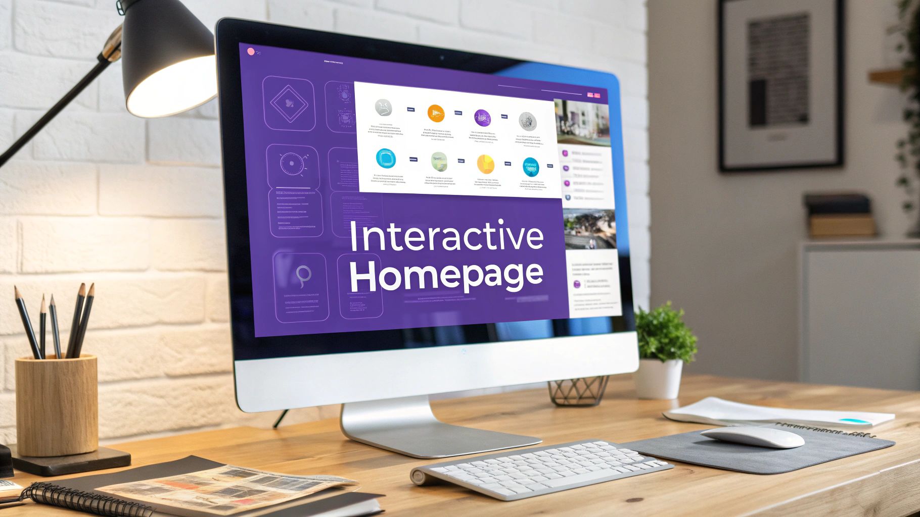
Interactive web design is all about turning a website from a static brochure into a two-way conversation. It’s a way of building experiences that actually react when someone visits your site. Think clicking, scrolling, hovering—anything that invites the user to play and explore. Instead of just being a passive reader, your visitor becomes an active participant, making their time with you far more engaging and memorable.
What Defines an Interactive Website
At its heart, interactive design is about turning passive viewing into active participation. It's the difference between being handed a flyer and having a conversation with an expert guide. A static site just throws information at you. An interactive one, on the other hand, responds to your curiosity and creates a feedback loop that keeps you hooked. The whole idea is that when people can influence what they see on screen, they feel more connected and in control.
But this isn't just about adding flashy animations for the sake of it. Far from it. Every interactive element needs a job to do—whether that's simplifying a complex topic, guiding a visitor toward a call-to-action, or just making the whole experience more delightful. Get it right, and you'll see your bounce rates plummet because you're giving people a real reason to stick around.
The Shift from Static to Dynamic
This move toward dynamic, responsive experiences didn't just happen. The roots of interactive web design stretch back to the early 1990s with the birth of HTML. The real game-changer, though, was JavaScript in 1995. Suddenly, developers could build in automated responses and sophisticated interactions, pulling websites beyond basic text and images. Then came Adobe Flash in 1996, which blew the doors open for rich multimedia and set the stage for the kind of immersive design we see as standard today.
These early technologies built the foundation for modern web strategy, where interactivity isn't an add-on; it's the main event. It’s a direct response to how our expectations have changed. People don't want to be talked at anymore—they want to be part of the dialogue.
An interactive website doesn't just display content; it collaborates with the user. It anticipates their needs, responds to their inputs, and guides them through a narrative they help create.
Key Principles of Effective Interaction
Building a truly interactive experience is more than just coding. It takes a solid grasp of user psychology and a clear set of goals. A few core principles can guide you here, making sure the end result feels both effective and completely natural to use.
- Provide Immediate Feedback: When someone clicks a button, it should look and feel clicked. If they fill out a form field correctly, show a little checkmark. This instant confirmation tells the user, "Hey, I got that," and encourages them to keep going.
- Guide the User's Journey: Good interactivity is a powerful storytelling tool. You can use scroll-triggered animations to reveal information piece by piece, creating a narrative that pulls users along, almost like turning the pages of a book.
- Make It Intuitive: The best interactive elements feel invisible. Users shouldn't ever have to stop and wonder what something does. With clear visual cues and familiar patterns, you can create a frictionless experience that feels helpful, not frustrating.
To get a better sense of how these pieces fit together, it helps to see them in action. Here are some common interactive elements and the role they play.
Core Components of Interactive Web Design
Hover Effects
- Purpose & Function: Provide visual feedback when a user's cursor is over a clickable element, like a button or link.
- Impact on User Engagement: Confirms interactability and makes the interface feel more responsive and "alive."
Quizzes & Polls
- Purpose & Function: Ask users questions to personalize content, gather feedback, or simply entertain them.
- Impact on User Engagement: Actively involves the user, making them a co-creator of their experience and boosting time on page.
Calculators
- Purpose & Function: Allow users to input data (e.g., budget, measurements) to receive a customized result or estimate.
- Impact on User Engagement: Delivers immediate, personalized value, turning passive interest into an active problem-solving session.
Scroll-Triggered Animations
- Purpose & Function: Reveal content, graphics, or data as the user scrolls down the page.
- Impact on User Engagement: Creates a dynamic narrative flow, encourages further exploration, and highlights key information sequentially.
Interactive Maps
- Purpose & Function: Let users explore geographical data by clicking, zooming, or filtering points of interest.
- Impact on User Engagement: Turns data visualization into an engaging, self-directed discovery process.
Ultimately, building an interactive website is about creating a more human-centered digital space. You can learn more about the technical nuts and bolts by reading a guide on how to create an interactive website. By focusing on genuine engagement and clear communication, you can build something that doesn't just grab attention but actually drives meaningful action. For more inspiration, check out these compelling interactive web page examples.
Planning Your Interactive Experience for Maximum Impact
Before you write a single line of code or drag an element in a builder, the most powerful interactive web experiences start with a solid plan. I've seen it time and time again: without a clear strategy, fancy animations and clickable features just become noise. They're distractions, not conversion tools.
The whole process really kicks off when you define what success actually looks like. You're not just trying to build something "cool." You're guiding a visitor toward a very specific action. For a speaker working a live audience, that goal is probably capturing leads with a quick QR code scan that pops open a mobile-friendly landing page. For an e-commerce brand, it might be an interactive product customizer that gets someone to build their perfect item and smash that "add to cart" button.
This is all about turning passive viewers into active participants.

As you can see, the goal is to create a memorable experience that pulls people in, rather than just pushing information at them.
Define Your Audience and Their Motivations
To build an experience that actually connects, you have to know who you're building it for. This means going way beyond basic demographics. I'm talking about creating detailed user personas to get inside your audience's head, anticipating what they need and where they might get stuck.
What's their real motivation? What problem are they trying to solve right now? A field marketing manager at a conference has a completely different mindset than a SaaS founder researching new software. The manager wants quick, shareable resources for their team, while the founder is probably looking for something like a high-level ROI calculator.
When you understand these little details, you can tailor your interactive elements to provide real, tangible value. A smart quiz that helps someone pinpoint their biggest business challenge will always outperform a generic animation that just looks pretty.
Storyboard the Entire User Flow
Okay, so you know your audience and your goals. Now it's time to map out the entire user journey, from the first click to the final conversion. Storyboarding isn't just for Hollywood—it's an incredible tool for visualizing every interaction point. Think of it as the blueprint for your user's experience.
Start from their very first touchpoint, whether that's a social media ad, a QR code on a presentation slide, or an organic search result. Then, map out every single step.
- Identify Key Touchpoints: Where can an interaction make a choice simpler, clarify a complex idea, or encourage them to take the next step?
- Sketch the Interface: Don't get fancy. Simple wireframes or even pen-and-paper sketches for each screen are perfect for thinking through the layout before you touch any design software.
- Anticipate Friction: Where are people likely to get confused or just give up? Storyboarding helps you spot those roadblocks—like a form that asks for too much info upfront—and design a smoother path forward.
A great interactive experience feels like a natural conversation. It anticipates the user's next question and provides the answer before they even have to ask, making them feel understood and guided.
Choose Interactions That Add Value
The last piece of the planning puzzle is picking the right interactive elements. It's so tempting to throw in everything you can think of—gamification, parallax scrolling, wild animations. But real impact comes from being selective.
Always ask yourself this one critical question: Does this element make the experience better, easier, or more valuable for the user?
A scroll-triggered animation that reveals product features as someone moves down the page can be a fantastic storytelling tool. But that same animation on a simple "Contact Us" page is probably just an annoying distraction. An interactive calculator that gives a personalized cost estimate delivers huge value, whereas a playful custom cursor might not fit the serious tone of a B2B legal service.
Ultimately, the best planning is a careful balance of creativity and user-focused problem-solving. It’s what ensures your interactive design doesn't just grab attention, but actually turns that attention into real, measurable results.
Getting Your Audience to Act: The Patterns That Actually Convert
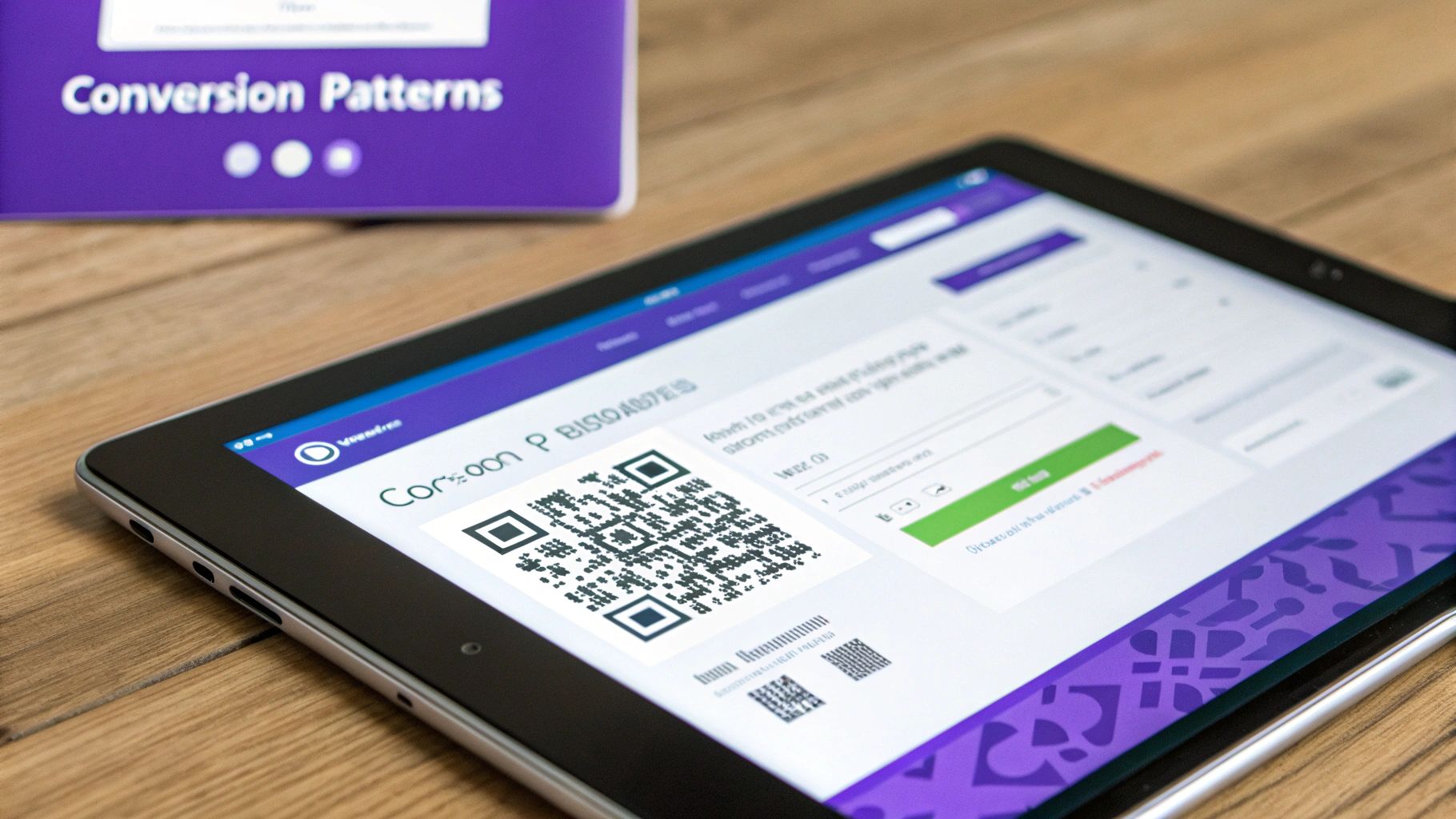
This shot from the SpeakerStacks homepage is a perfect example of what I'm talking about. A QR code isn't just a technical element; it's the front door to your digital experience, bridging the gap between a live event and an online interaction. By making the call-to-action dead simple and scannable, you tear down the biggest barrier to getting your audience to engage right now.
Use QR Codes to Drive Action at Live Events
One of the most effective conversion plays I've seen, especially for speakers and anyone running a booth at an event, is the QR-driven landing page. Forget asking a packed room to type a long, clunky URL into their phones. Just flash a big QR code on your slide. One quick scan, and they're exactly where you want them.
This creates a ridiculously smooth path from the physical world to the digital one, capturing people’s attention when it's at its absolute peak. The trick is to send them to a lightweight, mobile-first page that’s built for one thing and one thing only: action. No bloated navigation, no essays. Just a clear path to what you want them to do next.
This approach just plain works. It removes all the friction, meets your audience where they already are (glued to their phones), and gives you a way to track engagement from a specific event. Finally, you get some clear ROI data.
The Understated Clout of Micro-interactions
Micro-interactions are those tiny, often overlooked animations and visual cues that happen when someone interacts with your site. Think of a button that subtly pulses when you hover over it, or a form field that turns green when you type in a valid email. They may seem small, but their impact on the user experience is huge.
These little details are all about providing feedback. They signal to the user, "Hey, I got that," confirming their input is being processed. This constant back-and-forth between action and reaction makes an interface feel alive, intuitive, and frankly, a bit more human.
For instance, a slight bounce animation on a "Download Now" button right after it's clicked gives a small jolt of satisfaction. This isn't just fluff; it's a psychological nudge that reinforces the user's decision and makes them feel good about completing the task. It's a simple way to boost form submissions and click-throughs.
Using dynamic elements to guide users is a concept that goes way back. In the mid-to-late '90s, the rise of JavaScript allowed for the first interactive buttons and menus. The first banner ad popped up in 1994, introducing commercial interactivity. As the internet exploded from a few million users to roughly 36 million by 1996, the demand for richer, more engaging experiences took off.
Designing Lead Capture Forms That People Actually Complete
Your lead capture form is often the last hurdle between you and a new customer, yet it’s where so many people bail. Smart interactive design can transform a tedious form into a smooth, even enjoyable, experience. The secret is to break the process down and make it feel less like homework.
A well-designed form shouldn't feel like an interrogation. It should feel like a guided conversation where the user feels supported and motivated to reach the end.
Instead of hitting someone with a wall of ten fields at once, try a multi-step approach. Ask for just one or two things per screen. This "foot-in-the-door" technique gets people to commit with a small, easy step (like entering their name), making them far more likely to see it through to the end.
Here are a few interactive patterns that I’ve found make forms convert so much better:
- Progress Bars: Showing someone how close they are to the finish line is a massive motivator. A simple bar that fills up as they progress can seriously cut down on how many people give up halfway through.
- Conditional Logic: This is where your form gets smart and adapts on the fly. If a user selects "Other" from a dropdown menu, a new text field instantly appears for them to elaborate. The form feels personalized and doesn't waste their time with irrelevant questions.
- Real-time Validation: Don't wait until someone hits "submit" to tell them they messed up. Give instant feedback as they type—a green check for valid info, a red outline for errors. This prevents frustration and keeps the momentum going.
By weaving in these small but mighty interactive elements, you guide people through the conversion process instead of pushing them. For a deeper look at creating forms that work, check out these excellent web form design examples. At the end of the day, these patterns are effective because they respect the user's time and attention, turning a chore into a positive interaction with your brand.
Choosing the Right Tools for Your Interactive Project
An incredible idea for an interactive experience is just the start. Bringing it to life hinges on the technology you choose, and this decision is far more than just a technical detail—it impacts performance, scalability, and frankly, your team's sanity. Your tech stack should feel like a custom-fit suit, perfectly tailored to your project's needs.
The whole decision really boils down to one question: how complex does this need to be?
For simple, snappy UI effects like button hovers or subtle fade-ins, native CSS animations and transitions are your best friends. They're incredibly lightweight because they run directly in the browser's rendering engine, guaranteeing a smooth experience without bogging down the page.
But when you need to choreograph complex, orchestrated animation sequences—think multi-stage timelines or dynamic, physics-based movements—CSS starts to feel like you're trying to build a ship in a bottle. This is where a dedicated JavaScript library becomes essential.
When to Use CSS vs JavaScript Libraries
The trick is knowing where one tool’s limits become another’s strength. A simple state change, like a link changing color when you hover over it, is perfect for CSS. You're just telling the browser to smoothly transition from one predefined state to another. Easy.
When your animations need a conductor to manage all the moving parts, that’s your cue to bring in JavaScript.
Libraries like GSAP (GreenSock Animation Platform) give you precise control over timing, sequencing, and intricate motion paths that would be a nightmare to manage with CSS alone. It's the difference between flipping a single light switch and choreographing a Broadway light show.
This reliance on JS and CSS is a direct result of a huge industry shift. The move away from Flash-based websites kicked into high gear after Apple famously refused to support it on the iPhone back in 2007. That decision pushed the web toward HTML5, CSS3, and powerful JavaScript frameworks like ReactJS, which first appeared in 2013.
Today, with over 60% of global web traffic coming from mobile devices, this performance-first, mobile-friendly approach isn’t just a good idea—it's non-negotiable. You can get a great overview of this evolution by reading up on the history of web design at contentsnare.com.
Comparing Interactive Animation Libraries
To help you decide, here is a quick comparison of some of the most popular JavaScript libraries for web animation. Each has its own strengths, so picking the right one often depends on the specific demands of your project.
GSAP
- Best For: Complex timeline choreography and high-performance sequencing.
- Performance Profile: Excellent. Highly optimized for smooth animations.
- Learning Curve: Moderate
Framer Motion
- Best For: Declarative animations within React applications.
- Performance Profile: Very good, especially for component-based UIs.
- Learning Curve: Gentle
Three.js
- Best For: 3D animations and immersive WebGL experiences.
- Performance Profile: Depends heavily on scene complexity.
- Learning Curve: Steep
Anime.js
- Best For: Lightweight, flexible animations with a simple API.
- Performance Profile: Great. Small file size and fast execution.
- Learning Curve: Gentle
Ultimately, GSAP is often the go-to for complex, standalone interactive stories, while something like Framer Motion is perfect for adding life to a React app. For anything 3D, Three.js is the undisputed king, but be prepared for a steeper learning curve.
Building Dynamic Interfaces and 3D Worlds
For building the interactive interfaces themselves, modern JavaScript frameworks are the industry standard. Tools like React and Vue.js let you build sophisticated UIs out of small, reusable components. This approach is a game-changer for interactive design because each piece can manage its own state and logic, making the entire application easier to build, debug, and scale.
When your vision extends into the third dimension, you'll need to reach for specialized tools. Three.js is an incredible library that makes it possible to create stunning 3D experiences that run right in the browser using WebGL. It handles the low-level complexities of rendering, cameras, and lighting, freeing you up to focus on the creative side of your immersive world.
Choosing the right tool isn't just a technical decision; it's a creative one. The right technology should empower your vision, not limit it. The goal is to find the simplest tool that can effectively execute your interactive concept without adding unnecessary complexity or performance overhead.
At the end of the day, remember that the best tools are the ones your team already knows how to use well. It’s always better to build a polished, high-performing experience with a familiar technology than to get bogged down struggling with a new, trendy framework that doesn't fit your team's skills.
As you weigh these options, think about how they fit into your bigger picture of turning audience engagement into real results. For more on that, check out our guide on finding the right conversion rate optimization software to measure your success.
Keeping Your Interactive Design Accessible and Fast
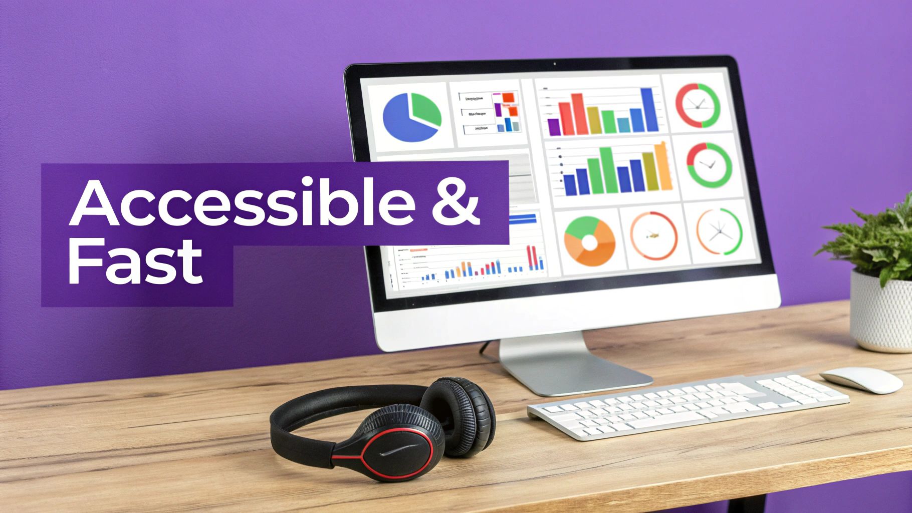
It’s easy to get carried away with cool animations and complex interactions. But if that flashy experience excludes people or takes an eternity to load, it’s not just ineffective—it's broken.
The real mark of a great interactive design is how effortless and inclusive it feels for everyone, no matter their device or abilities. Juggling ambitious creative ideas with rock-solid accessibility and performance isn't just a box to check; it’s the entire foundation of a successful project. Get this right, and you’ll connect with your audience instead of frustrating them.
Making Sure Everyone Can Interact
An interactive design is only as good as its ability to be, well, interacted with. Accessibility isn't some final polish you add at the end; it has to be baked in from the very beginning. It's about respecting your users and making sure your message actually lands. A big piece of this puzzle is simply understanding what responsive web design means and building for every screen.
Here are a few practical things I always focus on to make interactive elements inclusive:
- Keyboard navigation is a must. Not everyone uses a mouse or a trackpad. Can a user tab through every single button, link, and menu? Can they trigger every animation or open every dropdown with just their keyboard? This is often the first and most important test.
- Give screen readers context with ARIA. Dynamic content can be confusing for screen readers. Accessible Rich Internet Applications (ARIA) attributes are like little signposts. For example, adding
aria-expanded="true"lets a screen reader announce that a collapsible section is currently open. - Offer text alternatives. If an animation or a chart is the only way you’re communicating a key piece of information, some people will miss it entirely. Always provide that same info in plain text for screen readers or for those who have animations turned off.
These aren't edge cases. Building this way makes your work more robust and usable for a much wider audience, which is always the goal.
True engagement means empowering every user to participate. Accessible interactive design isn't about checking boxes; it's about fundamentally respecting the people you're trying to reach.
Respecting Motion Sensitivity
Have you ever felt a bit queasy from a website with too much movement? You’re not alone. Many people enable a system setting called prefers-reduced-motion because animations can be distracting or even physically uncomfortable for them.
Ignoring this user preference is a huge mistake.
Luckily, it’s incredibly easy to respect this setting. A simple CSS media query lets you tone down or turn off animations for users who’ve asked for it.
Here’s what that looks like in practice:
@media (prefers-reduced-motion: no-preference) {
.animated-element {
animation: slide-in 1s ease-out;
}
}
This little snippet of code is a game-changer. It ensures only people who are comfortable with motion see the full-blown animations, while everyone else gets a perfectly functional, static experience. It’s a small detail that shows a massive amount of respect for your audience.
Performance Is Part of the Experience
Nothing kills a brilliant interactive design faster than lag. If your page stutters or takes forever to become usable, people are gone. They’ll click away before they ever get to see the amazing thing you built.
For buttery-smooth animations, stick to efficient CSS properties. Animating transform and opacity is way more performant than animating properties like width, height, or margin. That’s because the browser can offload those changes to the GPU, freeing up the CPU and preventing that dreaded jank.
Beyond that, think about your loading strategy.
Always lazy-load heavier interactive components. If you have a complex widget halfway down the page, don't force the browser to load its scripts and assets right away. Wait until the user actually scrolls near it. This one trick can dramatically improve your initial page load time.
And, of course, optimize all your assets. Compress images, minify your code, and serve media that’s properly sized for the device viewing it. Every single kilobyte you shave off contributes to a faster, better experience that keeps users focused on your message, not on a loading spinner.
Got Questions About Interactive Web Design?
As you're getting ready to dive into your own project, a few practical questions are bound to surface. I hear these all the time from people just starting out. Let's walk through some of the most common ones to clear up any lingering doubts.
What’s the Real Cost of Interactive Web Design?
This is the big one, and the honest answer is: it really depends. The price tag is tied directly to how complex you want to get. A website with some nice CSS hover effects and a few tasteful animations that appear as you scroll? That might not cost much more than a standard web design project.
But once you start talking about custom 3D models, intricate JavaScript animations using a library like GSAP, or a multi-path quiz with branching logic, you're entering a different league. Those features need specialized development skills and, naturally, a lot more time. Think of it this way: the more custom code and choreographed animation you need, the higher the investment.
An interactive website is an investment in engagement, not just a line item on a budget. Yes, the upfront cost can be higher than a static site, but the return on that investment often shows up in better conversion rates, people sticking around longer, and a brand experience they actually remember.
Can All These Bells and Whistles Hurt My SEO?
It’s a smart question, and the short answer is no—if you do it right. Search engines like Google have gotten incredibly sophisticated at crawling and understanding sites that rely heavily on JavaScript. The trick is making sure your core content is always accessible and not locked away behind an interaction a crawler can't trigger.
The real SEO killer here is performance. If your cool interactive features are bloated and make your page load at a snail's pace, that will absolutely drag down your rankings. Always put performance first. That means optimizing your images and videos, lazy-loading heavier elements, and using efficient code to keep the entire experience snappy.
Is This Stuff Only for Big Brands With Deep Pockets?
Absolutely not. While you see big companies rolling out massive interactive campaigns, the core ideas are scalable for anyone. Small businesses, consultants, and even individual speakers can get a huge lift from adding simple, strategic interactions.
You don't need a huge budget to do something effective. For instance:
- A consultant could replace a long, daunting contact form with a simple multi-step version that feels easier to complete.
- A software founder could build an interactive pricing calculator that gives potential customers instant, personalized answers.
- A speaker can drop a QR code into their slides that leads to a landing page with a simple "tap to reveal" Q&A section.
It’s not about being flashy; it’s about being thoughtful. These small touches boost engagement and drive conversions without breaking the bank.
What's the Single Biggest Mistake People Make?
Hands down, the most common mistake is adding interactive elements just because they look cool. There’s no purpose behind them. Every animation, every clickable element, every transition needs to do a job. It should either guide the user, explain something more clearly, or make it easier for them to take the next step.
When interactivity becomes a gimmick, it just gets in the way and creates a frustrating experience. Before you add anything, ask yourself this one simple question: "Does this actually make the user's journey better?" If you can't give a firm "yes," it's probably better to stick to the basics.
Ready to turn your presentations into powerful lead-generation tools? SpeakerStacks makes it easy to create QR-driven, interactive landing pages that capture audience attention and drive measurable results. Start converting your audience today at SpeakerStacks.
Ready to capture leads from your next talk?
SpeakerStacks helps you display QR codes, capture attendee information, and sync leads directly to your CRM. Get started free.
Want More Insights?
Subscribe to get proven lead generation strategies delivered to your inbox.
Subscribe to Newsletter