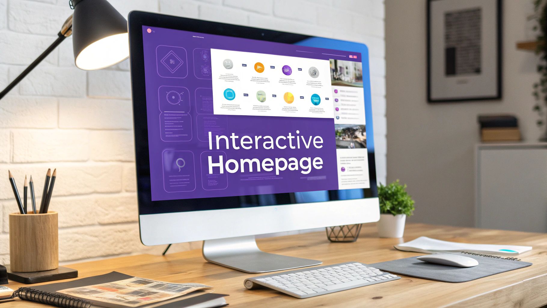
Your homepage shouldn't be a static, one-way brochure. Think of it as your digital handshake, your opening line. An interactive homepage design transforms that first impression from a passive glance into an active, engaging conversation.
It's about creating a dynamic space that invites people to participate, not just read.
What Is Interactive Homepage Design
Let's use an analogy. A static homepage is like a storefront with a "We're Open" sign—it tells people you exist, but that's about it. An interactive homepage, on the other hand, is like having a friendly guide at the door, ready to welcome visitors, answer questions, and show them exactly what they’re looking for.
This isn't just a flashy trend; it's a fundamental shift in how businesses connect with their audience online. In a world where attention is the most valuable currency you have, a passive website is an invisible one.
The Shift To Active Engagement
People today don't just want to consume information; they expect an experience. This is especially true on mobile, where 61.19% of all web traffic now originates. A clunky, unresponsive site just won’t cut it. In fact, research from Hostinger shows that 30% of users will ditch a mobile page if it doesn’t display properly.
This is where the principles of interactive web page design make all the difference. The focus moves from just showing content to creating a journey.
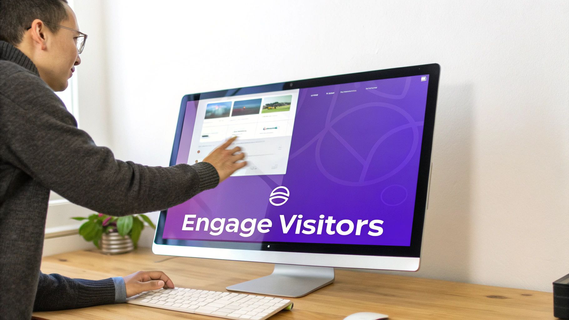
The core goal of an interactive homepage is to turn passive scrolling into active participation. It asks visitors to do something—click, hover, scroll, or type—which deepens their connection to your brand and guides them naturally toward your call to action.
Why It Matters For Your Business
An interactive homepage isn't just about looking good; it's about driving real business results. By inviting users to play a part in their own journey, you hit several key metrics that static designs simply can't touch.
- Boosts User Engagement: Elements like quizzes, polls, or calculators keep people on your site longer. This extended "dwell time" is a strong positive signal to search engines.
- Improves Conversion Rates: Instead of making users hunt for information, you can guide them. An interactive product finder, for instance, can lead a visitor directly to the perfect solution, making a sale far more likely.
- Lowers Bounce Rates: When a visitor is immediately captivated by a clever animation or a unique scrolling effect, they're far less likely to hit the "back" button in the first few seconds.
- Tells a Stronger Brand Story: You can unfold your brand’s mission through scroll-triggered animations and narratives, making your message more memorable and impactful than a simple block of text ever could.
Let's quickly compare the two approaches side-by-side.
Static Homepage vs Interactive Homepage At A Glance
Let's break down the fundamental differences in user experience and business impact.
With a Static Homepage (The Old Way), the user's role is that of a passive observer. The content delivery simply presents information like text and images, leading to a linear and self-directed user path. The first impression is often informational and forgettable. Conversion focus relies on the user finding the call-to-action (CTA), which often results in high bounce rates and low engagement.
In contrast, with an Interactive Homepage (The Modern Approach), the user becomes an active participant. Content delivery tells a story and creates an experience, guiding the user on a personalized path. This makes the first impression memorable, intriguing, and engaging. The design actively guides the user toward the CTA, leading to lower bounce rates and higher conversions as the primary business outcome.
As you can see, the modern approach is designed from the ground up to hold attention and drive action, which is exactly what you need a homepage to do.
The Core Principles of Effective Interactive Design
So, we've covered what an interactive homepage is, but let's get into the good stuff: how it actually works. A great interactive experience isn't about just tossing in some flashy animations for the sake of it. It’s built on a solid foundation of human psychology and UX principles that make the difference between a delightful journey and just a bunch of digital noise.
Think of these principles like the unwritten rules of a good conversation. When a design gets them right, you feel understood, guided, and in control. But when it breaks those rules, you just end up confused, frustrated, and ready to click away.
Predictability and Immediate Feedback
The first—and most important—rule is predictability. When someone lands on your page, they should have a pretty good idea of what’s going to happen when they click, hover, or scroll. A button that looks like a button needs to act like one. Simple, right? This predictability is huge for building trust and lowering the mental effort required from your visitor; they don’t have to waste energy guessing what to do next.
Hand-in-hand with this is immediate feedback. This is the website’s way of nodding and saying, "Got it." It’s that subtle color shift when your mouse moves over a button or the little loading spinner that pops up after you submit a form. This feedback confirms the site registered your action, which is absolutely vital for a smooth, reassuring experience.
An interactive element without feedback is like pressing an elevator button that doesn't light up. You're left wondering if it worked, so you press it again, and again, creating frustration where there should be simple confirmation.
Without that instant acknowledgment, users are left hanging. That uncertainty can quickly lead them to bounce. A tiny microinteraction can be the difference between a confident action and a hesitant, frustrating click.
Discoverability and Clear Signifiers
Next up is discoverability. It’s a simple concept: how easily can people find the interactive parts of your page and figure out what to do with them? An element is completely useless if nobody knows it’s there or how it works.
To make things discoverable, we use signifiers—visual hints that tell people what an object does. They come in a few flavors:
- Explicit Signifiers: These are the most obvious clues, like a button that says "Click Here" or an arrow icon that screams "scroll down for more!"
- Pattern Signifiers: These lean on design conventions everyone already knows. Think of the three horizontal lines (the "hamburger" icon) that always mean "menu," or blue, underlined text that signals a hyperlink.
- Hidden Signifiers: These only show up when you interact, like extra options appearing when you hover over something. They can create a clean look, but you have to be careful not to hide important features.
The goal is to build an intuitive path that guides users without them needing a map. Every interactive feature should feel like the natural next step, not a puzzle they have to solve. For a deeper look into creating these kinds of intuitive experiences, check out these best practices for effective user interface design.
Progressive Disclosure and Focused Attention
Finally, one of the most powerful techniques in our toolkit is progressive disclosure. This is all about showing users only the information they need at that specific moment. More complex details or features are revealed only as they choose to dig deeper.
Take a pricing page, for example. Instead of hitting a visitor with a wall of text listing every single feature for three different plans, you could start by just showing the plan names and prices. When they click "Learn More" on a plan that interests them, then you reveal the detailed feature list. This approach tames complexity and keeps the user from feeling overwhelmed.
This method shows respect for the user's attention. We know people get paralyzed by too many choices. Progressive disclosure simplifies the whole experience, making it feel cleaner and far more manageable. It guides people from a bird's-eye view down to the nitty-gritty details, creating a logical flow that helps them understand their options instead of just giving up.
Key Interaction Patterns That Engage and Convert
Now that we've covered the core principles like feedback and discoverability, let's get into the practical tools of the trade. These are the specific interaction patterns that can turn a static, passive homepage into a dynamic, active experience. Think of them as the proven techniques in a designer's toolkit, each with a clear job: to grab attention and guide visitors where you want them to go.
A great interactive homepage doesn’t just add flashy animations for the sake of it. Every movement, every reveal, and every action the user triggers has to feel intentional. These patterns are what create a genuine dialogue between your website and your visitor.
This is all about putting the user at the center of the experience, as this diagram shows.
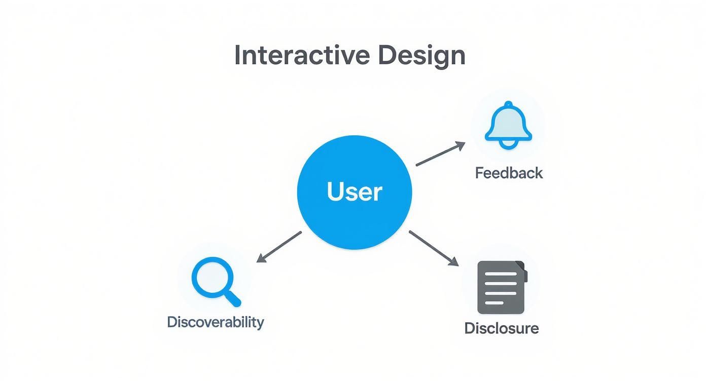
The idea is simple: every interaction should give the user clear feedback, make features easy to find, and reveal information bit by bit so they never feel overwhelmed.
H3: Microinteractions That Delight
Microinteractions are the tiny, often subtle, animated responses you get when you perform a single action. They're the unsung heroes of fantastic interactive design, offering immediate feedback while injecting a bit of personality into the experience.
These small moments are what make an interface feel alive. Think of a "like" button that bursts with confetti or a toggle switch that satisfyingly slides and changes color. These aren't just decorative touches; they confirm that an action was successful and simply make the experience more enjoyable.
A well-executed microinteraction is the digital equivalent of a satisfying click of a well-made button. It’s a small detail that communicates quality and care, building user confidence with every interaction.
H3: Scroll-Triggered Animations
One of the most powerful ways to tell a story on a webpage is with scroll-triggered animation, a technique often called "scrollytelling." As a visitor scrolls down, elements glide into view, text fades in, or illustrations morph, creating a narrative journey that unfolds right before their eyes.
This approach is incredibly effective for a few key reasons:
- Pacing Information: You get to control the flow of information. Instead of hitting them with everything at once, you reveal your brand story piece by piece, letting them absorb it at their own speed.
- Creating Focus: By animating one section at a time, you masterfully direct the user's attention exactly where you want it.
- Building Anticipation: The simple act of scrolling to see what’s next is surprisingly compelling. It keeps people engaged and encourages them to keep moving down the page.
Instead of a static wall of text, scrollytelling transforms your homepage into something closer to a cinematic experience. It’s a brilliant way to make complex products or services feel simple and easy to grasp.
H3: Interactive Calculators and Quizzes
Nothing says "engagement" quite like delivering immediate, personalized value. This is where tools like interactive calculators, product configurators, or short quizzes really shine. They’re a fantastic way to turn passive browsers into active participants.
Imagine a real estate website with a mortgage calculator right on its homepage. It gives visitors a powerful reason to interact because it helps them solve a real-world problem. Or think of a skincare brand that uses a quick quiz to recommend the perfect product routine, instantly tailoring the journey to that specific user.
These tools work because they offer a tangible reward for engagement. Your homepage stops being just a brochure and becomes a genuinely useful utility. For more great ideas, you can explore a variety of other interactive web page examples that nail this concept of immediate value.
H3: Balancing Performance and Visual Appeal
Of course, all the clever interactions in the world won't matter if your site is slow and clunky. The success of any interactive homepage depends on finding the sweet spot between visual appeal and technical performance. The two are deeply linked.
The numbers don't lie. Research shows that in 2025, 47% of users expect a website to load in under two seconds. As load time climbs from one to three seconds, bounce rates can jump by 32%.
On the flip side, a great color palette can boost brand recognition by a staggering 80%. But if performance suffers, retailers can lose an estimated $2.6 billion in sales each year. It’s a stark reminder that our designs must be as fast and seamless as they are beautiful.
How AI Is Powering Personalized Homepage Experiences
https://www.youtube.com/embed/3Fud1gc6Hy0
While cool interaction patterns like scrollytelling and microinteractions make a homepage feel alive for everyone, the next big leap is making it personal. This is where Artificial Intelligence (AI) and machine learning come in, shifting the whole game from a one-size-fits-all website to a one-on-one conversation with each visitor.
This isn't just about adding another slick animation. It’s about building a homepage that genuinely adapts, in real-time, to the person looking at it. The goal is to create a journey that feels like it was designed just for them.
Moving Beyond Static Interactions
Think about most interactive elements—they're the same for every user. A scroll-triggered animation always unfolds the same way, and an ROI calculator crunches numbers based on whatever you type in. These are fantastic tools, but AI pushes interactivity to another level by making it predictive and dynamic.
Imagine a homepage that doesn't just react to your clicks but actually anticipates what you need next. That’s the magic of AI in web design. It crunches data to make smart decisions on the fly, crafting a far more relevant experience for each person who lands on the page.
AI-powered personalization transforms a homepage from a static billboard into a smart, responsive digital concierge. It learns from user behavior to present the most relevant content, offers, and pathways, often before the user even knows they're looking for them.
This tech lets us create what feels like countless versions of a homepage experience without having to manually build every single one. It’s all about getting the right message to the right person, right when it matters most.
How AI Delivers Hyper-Personalization
So, how does this actually work? In short, AI engines gather and analyze data points to build a profile for each visitor. Then, they use that profile to instantly customize the homepage content.
This personalization can be triggered by all sorts of factors:
- Geographic Location: A clothing retailer could show heavy winter coats to someone browsing from a snowy city, while someone in a tropical spot sees the latest swimwear.
- Browsing History: An e-commerce site might greet you with products you've previously viewed or left in your cart, making it effortless to pick up where you left off.
- Referral Source: If someone clicks through from a specific ad campaign, the homepage can feature a hero image and headline that perfectly match the ad’s messaging. It creates a smooth, reassuring journey.
- User Behavior: The AI can notice which elements a user interacts with most and start prioritizing similar content on their next visit, essentially learning their preferences over time.
This depth of customization makes every interaction feel more meaningful and less generic, which dramatically increases the likelihood of a conversion.
The Tangible Business Impact of AI
Using AI in web design isn’t some futuristic trend anymore; it's a mainstream strategy that gets real results. The impact is huge because AI helps automate optimizations that used to be incredibly time-consuming and almost impossible to scale effectively.
In 2025, a staggering 93% of web designers have used AI tools to help with their work, and nearly half (49%) are already relying on AI to test out new design ideas and styles. The business results are even more impressive. Studies show that businesses using AI to power well-designed interactive homepages can see up to a 400% increase in conversion rates and a massive return on their user experience investments. You can explore more web design statistics and their impact to see the full picture.
These numbers tell a clear story: AI-driven personalization isn't just a "nice-to-have" feature. It’s a powerful engine for business growth, turning a great interactive homepage design into a highly efficient conversion machine.
Real-World Examples Of Brilliant Interactive Homepages
It’s one thing to talk about theory, but it’s another thing entirely to see an interactive homepage design in the wild. That's when the lightbulb really goes on.
The best interactive sites aren’t just flashy for the sake of it. They use motion and engagement with a clear purpose: to make a complex idea simple, tell a story that sticks, or gently steer visitors toward a specific action.
Let's look at a few fantastic examples that nail the connection between strategy and execution.
Apple: The Master Of Scrollytelling
Apple has always set the standard for product presentation, and their homepages for new releases like the iPhone are a masterclass in what we call "scrollytelling." Forget boring spec sheets. Apple takes you on a cinematic journey down the page.
As you scroll, the phone gracefully rotates in 3D. Text fades in to highlight a key feature, and subtle animations bring new capabilities to life. It’s an approach that transforms a potentially dry feature list into a genuinely exciting narrative.
The real goal here? To make the product feel intuitive, powerful, and premium before you've even held it. By controlling the pacing of information, Apple builds desire and communicates value in a way static images never could.
The user's own action—the scroll—is what drives the story forward. It turns them from a passive observer into an active participant in the product reveal. It’s a simple, yet brilliant, way to create a connection.
Nuka: Product Exploration Through Interaction
Nuka, a brand that makes unique "eternal" stationery, offers another killer example. Their homepage pulls you in right away with a clean, minimalist design and a clear invitation to play with the product.
They use a mix of high-quality GIFs, smooth parallax effects, and scroll-triggered animations to show you exactly how their products work. A static image could never explain how their special notebook syncs with a pen and an app, but a short, looping GIF does it instantly and elegantly.
This approach accomplishes a few key things:
- Demystifies a New Concept: It quickly teaches visitors how a novel product actually functions.
- Broadcasts Quality: The fluid animations and crisp visuals scream craftsmanship and attention to detail.
- Highlights the "Wow" Factor: By animating the coolest features, the design makes sure visitors don’t miss the most compelling selling points.
The whole experience is built around stoking curiosity and encouraging discovery. It guides you from that initial moment of intrigue to a deep "aha!" moment about the product's value. To see more great examples like this, check out these interactive website design examples.
Drunk Elephant: Engaging Through Personality And Video
Skincare brand Drunk Elephant uses its interactive homepage to build a brand identity that’s vibrant, fun, and deeply trustworthy. The moment you land, you're hit with a burst of color, playful microinteractions, and engaging video content that perfectly captures their personality.
They use carousels to showcase products and video backgrounds to create a dynamic, immersive atmosphere. This isn't just about looking pretty; it’s about making the brand feel alive and approachable.
By weaving in social media feeds, they also add a powerful layer of social proof, showing real people loving their products. This mix of interaction and authenticity turns a simple shopping trip into a genuinely delightful brand experience, building the kind of loyalty that keeps people coming back for more.
Bringing Interactive Design to Niche Landing Pages
Great interactive design shouldn't be reserved just for your homepage. You can—and should—apply these same powerful ideas to any important landing page. The real magic happens when you stop thinking about these pages as static information dumps and start treating them as living, breathing experiences designed to help your visitor take a specific action.
Event, webinar, and speaker pages are prime candidates for this kind of makeover. Too often, they’re treated like digital brochures: a wall of text, a schedule, and a sign-up form. But with a few thoughtful interactive elements, you can turn them into something far more valuable.
How to Rethink Speaker and Event Pages
Picture the average conference landing page. It’s usually a long, scrolling list of speaker headshots and session titles. It gets the job done, but it’s not exactly engaging, is it?
Now, let's inject some interactivity.
Instead of that static list, what if you created an interactive schedule? Visitors could click on the sessions they find interesting to build a personalized agenda they can save or export. That one simple interaction changes everything. Suddenly, your visitor isn't just a passive reader; they're an active participant, and the event feels like it was designed just for them.
The secret is to focus on interactions that solve a real problem for your user, whether it's organizing their schedule or getting to know a speaker better. When a design is genuinely helpful, it's not just pretty—it's effective. That utility is what builds engagement and ultimately drives people to act.
The same goes for speaker profiles. A boring bio can become an interactive card. On a hover or a click, it could expand to reveal more content—maybe links to their social media, downloadable slides from past talks, or even a quick introductory video. This approach, known as progressive disclosure, keeps the main page clean while offering deeper information to those who are truly interested.
Practical Ways to Drive Action
At the end of the day, every landing page has a job to do: guide the user toward a specific goal. Interactive elements are brilliant at this because they deliver immediate value, which makes your call to action feel less like a sales pitch and more like the logical next step.
Here are a few concrete ideas to get you started:
- On Event Pages: Add a simple quiz to help attendees find the most relevant sessions based on their job title or interests. It’s a great way to personalize their journey and point them directly to the content they’ll find most valuable.
- On Speaker Pages: Don't just settle for a generic "contact us" form. Why not embed an interactive calendar to let people book a meeting directly? You remove all the back-and-forth friction and convert warm interest into a scheduled call on the spot.
- For In-the-Moment Connections: Imagine a speaker on stage. A QR code on their slide can link the audience to a mobile-first page built for that exact moment. To see this in action, check out how a personalized landing page can be used to capture leads right from the stage.
These examples prove that interactive design is a flexible strategy. It’s not just for your main homepage; it's for making any critical touchpoint in your user's journey more engaging, more memorable, and a whole lot more effective.
Got Questions About Interactive Homepages? Let's Talk.
Thinking about making your homepage more interactive is exciting, but it's normal to have a few questions before you dive in. Let's tackle some of the most common ones I hear from clients and teams.
Clearing up these points will help you move forward confidently and start building something truly engaging.
Will an Interactive Homepage Wreck My SEO?
Not at all—as long as you do it right. In fact, a well-executed interactive design can be a huge win for your SEO by boosting the user engagement signals that search engines love.
When people spend more time on your page, click around, and actually use the elements, it tells Google that your content is valuable. The real trick is performance. Your interactive features need to be fast and built on clean, accessible code that search engine crawlers can actually read. Steer clear of bloated animations or heavy scripts that kill your page load speed.
What Are the First Steps to Make My Homepage More Interactive?
You don't have to tear everything down and start from scratch. The smartest way to begin is to think small and focus on a single, high-impact change that serves a clear business goal.
First, pinpoint one key action you want visitors to take. Maybe it’s signing up for your newsletter. A great first step would be to add a simple microinteraction—like a subtle animation or a satisfying color change when someone hovers over the sign-up button. Another easy win is adding a small tool that gives instant value, like a simple cost calculator or a quick quiz.
The key is to take it one step at a time. Introduce a new element, measure how it affects user behavior, and then double down on what works. This way, you can steadily improve your homepage without needing a massive budget or a full-blown redesign.
How Much Does It Cost to Build an Interactive Homepage?
This is the classic "it depends" answer, but it's true. The cost can be anything from next-to-nothing to a significant investment, and it all comes down to the complexity of what you want to build.
Simple touches like hover effects, animated icons, or basic scrolling animations are usually cheap and can be handled by most web developers. The bill starts to climb when you get into more advanced territory.
- Low Cost: Think simple CSS animations, microinteractions, or embedding pre-built interactive tools.
- Medium Cost: This is where you get into custom scroll-triggered narratives or personalized content modules.
- High Cost: We're talking complex 3D models, AI-powered personalization, or fully immersive virtual experiences.
The best strategy? Figure out your goals and your budget first. Then, pick the interactive elements that give you the biggest bang for your buck. Start with the essentials and scale up once you see the results coming in.
Ready to turn audience attention into real results? SpeakerStacks gives you the tools to create branded, QR-code-driven landing pages for your talks in seconds. You can capture leads, book meetings, and finally prove your speaking ROI. Find out more at SpeakerStacks.com.
Ready to capture leads from your next talk?
SpeakerStacks helps you display QR codes, capture attendee information, and sync leads directly to your CRM. Get started free.
Want More Insights?
Subscribe to get proven lead generation strategies delivered to your inbox.
Subscribe to Newsletter