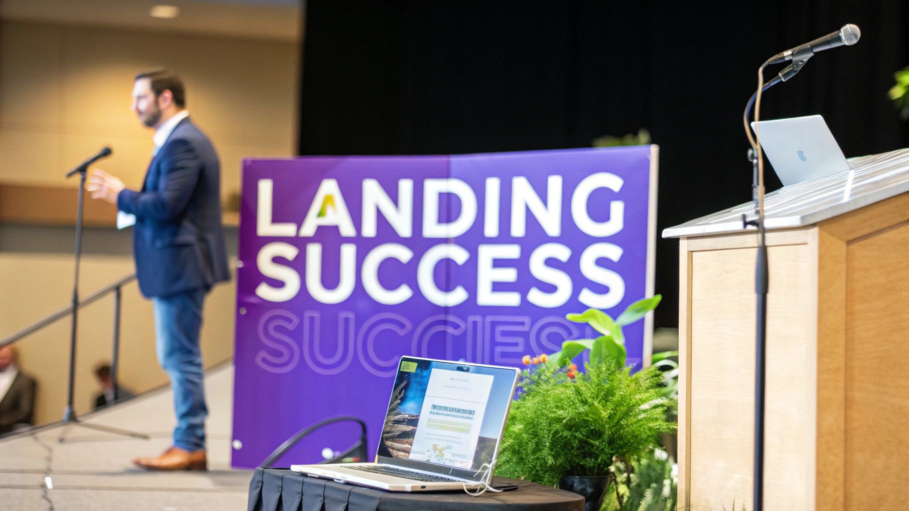
You've just wrapped up a killer keynote. The audience is buzzing, hanging on your every word. This is the moment—the golden window to turn that rapt attention into a real business opportunity. So, what's your next move?
If your answer is "send them to my website," you might be losing that momentum as soon as it builds.
Why Your Speaker Website Isn't Built for This Moment
Your professional website is your digital hub. It's fantastic for telling your story, showcasing your full range of services, and hosting your blog. It’s built for people to explore and learn about you at their own pace. But that's exactly the problem. Exploration is the enemy of immediate action.
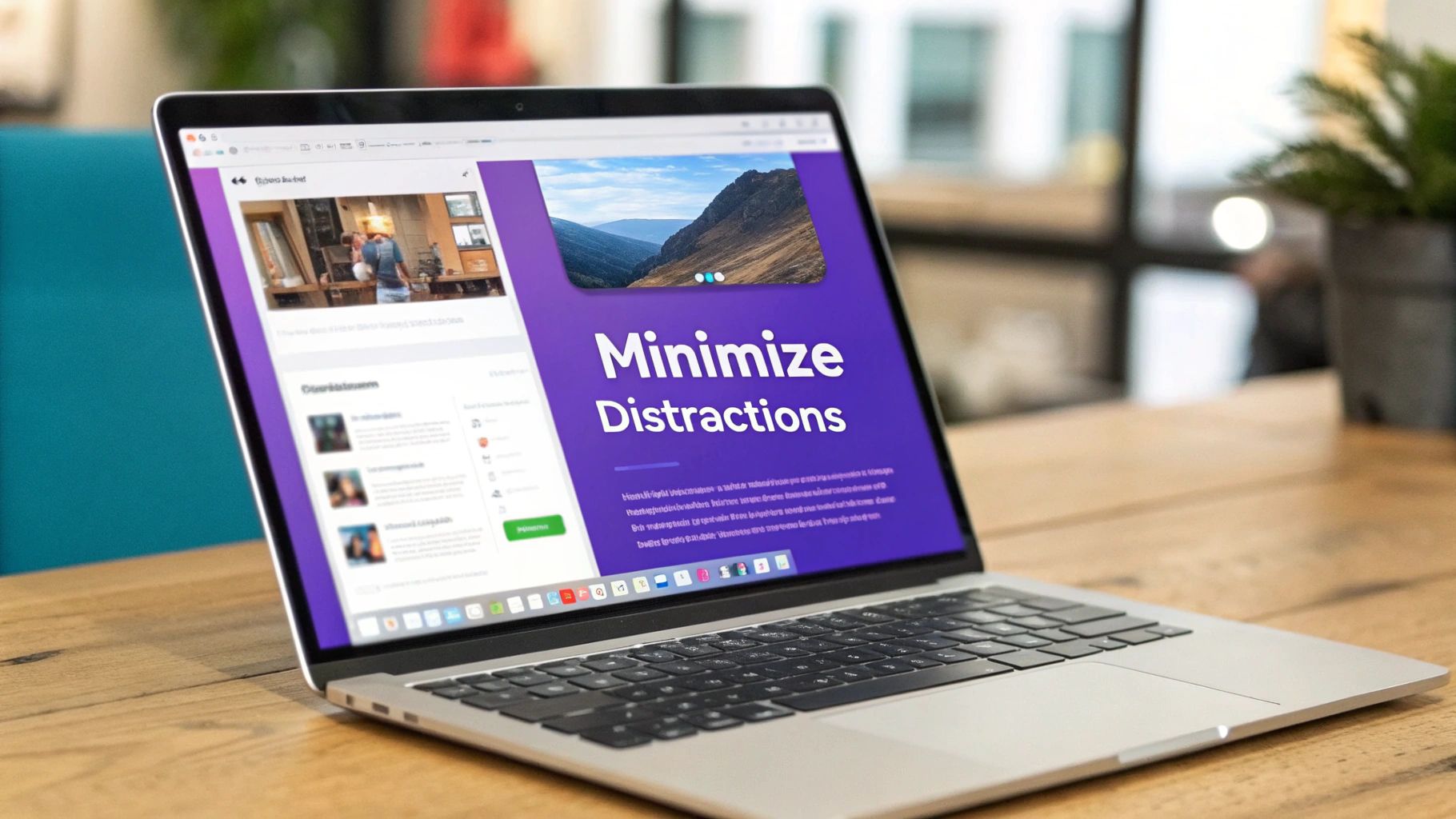
Think about it. You direct an inspired audience member to your site, and they're immediately greeted by a navigation bar with five different options, links to your social media, your latest articles... a dozen different paths to take. This is classic decision fatigue. Instead of taking that one specific action you want them to—like downloading your slide deck or booking a discovery call—they click around, get sidetracked, and that initial spark of inspiration fizzles out.
This is precisely where a dedicated landing page changes the game.
The Power of a Single, Undivided Focus
A landing page is built on a brutally simple and effective principle: one page, one purpose. That's it. It strips away all the usual website clutter—the navigation menu, the extra links, the sidebars—to create a clean, direct path from A to B.
Every single element on the page, from the headline down to the button, is working in harmony to persuade the visitor to do one thing.
For a speaker, this focused approach is a perfect match for post-presentation engagement:
- Seize the Moment: You can put a QR code or a short link on your final slide that takes the audience directly to a page that continues the conversation you just started.
- No Rabbit Holes: With no navigation or other links to click, your audience can't get lost. The only way forward is the one you designed.
- Skyrocket Conversions: It’s a proven fact: pages with a single, clear call-to-action convert far better than pages with competing offers. You're making their next step obvious and easy.
A website is for browsing. A landing page is for deciding. It’s that simple. For a speaker, that decision is the critical first step in turning an audience member into a client.
Website Page vs Dedicated Landing Page Breakdown
To make it crystal clear, let's break down the key differences. A standard page on your website is designed to be part of a larger whole, while a dedicated landing page is a standalone tool built for a single job.
Standard Website Page
- Primary Goal: Inform and explore
- Navigation: Full website menu and links
- Content Focus: Broad, covers multiple topics
- Call-to-Action (CTA): Multiple (Contact, About, Services)
- Audience: General visitors, varied interests
- Success Metric: Time on site, pages per visit
Dedicated Landing Page for Conversion
- Primary Goal: Drive a single, specific action
- Navigation: None (or links that support the goal)
- Content Focus: Narrow, focused on one offer or call
- Call-to-Action (CTA): One clear, prominent CTA
- Audience: Highly targeted traffic from one source
- Success Metric: Conversion rate (form fills, clicks)
As you can see, when your objective is to get someone to sign up, download, or book a call, the focused environment of a landing page is purpose-built to get you there.
Think of your website as the library, full of incredible resources for people to browse. Your landing page is the sign-up sheet for the exclusive workshop, placed right at the entrance. Both are valuable, but they serve entirely different functions. To learn more, check out our guide on the core differences between a landing page or website.
Ultimately, relying on your main website to convert a captive audience is leaving money on the table. A landing page for conversion isn't just a marketing tactic; it's an essential tool for any serious speaker who wants to turn applause into appointments.
Defining Your Single Conversion Goal
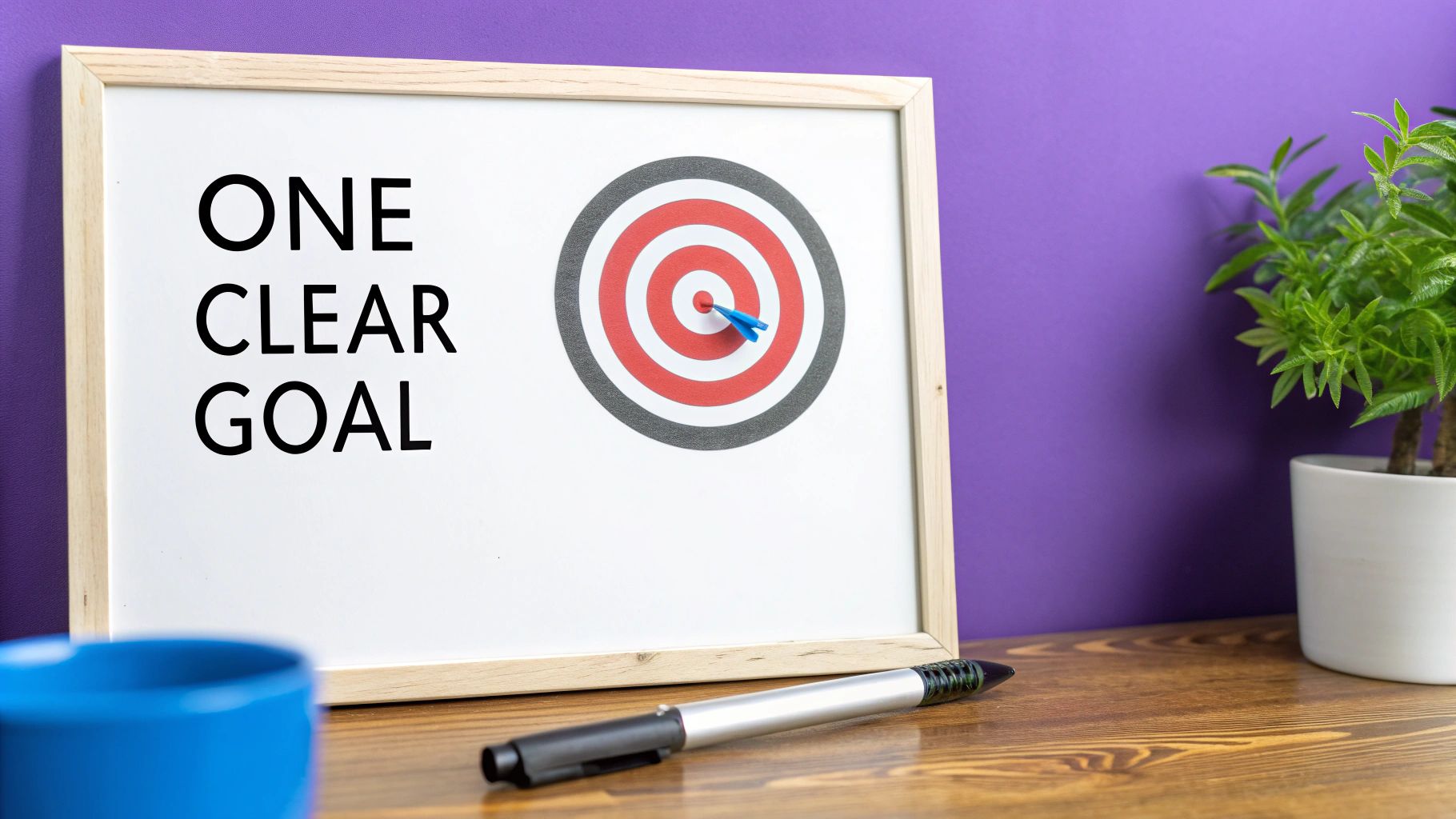
Before you even think about colors or fonts, stop and ask yourself the most important question of all: What is the one thing I need a visitor to do on this page?
A vague goal like "get more leads" is a wish, not a strategy. The magic of a great landing page is its relentless focus on a single, measurable outcome. This clarity is what separates a page that gets results from one that just sits there. Every headline, every image, every word must steer the visitor toward that one specific action.
Aligning Your Goal with Your Audience
As a speaker, your goal should be the logical next step for an event planner who has just seen you command a stage. They're impressed and interested; what do they need right now?
Here are a few sharp, actionable goals I’ve seen work wonders for speakers:
- Book a 15-Minute Strategy Call: This is a perfect low-friction way to get a qualified, interested person straight into your calendar.
- Download My Speaker One-Sheet: You give the event planner a valuable, shareable asset, and in return, you get their contact details. It's a classic win-win.
- Request My Speaking Fees: This is a fantastic qualifier. It targets decision-makers who are already serious about bringing you in.
This one goal dictates everything else on the page. If you want bookings, you'll fill the page with testimonials and calendar availability. If you're pushing the one-sheet, you'll talk about the powerful insights contained within it. This entire process is tied directly to having a clear message, which is something we cover in our guide on how to create a compelling value proposition.
The discipline of choosing one goal is the hardest part of creating a high-converting landing page. It feels limiting, but it’s this very limitation that creates clarity and drives action.
Why This Specificity Matters
Having a precise goal lets you create multiple, laser-focused landing pages for different situations. Maybe you have one for corporate events and another for non-profits. This strategy pays off, big time.
Here's a stat that always gets my attention: companies with 31 to 40 landing pages generate seven times more leads than companies with just one to five. That's not a small difference. It shows just how powerful it is to tailor your offer to a specific audience or event. You can dig into more stats about landing page performance on meetanshi.com.
Think of your conversion goal as the North Star for your entire page. It’s what transforms a simple webpage into a powerful business tool, ensuring the energy you create on stage translates directly into tangible results.
Crafting Content That Inspires Action

Alright, you know what you want visitors to do. Now comes the fun part: using your words to make it happen. Think of your landing page copy as your silent salesperson. It’s working around the clock to convince that busy event planner or frazzled HR manager that you're the exact solution they’ve been searching for.
Everything starts with that first impression. Your headline isn't just a title—it’s the most important string of words on the entire page. It has one job: to instantly answer the visitor's unspoken question, "What's in it for me?" Get it wrong, and they're gone. But nail it, and you'll pull them right down the page.
The Art of the Benefit-Driven Headline
This is where so many speakers miss the mark. They lead with what they do, not with the outcome they deliver. An event planner isn't really buying a "keynote speech." They're buying a re-energized sales team, a more cohesive leadership group, or a room buzzing with inspiration. Your headline has to reflect that transformation.
Here are a few frameworks I’ve seen work wonders for speakers:
- Problem/Solution: "Tired of Uninspired Sales Teams? Discover How My Framework Ignites Performance and Boosts Revenue."
- Direct Benefit: "The Proven Communication Strategies That Will Turn Your Managers into Unforgettable Leaders."
- Audience-Specific: "Finally, a Leadership Keynote That Resonates with Tech Founders and Engineers."
See the difference? These headlines connect directly to a real-world problem or desire, showing that you get it. A headline like this can single-handedly change how people engage with your page.
Your headline is an advertisement for the rest of your page. If it doesn't sell the visitor on the idea of reading the next sentence, nothing else you've written matters.
Building Trust with Body Copy and Social Proof
Once your headline has them hooked, the rest of your copy needs to follow through. This is where you lay out the case for why you’re the perfect fit for their event. Keep your paragraphs short and scannable. Your goal is to address their challenges head-on and position your expertise as the undeniable solution.
This is also the ideal spot to weave in your social proof. For a speaker, credibility is currency. Social proof lets you show off your track record without sounding like you're bragging. It's not about telling them you're a great speaker; it's about showing them that other respected people think so.
Here’s how you can build that trust instantly:
- Client Testimonials: Pull powerful quotes from past clients—especially recognizable ones—that highlight specific, tangible results from your talk.
- Company Logos: A simple "Trusted By" or "As Seen At" section with logos of companies you've spoken for is incredibly effective.
- Video Clips: Honestly, nothing beats this. A short, high-energy sizzle reel of you commanding a stage is the ultimate proof. It gives them a real taste of your style and stage presence.
The data doesn't lie. Research shows that about 36% of the highest-performing landing pages use testimonials to build credibility. And while the average landing page conversion rate hovers around 6.6%, pages that effectively build trust consistently blow that number out of the water. If you want to dive deeper, there are some great landing page statistics on hostinger.com.
Ultimately, your content needs to tell a story that takes a visitor from being curious to feeling confident, making that final click to book you feel like the most natural next step.
Designing for a Flawless User Experience
You could have the most powerful message in the world, but if your landing page is clunky and confusing, that message is dead on arrival. Once you've nailed your copy, the next challenge is presenting it in a way that feels completely effortless for your visitor. A great user experience isn't about flashy gimmicks; it's about clarity, speed, and building immediate trust.
For speakers, your landing page is a direct reflection of your professionalism. It has to look and feel as polished as you are on stage. This all starts with a clean, uncluttered layout. Think of white space as your best friend—it helps guide the eye directly to the most important parts of the page, namely your value proposition and your call-to-action.
Guiding the Eye with Visual Hierarchy
Your page needs to tell a visual story, and you're the hero. Use high-quality, dynamic photos of you in action, commanding a stage. These images do more than just fill space; they're powerful social proof that instantly shows your energy and expertise. Whatever you do, avoid generic stock photos. An event planner wants to see you, not some random person in a business suit.
Color psychology is another key piece of the puzzle. While the page should absolutely feel on-brand, your CTA button needs to scream for attention. Pick a high-contrast color that practically jumps off the background. It should be the most obvious, unmissable target on the screen.
A great design makes the next step feel intuitive. It removes friction and builds confidence, so clicking your CTA feels like the natural conclusion to the visitor's journey.
Prioritizing the Mobile Experience
Think about where your ideal client is seeing your page. Event planners are constantly on the move, checking emails and clicking links on their phones between meetings. If your landing page isn't a dream to use on a mobile device, you're throwing leads away. This isn't just a nice-to-have; it's absolutely essential.
You need to test your page religiously on different devices. Ask yourself:
- Is the text easy to read without pinching and zooming?
- Do the images load properly and not break the layout?
- Are the buttons big enough to be tapped easily with a thumb?
- Are the forms simple and quick to fill out on a tiny keyboard?
The Critical Role of Page Load Speed
Let's be honest: patience is a rare commodity online. A slow-loading page is one of the fastest ways to kill a conversion. Those first few seconds are everything. A delay makes you look unprofessional before the visitor has even read a single word of your headline.
The impact of speed is staggering. Study after study confirms that faster pages convert better. For instance, a page that loads in one second can triple conversion rates compared to a page that takes a leisurely five seconds. And the gap just gets wider from there. You can dig into more data on landing page speed and performance on wordstream.com.
To keep your page lightning-fast, get ruthless about optimizing your images and ditching any unnecessary code or scripts. Use modern image formats like WEBP and always compress your photos before you upload them. When your page loads almost instantly, you keep your audience hooked from the very first moment, giving your message the chance it deserves.
Optimizing Your CTA and Lead Capture Form
Everything you've built so far—the killer headline, the persuasive copy, the slick design—it all funnels down to this one moment. This is where your visitor either becomes a solid lead or vanishes for good. Your call-to-action (CTA) and the form that follows are the final hurdles, and they need to be perfect.
I see so many speakers drop the ball here with a lazy, generic CTA button like "Submit" or "Download." Those words are dead on arrival; they don't inspire anyone to do anything. Your CTA has to be an active, compelling command that spells out the value the visitor gets by clicking.
Crafting a Compelling Call-to-Action
Put yourself in the shoes of a busy event planner. What are they trying to accomplish? They need to find the right speaker and solve a problem. Your CTA should feel like the button that makes it happen.
Ditch the vague language and get specific with benefit-driven text. Try these on for size:
- Check My Availability: This creates a little urgency and speaks directly to their planning needs.
- Get My Speaker Kit: It’s a clear, tangible promise. They know exactly what they’re getting.
- Book Your Discovery Call: This frames the next step as a high-value consultation, not a pushy sales call.
This isn't just about semantics; it’s about psychology. A simple wording tweak can transform a passive request into an active solution, making it infinitely more persuasive.
Your CTA button isn't just a button; it's the finish line. The text on it must promise a clear and immediate reward for crossing it.
The infographic below really nails the core principles of designing an experience that guides people smoothly toward that final click.
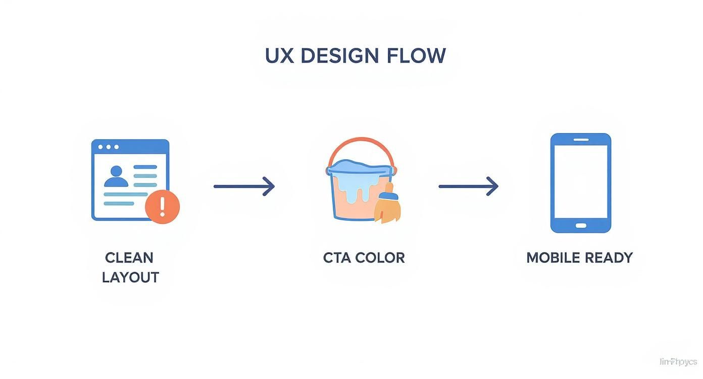
As you can see, it’s all about creating an intuitive path to conversion with a clean layout, a high-contrast CTA, and a design that works flawlessly on mobile.
The Art of the Frictionless Form
Okay, they’ve clicked your brilliant CTA. Now they’ve landed on your form. This is the graveyard where most conversions go to die. The golden rule here is painfully simple: ask for the absolute bare minimum.
Think about it. Every single field you add is another little piece of friction, another reason for someone to second-guess and abandon the whole thing.
As a speaker, what do you truly need to get the ball rolling?
- Name: So you know who you’re talking to.
- Email: So you can actually get in touch.
- Event Date (Optional): This is a great qualifier that helps you gauge their seriousness.
That’s it. Seriously. You don't need their phone number, company size, or annual budget right now. The goal is to open a door, not to conduct a full-blown interrogation. Just cutting the number of form fields from eleven to four can boost conversions by a staggering 120%.
Respect their time. A short, simple form feels effortless and sends a clear message that you value their attention. You can always gather more details on the follow-up call. For more ideas, check out these fantastic examples of form design we've compiled.
When you pair an action-packed CTA with a minimalist form, you remove the last roadblocks. You make saying "yes" the easiest, most logical next step for any event planner who’s interested in what you have to offer.
Common Landing Page Questions I Hear from Speakers
Even with a solid plan, building a landing page that actually converts can feel like a puzzle. As speakers, we have a unique job: translating the energy and connection we create on stage into a digital format that gets results. It’s a common stumbling block.
Let's walk through some of the questions that pop up most often. These aren't just hypotheticals; they come straight from speakers in the trenches, trying to turn a great talk into tangible business opportunities. Getting these right can be a total game-changer.
How Many Landing Pages Do I Really Need?
This one comes up all the time. Is one page enough? Look, starting with a single, well-crafted landing page is a fantastic first step. But if you want to see serious results, the goal is to create a unique page for each distinct audience or offer.
Think about it. The message that resonates with a corporate sales team is going to be completely different from what a group of non-profit leaders needs to hear. A tailored landing page lets you speak their language, hitting on their specific pain points and aspirations.
For instance, you might have:
- One page for your "Sales Kickoff Keynote," aimed squarely at VPs of Sales and corporate event planners.
- A totally separate page for your "Leadership for Impact" workshop, designed for foundation directors.
- A simple, general page for audience members to grab your media kit after a multi-speaker conference.
Don't just take my word for it—the data is overwhelming. Companies that go all-in and create 31 to 40 landing pages see seven times more leads than those with just a handful. That’s the power of speaking directly to the right person.
If I Can Only Focus on One Thing, What Should It Be?
Great question. If you had to nail just one element, it has to be your clear and compelling single conversion goal. Everything hinges on this.
This singular focus is your North Star. It tells you what your headline should promise, what your copy needs to say, and what your call-to-action (CTA) must ask for. Without that clarity, your page becomes a confusing mess of different ideas, and a confused visitor will almost never take action.
A powerful, benefit-driven headline that directly supports that one goal is a very, very close second.
Should I Put a Video on My Landing Page?
For a speaker? Absolutely, one hundred percent, yes. Video is the single most powerful tool you have to prove you can deliver. It’s your social proof on steroids.
Reading a glowing testimonial is nice, but seeing you own the stage, connect with the crowd, and deliver a powerful message is what seals the deal.
A short, high-energy sizzle reel or even a powerful one-minute clip from a past keynote builds instant trust. It shows, not just tells. Studies back this up, showing that adding video to a landing page can boost conversions by a staggering 86%. It lets event planners see your magic before they even pick up the phone, making the decision to book you a no-brainer.
Ready to stop leaving leads on the table after your talks? SpeakerStacks gives you the tools to create a high-converting landing page in under 90 seconds, complete with a unique QR code to share with your audience. Turn your next presentation into a powerful lead-generation machine. Start converting your audience today.
Ready to capture leads from your next talk?
SpeakerStacks helps you display QR codes, capture attendee information, and sync leads directly to your CRM. Get started free.
Want More Insights?
Subscribe to get proven lead generation strategies delivered to your inbox.
Subscribe to Newsletter