
In an attention-scarce economy, a static website simply isn't enough. The most successful brands capture and hold user interest by transforming passive browsing into an active, engaging experience. This is achieved through interactive web pages that invite participation, personalize content, and make information more digestible and memorable. From product configurators to data visualizations, these experiences are no longer a novelty; they are a strategic necessity for driving conversions and building brand loyalty.
This article dives deep into a curated collection of powerful interactive web pages examples. We move beyond simple descriptions to provide a strategic breakdown of what makes each one effective. For every example, you'll find a detailed analysis, screenshots, and direct links to see them in action. We'll uncover the specific tactics used to engage users, from gamification to personalized storytelling. At the heart of many interactive web pages lies dynamic content, which allows for personalized and changing experiences based on user input.
Our goal is to give you a blueprint of replicable strategies. Whether you're a marketer, founder, or creative director, you will leave with actionable takeaways and a clear understanding of how to implement these high-impact ideas. Let's explore the examples that are setting the standard for digital engagement.
1. SpeakerStacks
SpeakerStacks stands out as a premier example of purpose-driven interactive design, transforming the static experience of a presentation into a dynamic, two-way conversion channel. It empowers professionals who speak to generate business, such as marketers, founders, and consultants, by bridging the gap between audience attention and measurable action. Instead of just presenting information, speakers can now deploy a fully interactive, branded landing page in real time.
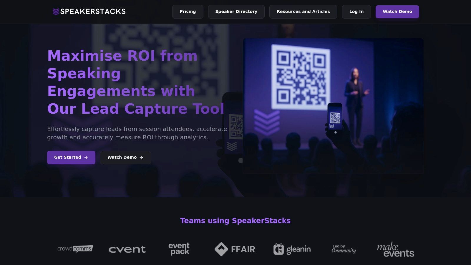
The platform’s core strength lies in its elegant simplicity and laser focus on ROI. In under 90 seconds, a user can create a unique, mobile-friendly webpage accessible via a QR code. This page becomes an interactive hub where audience members can download resources, book meetings, or subscribe to a newsletter directly from their phones. This immediate call-to-action mechanism is a powerful tool for lead capture, making it a stellar model for interactive web pages examples focused on conversion.
Strategic Breakdown and Key Features
SpeakerStacks excels by solving a critical business problem with a seamless user experience. It removes the friction typically associated with post-presentation follow-ups.
- Rapid Deployment: The ability to generate a complete interactive page with a QR code in under two minutes is a significant advantage. This allows for last-minute adjustments and ensures presenters are always ready to capture engagement.
- Deep CRM Integration: It connects directly with essential business tools like HubSpot, Salesforce, and Pipedrive. This automates the lead management process, ensuring every scan and interaction is logged in the user's primary system of record without manual data entry.
- Built-in ROI Analytics: The platform provides a dedicated dashboard to track key performance indicators. Users can instantly see leads generated, cost per lead, meetings booked, and conversion rates, directly attributing tangible business value to each speaking engagement.
- Compliance and Security: With GDPR and CCPA compliance built-in, SpeakerStacks addresses data privacy concerns from the start. This is a crucial feature for professionals operating in regulated markets, offering peace of mind and eliminating legal complexities.
Actionable Takeaways
SpeakerStacks offers a blueprint for creating interactive experiences that deliver tangible results. The platform masterfully combines a simple front-end user experience (for the audience) with a powerful, data-rich back-end (for the speaker). This strategic alignment is what makes it so effective and a leading example in its category.
For those looking to build similar interactive web pages, the key is to focus on a single, high-value goal. SpeakerStacks centers its entire experience on converting audience members into qualified leads. For more inspiration on engaging an audience, you can learn more about top interactive presentation ideas on SpeakerStacks.com.
Pricing and Access
SpeakerStacks operates on a freemium model. Users can get started with a free trial to access core features. For advanced capabilities, deeper integrations, and higher usage limits, paid subscriptions are available. This tiered approach allows individuals and small teams to test the platform's value before committing to a larger plan. You can explore its full feature set and sign up directly on the SpeakerStacks website.
2. Spotify Wrapped
Spotify Wrapped transforms personal data into a viral, interactive event. Each year, it presents Spotify users with a personalized, animated summary of their listening habits, turning raw data into a compelling narrative. Users navigate through a series of "stories," similar to social media platforms, that reveal their top songs, artists, genres, and listening minutes.
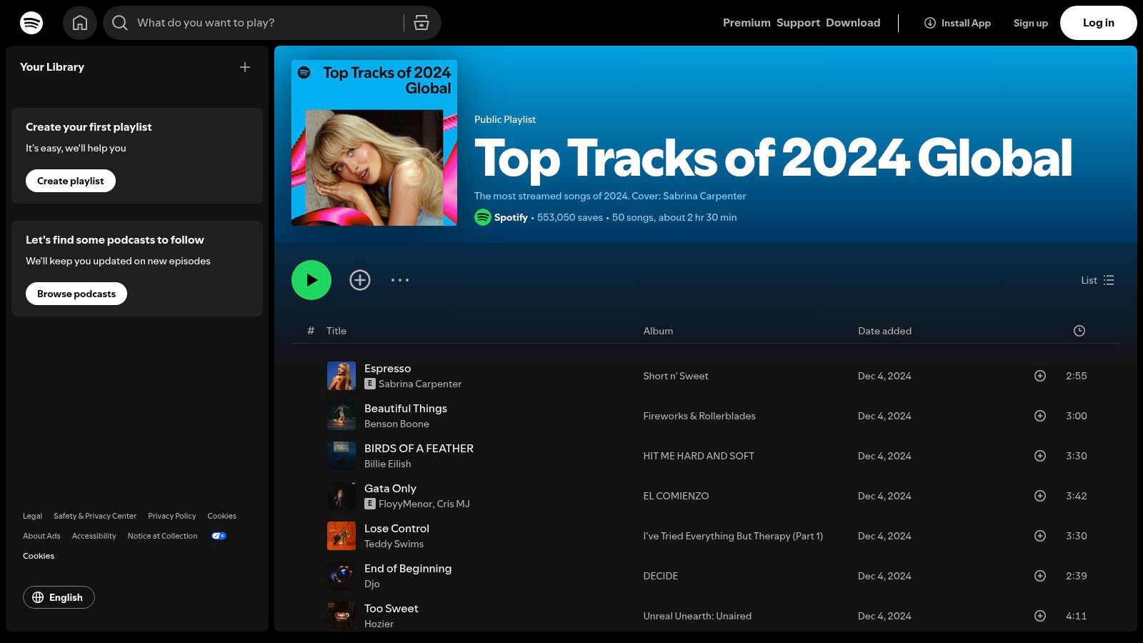
This experience is a masterclass in making data feel personal and shareable. The vibrant animations, custom color palettes, and dynamic text overlays make each user's summary feel unique. This high level of personalization is a key differentiator, creating an emotional connection that generic analytics dashboards fail to achieve. As one of the most anticipated interactive web pages examples each year, its success hinges on this hyper-personal approach.
Strategic Analysis: The Power of Personal Data
Spotify’s strategy is rooted in leveraging user data to create an exclusive, highly engaging experience that doubles as a powerful marketing tool.
- FOMO as a Driver: Wrapped is a limited-time event, available only at the end of the year. This scarcity creates a sense of urgency and Fear Of Missing Out (FOMO), driving massive user engagement in a short period.
- Built-in Virality: The entire experience is designed for social media. Each statistical highlight is presented as a visually appealing, easily shareable card. This turns every user into a brand ambassador, promoting Spotify organically across platforms like Instagram, Twitter, and Facebook.
- Emotional Connection: By framing data as a personal journey ("You listened to 50 genres this year!"), Spotify fosters a deeper relationship with its users. It's not just about numbers; it’s about a user's identity and memories associated with the music they love.
Actionable Takeaways for Your Projects
You can replicate Spotify's success by focusing on personalization and shareability.
- Turn Data into a Story: Don't just present users with raw numbers. Frame their data within a narrative. For a SaaS tool, you could show a user's "Productivity Journey" or "Biggest Wins of the Quarter."
- Design for Sharing: Create visually distinct, summary-style outputs that users will be proud to share. Pre-format content for specific social media channels to reduce friction.
- Create Exclusivity: Offer personalized reports or interactive summaries as a year-end reward or a milestone celebration for loyal customers. This makes users feel valued and reinforces brand loyalty.
Website: https://www.spotify.com/wrapped
3. IKEA Virtual Room Planner
IKEA’s Virtual Room Planner transforms the abstract challenge of furniture shopping into a tangible, interactive design experience. It allows customers to move beyond simple product browsing by letting them build and visualize their dream rooms using a drag-and-drop 3D interface. This tool bridges the gap between online shopping and the in-store experience, enabling users to test layouts, combinations, and styles from their own homes.
This platform excels by directly addressing a core customer pain point: uncertainty. By providing realistic 3D models of its products, IKEA empowers users to make confident purchasing decisions. The ability to design a space, save the layout, and generate a shopping list of the items used makes it one of the most practical interactive web pages examples in e-commerce. It shifts the user's role from a passive browser to an active creator.
Strategic Analysis: The Power of Practical Interactivity
IKEA's strategy is to use interactivity to solve a real-world problem, thereby reducing purchase friction and increasing customer confidence. It’s less about entertainment and more about utility.
- Reducing Return Rates: By allowing customers to "try before they buy" in a virtual space, IKEA helps prevent common purchasing mistakes, such as buying furniture that is too large for a room. This practical application of interactivity likely reduces costly product returns.
- Increasing Average Order Value: The tool encourages users to furnish an entire room, not just buy a single item. As users design their ideal space, they naturally add complementary products to their plan, which seamlessly translates into a comprehensive shopping list.
- Bridging Online and Offline: The planner is a powerful tool for both online and in-store shoppers. Users can create a plan at home and bring it to a physical store for consultation, creating a cohesive, omnichannel customer journey.
Actionable Takeaways for Your Projects
You can replicate IKEA's success by focusing on utility-driven interactivity that solves customer problems.
- Build a "Configurator": If you sell customizable products, create an interactive tool that lets users build their ideal version. This could be a "Build Your Own Laptop" tool for a tech company or a "Design Your Own Skincare Routine" feature for a beauty brand.
- Offer a Virtual "Try-On": Use augmented reality or 3D models to help customers visualize your product in their environment. This is highly effective for industries like fashion (virtual try-on for clothes) or home decor (placing a virtual painting on a wall).
- Connect Interactivity to a Purchase Path: Ensure your interactive tool leads directly to a clear next step. Don't just let users play; guide them to a "Save Configuration," "Add to Cart," or "Request a Quote" button.
Website: https://www.ikea.com/us/en/planners/
4. Google Arts & Culture
Google Arts & Culture democratizes access to global art and history, transforming passive viewing into an immersive, educational journey. The platform allows users to explore high-resolution artworks from thousands of museums, take virtual tours of cultural landmarks, and engage with interactive exhibits. It seamlessly blends technology with humanities, making priceless collections accessible to anyone with an internet connection.

The platform's strength lies in its diverse interactive features. Users can zoom in on paintings to see individual brushstrokes, use their phone's camera to find their art doppelgänger, or explore historical events through interactive timelines and maps. This variety makes Google Arts & Culture one of the most compelling interactive web pages examples for educational content, proving that learning can be deeply engaging and visually spectacular.
Strategic Analysis: The Power of Immersive Education
Google's strategy is to use its technological prowess to create an unparalleled educational resource that fosters curiosity and global connection. The platform serves as a powerful demonstration of Google's capabilities beyond search and advertising.
- Content as the Experience: Unlike platforms that use interactivity to sell a product, here the interactive experience is the product. By providing free access to high-quality, engaging content, Google builds immense brand equity and positions itself as a steward of global culture.
- Gamification of Learning: Features like "Art Selfie," "Color Palette," and art-based games turn the process of discovering art into a playful activity. This lowers the barrier to entry for audiences who might otherwise find museums intimidating.
- Leveraging Existing Technology: The platform brilliantly integrates technologies like Google Street View for museum tours and AI for features like "Art Transfer." This showcases Google's tech ecosystem in a non-commercial, highly positive context.
Actionable Takeaways for Your Projects
You can emulate the success of Google Arts & Culture by focusing on making your content immersive and educational, turning expertise into an explorable experience.
- Bring Your Content to Life: If you're explaining a complex process or product, don't just write about it. Create an interactive diagram, a 3D model, or a step-by-step virtual tour that users can control.
- Gamify Discovery: Introduce elements of play to encourage exploration. For a B2B service, you could create a "Business Maturity Quiz" that guides users through your content and provides a personalized result.
- Repurpose Content Interactively: Transform a static whitepaper or case study into an interactive story with clickable hotspots, embedded videos, and animated data visualizations to increase engagement. Learning how to create an interactive website like this can be a powerful way to showcase your brand's authority.
Website: https://artsandculture.google.com
5. Airbnb Interactive Maps and Experiences
Airbnb transforms the often-tedious process of travel planning into an engaging, interactive discovery. The platform’s core strength lies in its interactive maps and dynamic filters, allowing users to visually explore neighborhoods, set price ranges, and specify amenities in real-time. This moves beyond simple listings to a context-rich browsing experience.
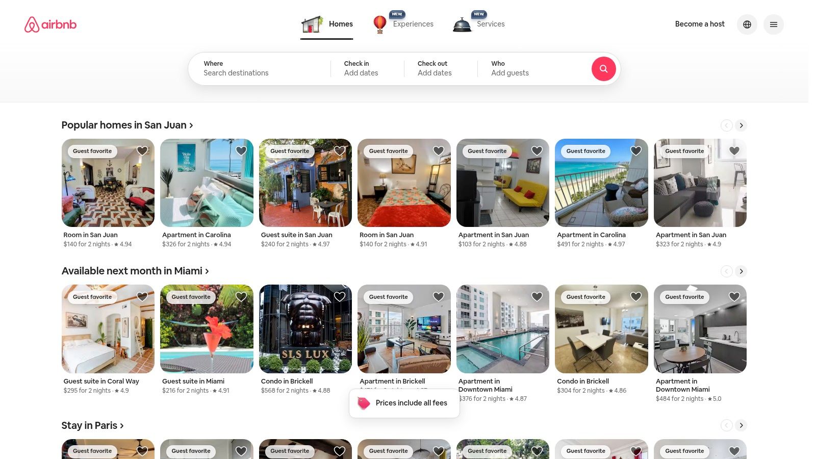
This approach makes finding the perfect stay or local activity feel less like a search and more like an exploration. As users pan across the map or adjust filters, the available options update instantly, providing immediate feedback. The integration of "Experiences"- locally curated activities hosted by residents- further deepens this interactivity, making Airbnb a standout among interactive web pages examples by blending utility with a sense of adventure.
Strategic Analysis: The Power of Contextual Search
Airbnb’s strategy is built on giving users powerful tools to explore possibilities, not just search for known quantities. It puts the user in control of discovery, building confidence and engagement.
- Visual Decision-Making: The interactive map is the centerpiece. Instead of just reading a neighborhood name, users can see a property's exact location relative to landmarks, transit, or the beach. This visual context is far more powerful than text descriptions alone.
- Layering Information: Airbnb successfully layers multiple types of interactive content. Users can switch between stays, experiences, and restaurants, all within the same map interface. This creates a one-stop-shop for travel planning, increasing time on site and user reliance on the platform.
- Empowering User Choice: The extensive and responsive filtering system empowers users to define what "perfect" means to them. By providing granular control over their search, Airbnb makes users feel understood and catered to, fostering a strong sense of personal relevance.
Actionable Takeaways for Your Projects
You can apply Airbnb's interactive principles to guide user decisions and enhance discovery on your own platform.
- Provide Visual Context: If your product or service has a geographic component, use an interactive map. A B2B service could map out customer case studies, while an e-commerce site could show where products are popular.
- Implement Dynamic Filtering: Give users real-time control over what they see. As they adjust filters, the results should update instantly without a page reload. This makes the experience feel fluid and responsive.
- Layer Your Content: Combine different types of related content into a single interactive view. For a software platform, you could create an interactive feature map that links to tutorials, use cases, and customer testimonials for each feature.
Website: https://www.airbnb.com
6. Apple Product Visualization
Apple's website redefines online product showcases by transforming them into an immersive, tactile experience. Instead of static images, users can interact with stunningly realistic 3D models of products like the iPhone or MacBook. This allows potential buyers to spin, zoom, and examine every curve, port, and finish as if holding the device in their hands.
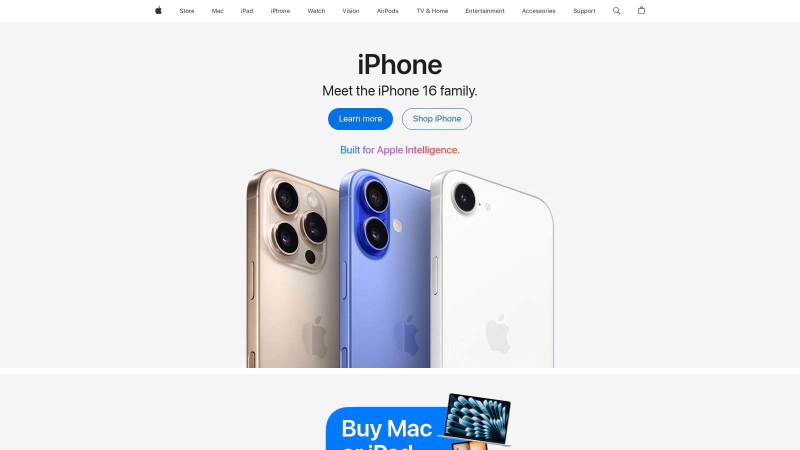
The experience masterfully blends minimalist design with powerful technology, bridging the gap between digital browsing and physical interaction. The animations are fluid, the textures are lifelike, and the integrated informational callouts appear seamlessly as you explore. This approach is one of the most sophisticated interactive web pages examples in e-commerce, as it builds desire and confidence by answering visual questions before a customer even asks them.
Strategic Analysis: The Power of Tactile Digital Experience
Apple’s strategy is to use interactive technology to replicate the premium in-store experience online, reinforcing brand value and driving conversion through detail-oriented exploration.
- Building Purchase Confidence: For high-ticket items, uncertainty is a major barrier. By allowing users to virtually "handle" the product, Apple reduces that uncertainty and builds a tangible sense of ownership and desire. It’s the next best thing to a physical demo.
- Brand Reinforcement: The flawlessness of the 3D models and the smoothness of the interaction are not just features; they are a direct reflection of Apple's brand promise: meticulous design, innovation, and superior quality. The web experience becomes an extension of the product itself.
- Guided Discovery: The interaction is not a free-for-all. As users rotate the models, specific hotspots appear, guiding them to key features and design innovations. This curated exploration ensures that users see the most important selling points in a natural, engaging way.
Actionable Takeaways for Your Projects
You can elevate your product showcases by focusing on interactivity and guided exploration, even without Apple's budget.
- Use 360-Degree Views: If full 3D modeling is too complex, start with 360-degree photography for your key products. This provides a significant step up from static images and gives users a more complete view.
- Highlight Key Features with Interactive Hotspots: Add clickable points or annotations to your product images or videos. When a user clicks, a pop-up can reveal more details, specs, or a close-up view of that specific feature.
- Ensure a Polished User Experience: The interaction must be smooth and intuitive. A laggy or clunky 3D model will reflect poorly on your product. Prioritize performance to ensure the experience enhances, rather than detracts from, your brand.
Website: https://www.apple.com
7. National Geographic Interactive Maps and Articles
National Geographic elevates digital storytelling by merging high-quality journalism with deeply immersive interactive maps and visuals. Instead of presenting static articles, it creates dynamic learning environments where users can explore complex geographical and cultural topics. Readers can scroll through narratives that unfold with animated maps, embedded videos, and data visualizations that respond to user input.
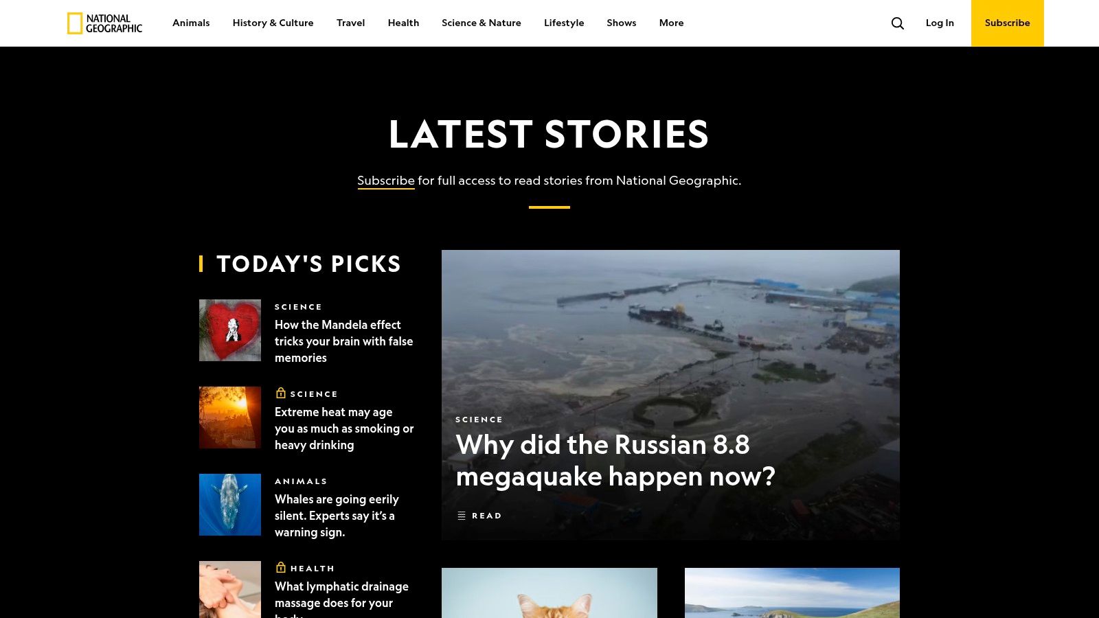
This approach transforms passive reading into an active exploration, making dense, educational content compelling and accessible. The seamless integration of multimedia elements within the narrative flow is a hallmark of their design. National Geographic's commitment to this format makes it a benchmark for educational and journalistic interactive web pages examples, demonstrating how to engage users with complex information effectively. While much content is free, a subscription is required for full access.
Strategic Analysis: The Power of Contextual Storytelling
National Geographic's strategy is to use interactivity to provide context and depth that static text and images alone cannot achieve. This builds authority and creates a premium educational experience.
- Learning Through Exploration: The interactive maps and timelines aren't just decorative; they are central to understanding the story. Users learn by doing, for example, by tracking animal migrations across a map or exploring historical events along an interactive timeline. This active participation improves comprehension and retention.
- Enhancing Narrative Impact: Animations and interactive data visualizations are timed to appear as the user scrolls, creating a cinematic and emotionally resonant experience. This controlled reveal keeps users engaged and guides them through the narrative's key points, making the story more impactful.
- Building Brand Authority: By investing in these high-production-value interactive features, National Geographic reinforces its reputation as a leader in scientific and cultural exploration. This premium experience justifies its subscription model and sets it apart from competitors.
Actionable Takeaways for Your Projects
You can use National Geographic's approach to make complex information engaging and authoritative.
- Guide Users with "Scrollytelling": Instead of presenting a dashboard full of data, reveal insights as the user scrolls. Tie animations and data points to scroll progression to create a guided narrative journey through your information.
- Make Data Tangible: Allow users to interact directly with your data. If you are presenting market trends, let users click on different regions of a map to see specific stats. This makes abstract numbers feel concrete and relevant.
- Invest in High-Quality Visuals: Use professional photography, clear data visualizations, and smooth animations to build credibility. A polished visual presentation signals to users that the content is trustworthy and valuable.
Website: https://www.nationalgeographic.com/
Top 7 Interactive Web Page Examples Comparison
Here's a direct comparison of the top interactive web page examples, outlining their complexity, resource needs, and ideal use cases.
SpeakerStacks
- Implementation Complexity: Low - No coding required, quick setup.
- Resource Requirements: Moderate - Requires CRM integration for full automation.
- Expected Outcomes: High - Delivers measurable pipeline, qualified leads, and clear ROI tracking.
- Ideal Use Cases: Marketers, sales leaders, and SaaS founders who use speaking engagements to drive business.
- Key Advantages: Instantly deployable branded landing pages, seamless CRM synchronization, and built-in ROI insights.
Spotify Wrapped
- Implementation Complexity: Medium - Involves complex data processing and custom design work.
- Resource Requirements: High - Demands significant data analytics and creative design resources.
- Expected Outcomes: High - Generates massive, personalized, and shareable user engagement.
- Ideal Use Cases: Music streaming users looking for a personalized annual summary of their listening habits.
- Key Advantages: Deep personalization, built-in social sharing, and a visually rich design.
IKEA Virtual Room Planner
- Implementation Complexity: Medium - Requires 3D modeling and user interface development.
- Resource Requirements: Moderate - Needs 3D assets and must ensure broad browser compatibility.
- Expected Outcomes: Moderate - Improves purchase confidence and helps customers with practical planning.
- Ideal Use Cases: Shoppers who want to plan a furniture layout before making a purchase.
- Key Advantages: Realistic 3D visualization and an intuitive drag-and-drop interface.
Google Arts & Culture
- Implementation Complexity: Medium - Depends on the creation of interactive content exhibits.
- Resource Requirements: Moderate - Requires hosting for high-resolution media.
- Expected Outcomes: High - Creates significant educational and cultural engagement.
- Ideal Use Cases: Art lovers, educators, and cultural explorers seeking accessible content.
- Key Advantages: Free access to global art collections and highly interactive exhibits.
Airbnb Interactive Maps
- Implementation Complexity: Medium-High - Involves map integration and advanced filtering logic.
- Resource Requirements: Moderate - Relies on location and data service APIs.
- Expected Outcomes: Moderate - Enhances the travel planning and booking experience.
- Ideal Use Cases: Travelers looking for a personalized way to find stays and local experiences.
- Key Advantages: Powerful interactive filters and integrated discovery of local experiences.
Apple Product Visualization
- Implementation Complexity: Medium - Requires creating 3D models and a sleek UI design.
- Resource Requirements: Moderate - Needs resources for 3D rendering.
- Expected Outcomes: Moderate - Allows for detailed and immersive product exploration.
- Ideal Use Cases: Customers interested in exploring Apple products in detail before purchasing.
- Key Advantages: Immersive 3D models, detailed specifications, and a premium brand aesthetic.
National Geographic Maps
- Implementation Complexity: Medium - Requires integrating multimedia and interactive map features.
- Resource Requirements: Moderate - Needs hosting capacity for multimedia content.
- Expected Outcomes: High - Achieves deep educational engagement through immersive storytelling.
- Ideal Use Cases: Readers interested in exploring geography, science, and culture.
- Key Advantages: Interactive maps that enhance the narrative and compelling multimedia storytelling.
Final Thoughts
Our exploration of these diverse interactive web pages examples reveals a clear, unifying principle: the most effective digital experiences are no longer static monologues but dynamic conversations. From the personalized data storytelling of Spotify Wrapped to the practical utility of the IKEA Virtual Room Planner, each example transforms passive consumption into active participation. They prove that when you empower users to explore, create, and personalize, you forge a much deeper, more memorable connection than any static landing page ever could.
The core takeaway is that interactivity is not merely about adding bells and whistles. It's a strategic tool for achieving specific business goals. Whether your aim is to simplify complex information like National Geographic, showcase product features like Apple, or generate highly qualified leads like SpeakerStacks, the right interactive approach can be a game-changer.
Strategic Insight: True engagement isn't just about clicks and scrolls. It's about giving users a sense of agency and delivering tangible value in return for their attention.
Your Next Steps: From Inspiration to Implementation
Feeling inspired by these interactive web pages examples is the first step. The next is to translate that inspiration into a concrete plan. Here’s how you can begin your journey toward creating a more engaging web presence.
1. Define Your "Why": Before you even think about tools or design, clarify your objective. Are you trying to:
- Educate? Consider interactive infographics, quizzes, or guided tours.
- Sell? Think about product configurators, virtual try-ons, or ROI calculators.
- Entertain? Personalized data stories, games, or interactive maps could be your answer.
- Qualify Leads? An interactive assessment or diagnostic tool is incredibly effective.
2. Map the User Journey: Think about where an interactive element would have the most impact. Is it at the top of the funnel to capture attention, in the middle to educate and nurture, or at the bottom to close the deal? The answer will guide your design and placement.
3. Choose the Right Tool for the Job: Your technical resources and goals will determine your platform. A simple quiz might be built with a no-code tool, while a complex 3D visualizer like Apple's requires a dedicated development team. The key is to match the tool's capabilities with your strategic "why."
Looking ahead, the integration of artificial intelligence opens up new possibilities for interactive web pages. Advanced tools are emerging that can generate highly specific, context-aware content on demand. For instance, a sophisticated AI metaprompt generator could be used to create dynamic, personalized user prompts, pushing the boundaries of user engagement even further.
Ultimately, the best interactive web pages are born from a deep understanding of the audience and a clear vision for the value you want to provide. By shifting your mindset from presenting information to creating experiences, you can build a powerful engine for engagement, education, and growth.
Ready to create your own high-impact interactive experience without needing a team of developers? SpeakerStacks makes it easy for consultants, coaches, and founders to build custom interactive assessments that generate qualified leads and provide instant value to your audience. See how you can turn your expertise into an engaging lead magnet by trying SpeakerStacks today.
Ready to capture leads from your next talk?
SpeakerStacks helps you display QR codes, capture attendee information, and sync leads directly to your CRM. Get started free.
Want More Insights?
Subscribe to get proven lead generation strategies delivered to your inbox.
Subscribe to Newsletter