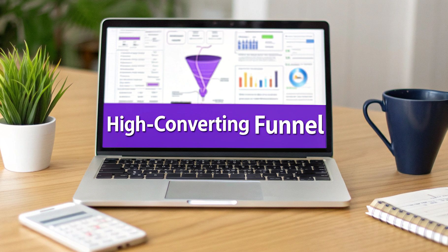
A landing page funnel isn't just a single page with a form on it. It’s a series of pages, each with a specific job, all working together to guide a visitor toward a single goal—whether that’s buying a product, booking a call, or signing up for a newsletter.
Instead of trying to do everything at once, a landing page funnel creates a multi-step journey. This approach lets you educate, build trust, and gently persuade people at each stage of their decision-making process.
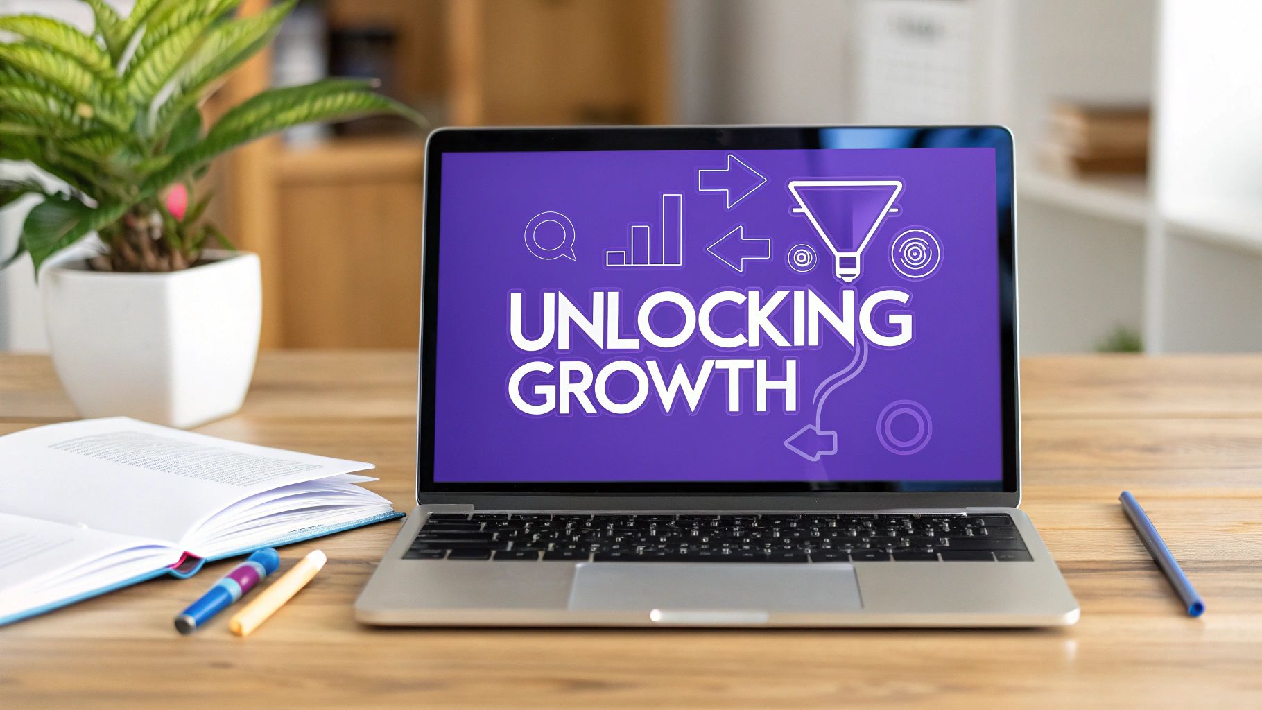
What a Modern Landing Page Funnel Looks Like
It's a common mistake to think of a funnel as just a page with a form. In reality, a high-performing funnel is a carefully designed psychological path. The goal is to meet visitors where they are and pull them toward your conversion goal with as little friction as possible.
This process closely follows the classic Awareness, Interest, Desire, Action (AIDA) model. It's not about the hard sell. It’s about giving people the right information at the right time to build their confidence and create momentum. To really nail this, you need to understand the key types of landing pages and know which one to use at each point in the journey.
This visual breaks down the simple, three-step journey a user takes through a funnel.
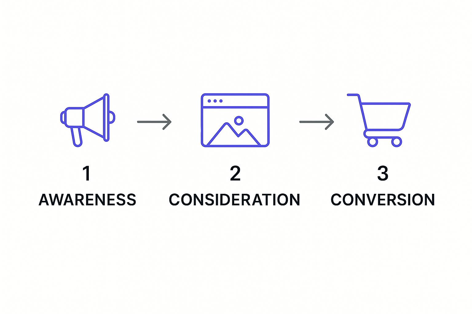
As you can see, each stage flows logically into the next, moving a visitor from their first click to the final conversion.
The Psychology Behind Each Stage
At the top of the funnel (Awareness), your only job is to grab attention and educate. The content here needs to speak directly to a visitor's problems, not shout about your product. This is where you build that initial flicker of trust by showing you understand their challenges.
Once they move into the middle (Consideration), they're actively looking for solutions. Your landing pages in this stage should get more specific, highlighting benefits and positioning your offer as the best choice. This is the perfect spot for lead magnets like webinars, detailed guides, or compelling case studies.
The final stage (Conversion) is where the decision is made. Your goal here is to make taking action as easy and appealing as possible, knocking down any last-minute doubts or hesitations.
Why You Can't Just "Set It and Forget It"
Building a funnel is just the beginning. The real magic—and the real results—come from continuous optimization.
Consider this: the average landing page conversion rate is a meager 2.35%. Yet, the top-performing pages can hit 11.45% or higher. That massive gap is pure opportunity, and it's closed by a well-optimized system.
Here's a breakdown of what each stage in a funnel typically looks like, its goal, and the content you'll need to make it work.
Core Stages of a Landing Page Funnel
Top of Funnel (ToFu)
- Primary Goal: Capture attention & generate awareness
- Essential Content/Elements: Blog posts, social media ads, infographics, educational videos
Middle of Funnel (MoFu)
- Primary Goal: Nurture leads & build trust
- Essential Content/Elements: Case studies, webinars, detailed guides, email sequences
Bottom of Funnel (BoFu)
- Primary Goal: Drive conversions & close the deal
- Essential Content/Elements: Sales pages, free trial offers, demos, compelling CTAs
This structure shows how each piece of content has a specific role to play in moving a user forward. A strong funnel doesn't leave anything to chance.
Little things can make a huge difference. For example, sites that load in one second convert 2.5 times higher than those that take five seconds to load. Despite this, only 34% of companies regularly optimize their funnels. This is a massive missed opportunity that you can easily take advantage of by paying attention to the details.
Designing Your Page for Maximum Impact
Let's be clear: great landing page design isn't about winning art awards. It’s about psychology. It’s about deliberately guiding a visitor’s eye down a path that ends with them taking one specific action. Think of it as creating a visual slide, moving them from your headline right to your call-to-action (CTA) button.
The biggest mistake I see is clutter. Every single thing on your page—the words, the images, the colors—must have a job. And that job is to get someone to convert. A page with too many choices creates a traffic jam in the user's brain, and they'll just leave. Keep it clean.
Crafting a Compelling Visual Journey
You’ve got about three seconds to convince someone they’re in the right place. That's it. Your design needs to scream relevance from the moment the page loads. This all comes down to a smart visual hierarchy.
Your headline has to be the biggest, boldest thing on the page, no contest. Right below it, a sub-headline should quickly explain the value. Then, your CTA button needs to pop. Use a color that stands out from everything else on the page so it's impossible to ignore. And please, use high-quality images or videos that actually connect with your offer and your audience.
Your landing page has one job: get the visitor to take the next step. If an element doesn't contribute to that goal, remove it. Simplicity and focus are your greatest assets in a landing page funnel.
The Power of Persuasive Copy and a Single CTA
Your words need to hit a nerve. You're not just listing features; you’re talking directly to your audience's biggest frustrations and showing them you have the exact solution they've been looking for. Frame everything in terms of benefits. How does this make their life better, easier, or more profitable?
All this great copy needs to point to one, and only one, call-to-action. Don't confuse people with buttons for "Download Now," "Learn More," and "Contact Us." That’s a recipe for inaction. Pick the most important action and make it the star of the show. We go into a lot more detail on this concept in our guide to building a lead generation landing page.
Building Trust to Boost Conversions
Doubt is the ultimate conversion killer. Your job is to dismantle that doubt right on the page by building a strong case for your credibility.
Here are a few proven ways to do it:
- Social Proof: Nothing works better than showing that other people already trust you. Sprinkle in some customer testimonials, logos of companies you’ve worked with, or short quotes from case studies.
- Trust Badges: Think security seals, industry awards, or a clear money-back guarantee. These little icons go a long way in making people feel safe and confident in their decision.
- Video Content: A short, authentic video can do wonders for building a personal connection. In fact, adding a video to your landing page can boost conversions by up to 86%. It’s a powerful tool.
These elements work together to lower a visitor's natural defenses, making them far more likely to click your CTA. To make sure you haven't missed anything, it's always a good idea to run through a solid landing page optimization checklist. It helps you systematically check every part of your page.
Creating a Frictionless Lead Capture Form
This is it. The make-or-break moment. After all the work you've put into your landing page—the compelling copy, the slick design—it all comes down to the form. This is where a visitor decides whether to give you their information or just click away. Honestly, this is where most funnels fall apart.
Any hint of confusion, any extra second of effort, and your conversion rates will nosedive. Think of your form not as a data collection tool, but as the final handshake. Make it a firm, confident one.
The golden rule here is beautifully simple: less is more. I've seen it time and time again—every single field you add is another little piece of friction, another reason for someone to bail. Put yourself in their shoes. They're about to trade their personal information for what you're offering. Is the trade worth it?

Hitting them with requests for a phone number, company size, and job title right out of the gate can feel way too invasive. You’ll scare off perfectly good leads who are just getting to know you. Stick to the absolute bare minimum you need to deliver your offer and kick off a conversation. For most top-of-funnel resources, that’s just a name and an email address. Seriously, that’s it.
Keep It Simple and Build Trust
Your form should feel effortless to complete. Use simple, clear labels right above the fields—don't make people guess. If you have the technical chops, using smart defaults or auto-fill can be a game-changer, especially for the massive number of people browsing on their phones.
Building trust right on the form itself is also a massively underrated tactic. People are understandably cagey about their data. A few small tweaks can put their minds at ease:
- Add a privacy note: Something as simple as, "We respect your privacy and will never share your information," can work wonders.
- Reiterate the value: Remind them exactly what they're getting. For example, "Enter your email to get the free guide instantly."
These little signals transform a cold, generic form into a genuine exchange of value. This is especially critical when you're trying to capture leads at a live event, where attention spans are even shorter. You can find more specific tactics for that in our guide on event lead capture ideas.
Back Up Your Form Design With Data
Optimizing your form isn't a guessing game. It's about looking at what the data tells us works. Webinar landing pages, for example, often hit conversion rates around 22.3% because the value is crystal clear and the forms are dead simple.
The consensus from countless marketing tests is clear: forms with minimal fields consistently outperform longer, more complex ones. The sweet spot is almost always four fields or fewer.
Even better, you can see a massive lift by directly addressing common fears. Simply reassuring visitors about data privacy or spam has been shown to boost conversions by as much as 80%. This isn't about flashy design; it's about a simple user experience and building trust. That's the foundation of a landing page funnel that actually performs.
Building Your Post-Conversion Journey
Don't pop the champagne just because someone hit "submit." Getting that conversion is a huge win, but honestly, the real work has just begun. What you do next will determine if that new lead becomes a raving fan or just another name on a list who forgets you exist by tomorrow.
This post-conversion journey is all about keeping the momentum going. You've made a promise, and now it's time to deliver on it, build some genuine rapport, and nudge them toward the next logical step. Dropping the ball here is like a keynote speaker nailing their talk, then just walking off stage without a closing thought or a call to action. It leaves people hanging.
Nail the Thank-You Page
I see it all the time: the thank-you page is the most neglected piece of real estate in the entire funnel. So many businesses treat it as a dead end, just a quick "Thanks, we'll be in touch." That's a massive missed opportunity.
Think about it. This is the moment their interest in you is at an absolute peak. They just took action! Instead of letting that energy fizzle out, use your thank-you page to deliver instant value and show them what to do next.
Here are a few ways I’ve turned my thank-you pages into powerful engagement tools:
- Deliver the Goods Immediately: If they signed up for a guide or a checklist, give it to them right there on the page. Don't make them dig through their inbox. A big, clear "Download Now" button is perfect.
- Offer the Next Step: What’s the very next thing you want them to do? Maybe it's booking a 15-minute discovery call, watching a quick demo video, or even following you on LinkedIn. Give them a clear, compelling option.
- Show Off Some Social Proof: A short, punchy case study or a powerful testimonial on this page can work wonders. It reinforces their decision and shows them they made the right choice.
By giving them something meaningful to do right away, you keep the conversation flowing and start deepening the relationship from the very first second.
Your thank-you page isn't just a receipt. It's a strategic bridge that confirms they made a great decision and immediately points them to the next step in their journey with you.
Map Out Your Welcome Email Sequence
Okay, so the thank-you page handled the immediate handoff. Now, your automated welcome email sequence takes over. This is your chance to build a real relationship, one email at a time. The goal here isn't to bombard them with sales pitches; it's to educate, add value, and build trust.
A smart sequence keeps you top-of-mind and warms up a lead for an eventual sales conversation, making it feel natural instead of pushy. Here’s a simple three-email blueprint I’ve used as a starting point for countless funnels.
The Welcome Email Sequence Blueprint
Email 1 (Immediately)
- Purpose & Content Example: Deliver the Goods & Set Expectations. "Here's the [resource] you requested! Over the next few days, I'll be sharing a few more tips on how to..."
Email 2 (2 days later)
- Purpose & Content Example: Educate & Build Authority. "I saw you were interested in [topic]. A lot of people get this one thing wrong—here's how you can avoid it..."
Email 3 (4-5 days later)
- Purpose & Content Example: Introduce a Soft CTA. "Now that you've had a chance to see [benefit], you might find our [next-step offer] really helpful. You can learn more here..."
This structured approach is all about giving before you ask. You establish credibility and provide real value first. It's how you turn a simple form submission into an engaged prospect who actually understands what you do and is far more likely to become a paying customer. This journey is the real heart of a high-performing landing page funnel.
Measuring and Optimizing Your Funnel's Performance
Getting your landing page funnel live is just the beginning. The real magic happens when you start digging into the data, figuring out what’s working, and methodically improving your results. This isn't about throwing things at the wall to see what sticks; it's a disciplined process of turning a good funnel into a great one.
Forget about vanity metrics like page views. We need to focus on the numbers that actually move the needle for your business. Let's get comfortable with the KPIs that tell the real story of your funnel's health.
Identifying Your Core Funnel Metrics
To start optimizing, you have to know what to measure. Every business has unique goals, but a handful of core metrics will give you a clear, honest look at your funnel's efficiency. These are the numbers that tie your marketing efforts directly to your bottom line.
Here’s where I always start:
- Conversion Rate: This is the big one. It’s simply the percentage of visitors who take the specific action you want them to, whether that's filling out a form or booking a discovery call.
- Cost Per Acquisition (CPA): This tells you exactly how much you're spending to get a new lead or customer. A low, sustainable CPA is the hallmark of a healthy, profitable funnel.
- Lead-to-Customer Rate: This metric connects the dots. It reveals how many of those hard-won leads actually convert into paying customers, giving you a powerful indicator of your lead quality.
Think of these three numbers as the dashboard for your funnel. If your CPA is creeping up or your lead-to-customer rate is dropping, you know it’s time to pop the hood and find out what’s wrong.
Pinpointing Weak Spots with the Right Tools
Once you know your numbers, you have to figure out the why behind them. Why are people dropping off? What's causing friction? This is where you need to go beyond basic analytics and look at actual user behavior.
Of course, a tool like Google Analytics is essential for understanding traffic sources and identifying which pages are leaking visitors. But to really get inside your visitors' heads, you need more.
Heatmap tools are my go-to for this. They create a visual map of where users are clicking, how far they're scrolling, and where their mouse hovers. I’ve had clients discover their most important call-to-action was being completely ignored simply because it was buried below the fold where 75% of their visitors never scrolled. That’s a game-changing insight you can’t get from a standard analytics report.
A high-performing landing page funnel is built on a constant feedback loop. Data from tracking tools removes the guesswork and emotion, letting you make small, evidence-based tweaks that can lead to huge wins.
A Practical Framework for A/B Testing
With real data in your hands, you can finally start optimizing. The most reliable way to do this is through A/B testing. The concept is simple: you create two versions of your page—the original (control) and a new version (variation)—and see which one performs better. The trick is to only test one thing at a time.
Always start with a clear hypothesis. For example, "I believe changing the button copy from 'Submit' to 'Get My Free Quote' will increase conversions because it clarifies the value for the user."
Then, you run the test until you have a statistically significant result. Some of the most impactful tests I’ve run for clients have involved:
- Headlines: Testing a benefit-driven headline against a pain-point-focused one.
- Button Color: Seeing if a high-contrast orange button gets more clicks than a subtle on-brand blue.
- Form Fields: What happens to your conversion rate when you make the "phone number" field optional instead of required?
This disciplined approach ensures your funnel is always evolving and improving. For a much deeper look into this process, check out our complete guide on conversion rate optimization best practices. Remember, continuous testing is what separates a good funnel from an unstoppable one.
Getting Past the Sticking Points: Your Landing Page Funnel FAQs
Even the most seasoned pros run into questions when building out a new funnel. You've got the strategy down, but then the practical, "what-if" scenarios start popping up. Let's tackle some of the most common questions I hear from people trying to get their landing page funnels just right.
So, How Many Landing Pages Do I Actually Need?
This is a classic one. While there's no single magic number, the data is pretty clear: businesses that maintain 10-15 landing pages see a significant jump in qualified leads. Think about it this way—instead of sending everyone to one catch-all page, you create a dedicated experience for each specific campaign or ad group.
This strategy lets you match your message, offer, and design directly to what brought that person to you in the first place. That kind of relevance is what really moves the needle on conversions. If you're just starting out, a good rule of thumb is to build a unique funnel for each of your core marketing initiatives and then branch out.
What’s a “Good” Conversion Rate Anyway?
You’ll see the industry average floating around 2.35%, but honestly, fixating on that number is a trap. A "good" rate is completely relative to your industry, your traffic source, and what you’re asking someone to do. Converting a visitor for a high-ticket consulting service is a different ballgame than getting them to download a free PDF.
The most productive approach is to benchmark against yourself. Focus on consistent, incremental improvements over time.
Top-tier funnels often hit conversion rates of 5-10% or more. The goal isn't to beat a generic industry average; it's to systematically optimize every element of your funnel to push your own numbers higher and higher.
How Long Should My Copy Be?
The "it depends" answer is frustrating, but it's the truth. The right copy length hinges on two things: how complex your offer is and how much your audience already knows about the problem you're solving.
For simple, low-risk offers (like a newsletter signup or a checklist download), short and punchy copy is your best friend. Get to the point quickly and make it easy for them to say yes.
For complex or high-ticket offers (like a detailed course or a B2B service), you’ll need longer-form copy. You have to build trust, handle objections, and thoroughly explain the value before someone is willing to commit.
The key is to provide just enough information to persuade, not overwhelm. Always let clarity, not word count, be your guide.
Ready to turn your presentations into a high-performing landing page funnel? SpeakerStacks helps you create branded landing pages with unique QR codes in under 90 seconds, capturing leads and measuring ROI directly from your speaking engagements. See how it works at SpeakerStacks.com.
Ready to capture leads from your next talk?
SpeakerStacks helps you display QR codes, capture attendee information, and sync leads directly to your CRM. Get started free.

Want More Insights?
Subscribe to get proven lead generation strategies delivered to your inbox.
Subscribe to Newsletter